
Flagging*
Making legible with “world-words”

Dear friends—
As this governmental crisis continues to rage, I wanted to share these words from my friend Sal Randolph, whose wisdom has always helped me, now and in the past. Sal writes that
“Care is a form of attention that is necessarily steady and responsive. Care brings your focus to a sphere of direct responsibility. Caring for something—tending a garden, raising a child, writing a book—requires us to hold it in mind. It cultivates a particular form of creativity, of trial and attempt and recovery from failure.”
I needed this reminder right now, that caring for myself, my work, and those around me is crucial in this particular moment of shock and disorientation.
As some of you may know, I’m working on a book about queer typographies these days, and I’ve been using this online space to test out some ideas. I’m out at a writing residency right now at Salmon Creek Farm, and I’ve had some time and space to dig down into a particular history that intrigues me: the rainbow flag. I’ve written some words about it, and even though this piece is a bit longer, I still think of it as a sketch. I wanted to share it with you now. It touches on some things that have been happening in the news recently, but also connects to the larger arcs and trajectories of liberation through queer time and space. Let me know what you think.
In solidarity,
Paul


A flag marks the spot, claims a territory. Flagging could be this: flying or waving a flag to send a signal. Some time ago, raising a piece of fabric was the most direct way to communicate across a landscape. It’s a visual statement addressing those who approach, and it says: this is the place. These people are here. This is what we stand for, and this is our message to you as you approach. A flag can signal that you’ve arrived (or that you should leave), or that you’re about to cross a boundary. A welcome, a warning.

Raising a flag immediately creates a landscape: as markers, flags make space legible. As symbolic icons, flags condense complex stories into singular images that make whole cultures and politics visible. They accumulate multiple histories, containing vast worlds.
In its physical manifestation, a flag is positioned in relation to human sight: elevated. Raise it up on a pole, fly it above a building, or hang it from a facade, like a banner. Of course we can do other things with flags too, like wrap a coffin, line a street, paint it on a plane, or burn it. In each case it works to mark a spot, or a thing, or an action, with a specific set of values that comes along with the world that it signifies.
I’m thinking about the flag as a legible image—a logo—but in the classic Greek definition of logo as “word, expression, utterance.” The logic of a flag is this: it’s a world-word that carries textual meaning in its visual legibility. Is a flag a text? Certainly it’s a glyph, a pictograph, a kind of typography. A legible image that signifies a world, working like a word or a phrase to contain meaning.
A flag is typically fixed in place, but like a poster, it can circulate too—on the body, in physical space, on digital networks. Flags can be stickers, emoji, avatars, a flash of color. The Palestinian flag emoji 🇵🇸 is used on social media to signal “Free Palestine,” as is the watermelon emoji 🍉, to show support for liberation without using the actual flag—a color-coded play on legibility for those who recognize the colors red, green, black, and white. This kind of flagging can happen on the body as well, using a flag in a coded way to signal a particular message to a select community. Flagging might involve wearing certain articles of clothing or accessories in specific colors and positioning them in different ways to send coded messages; flags make legible, enabling an accurate “read” for those in the know. In 1890s London, it’s said that Oscar Wilde would sometimes encourage friends to wear a green carnation, and when asked what it meant, replied:
“Nothing whatsoever, but that is just what nobody will guess.”
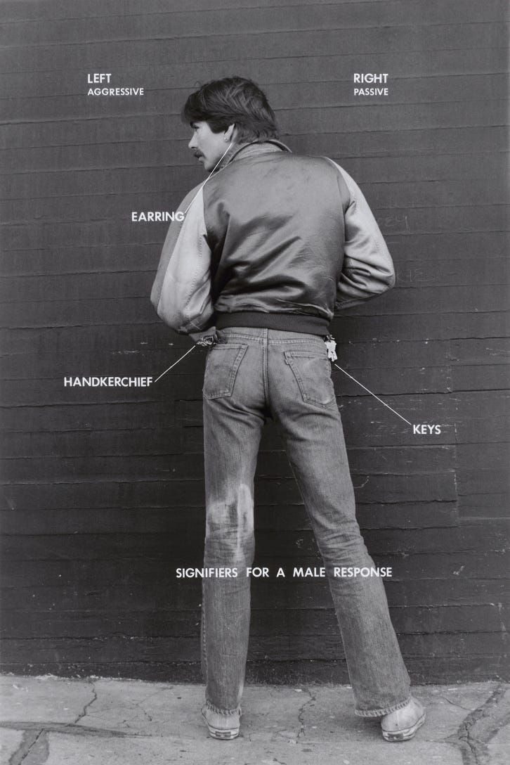
The story of Wilde’s green carnation and how it was to be read is compelling, even if unsubstantiated. Later in the 1970s, gay people would clip keys to belt loops or tuck them into pockets on a chain to indicate sexual preference, in a kind of binary code system: if worn on the left, the keys would signify “top,” or “bottom” if worn on the right. I remember something similar about single earrings worn by men. In a practice actually known as flagging (or the “hanky code”), a bandana in a specific color could be worn on the body, wrapped around the arm or tucked into a back pocket on the right or left, signifying different sexual positions, preferences, or kinks, when the code was known. Flagging as personal communication can be a powerful way to create a landscape of meaning at the scale of the individual body, signaling preferences, desires, or solidarity. The artist Hal Fischer documented some of these practices and more in Gay Semiotics (1977). Simple acts of typing or displays of world-words on the body can communicate across survival networks to spread the word, increase visibility, and code the read, especially when it’s working against the established order of things.

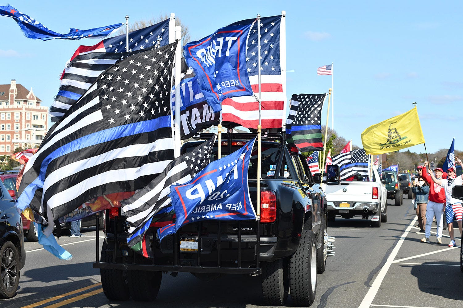
World-words are challenging to use when the subjects themselves are being surveilled, read, and regulated under the matrix of domination, especially when the signifier identifies vulnerable at-risk communities who aren’t organized around geography or nation states. What are the borders and boundaries of an affinity flag, like the LGBTQ+ rainbow flag or the transgender flag or the Black Lives Matter flag? I’m thinking about the US State Department’s order on January 20, 2025 that a “one flag policy” would be implemented for US government buildings and embassies globally. In declaring the US flag as the only allowable flag, the policy essentially bans all identity and affinity flags that may have flown over US buildings in the past. The policy eliminates complexity by imposing a uniform geo-political read onto the landscape, as stated in the order:
“The flag of the United States of America united all Americans under the universal principles of justice, liberty, and democracy. These values, which are the bedrock of our great country, are shared by all American citizens, past and present.”
The policy enforces a “country first” agenda by regulating and prioritizing nation-state domination and empire over all else. A policy like this one banishes important symbols of identity and community from the most visible, symbolic, and powerful places, flattening the landscape and further marginalizing those who have been struggling for rights and liberation for centuries, by disassociating them from these seats of power and denying them visibility in the commons.

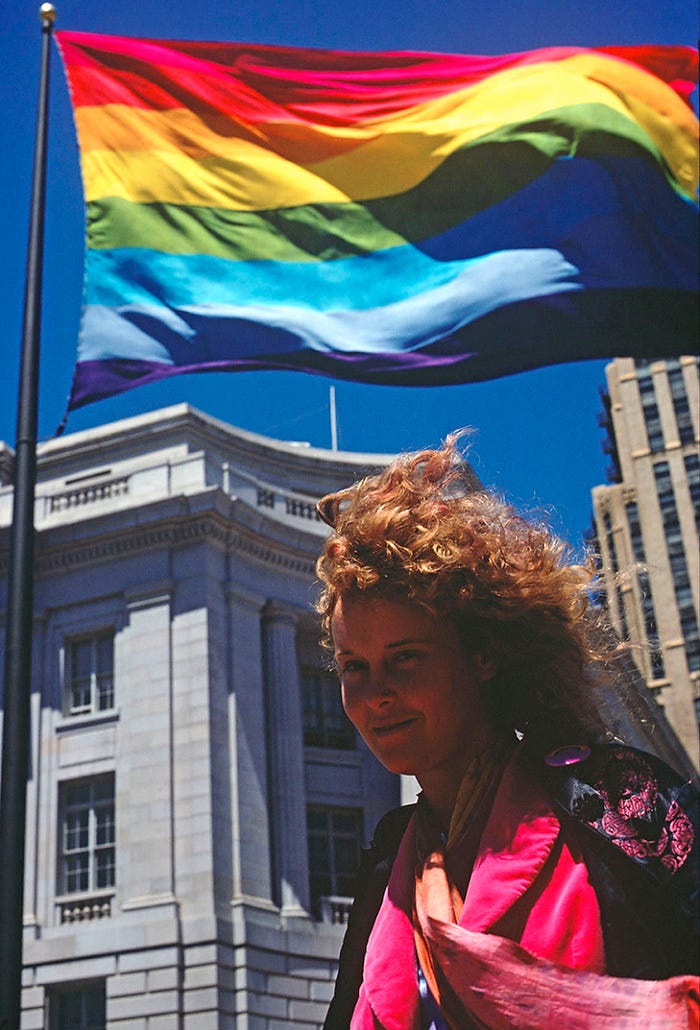
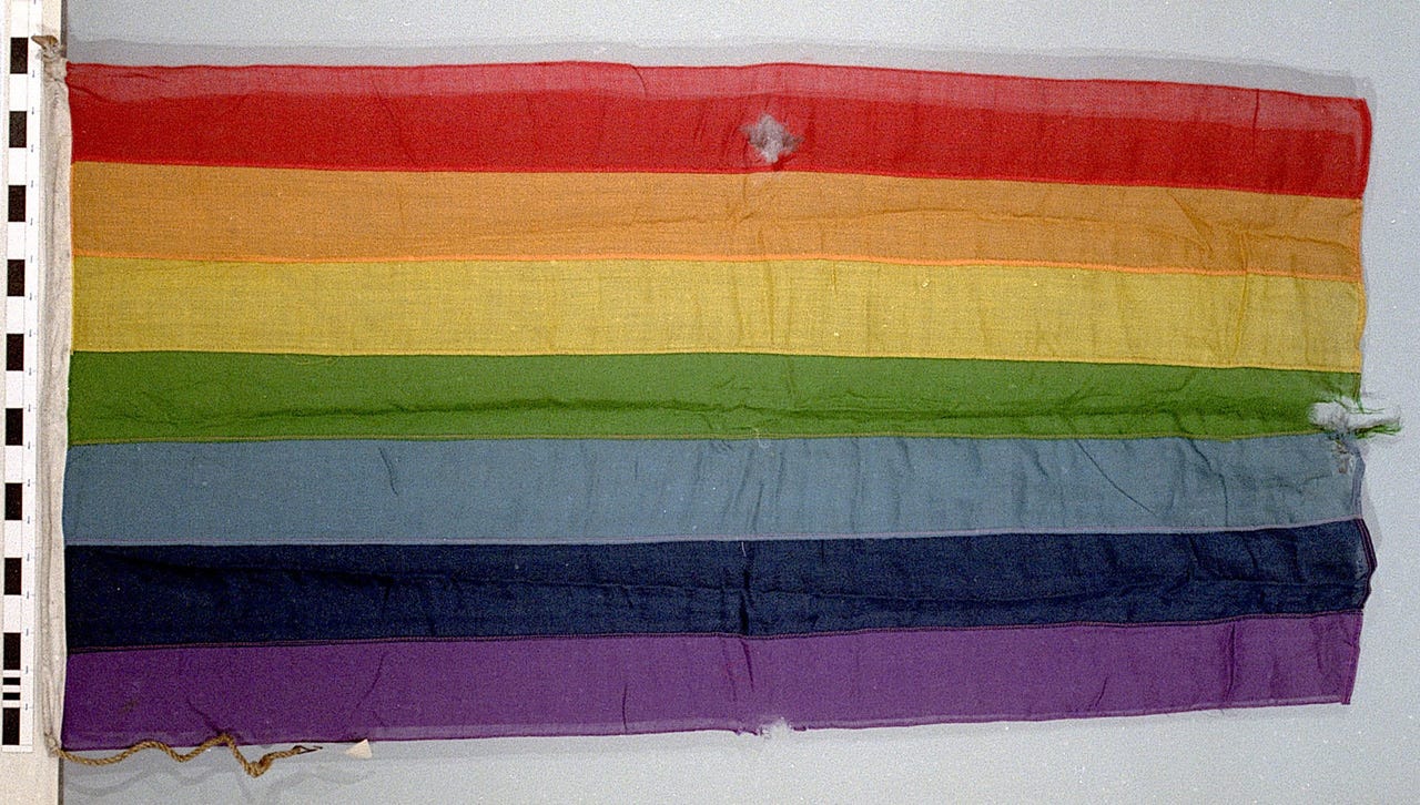
In spite of the most recent ban, the LGBTQ+ rainbow flag continues to evolve, change, and mutate across time and space. Today, the 6-color striped rainbow flag is ubiquitous, but not fixed—there are endless variations and mutations as additional stripes, emblems, and symbols have been added, modified, and merged through the years. And an entire library of newer flags continues to grow, representing the wide plurality of queer subgroups and communities. Collectively, all of these different rainbow flags are a vast, entangled system of world-words that carry multiple histories and no single fixed state or read; they mutate and transform.

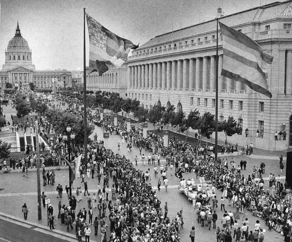
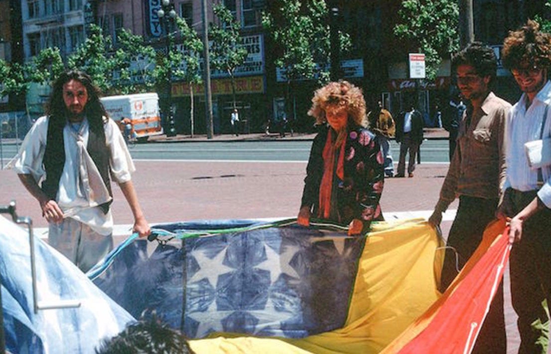
There are various stories about the origins of the core 6-color rainbow flag, but no definitive narrative about how it came to be. Most accounts credit the flag’s designer as Gilbert Baker (1951–2017). At the Museum of Modern Art in New York, which added “Rainbow Flag” to its collection in 2015, Baker is listed as the sole artist, and fabrication is attributed to Lynn Segerblom and James McNamara. But in this elaborate oral history by the LGBTQ History Project, Segerblom (who in the 1970s was an “Angels of Light” dancer and went by Faerie Argyle Rainbow) and others (August Bernadicou, Adrian Brooks, Bethany the Princess of Argyle, Dan Nicoletta, John Serrian, Lee Mentley, and Paul Langlotz; McNamara died in 1999) tell a much more detailed and complicated story about its creation. They describe the making of the flag as a communal effort for the June 1978 San Francisco Gay and Lesbian Freedom Day Parade, organized by a Pride Foundation committee with San Francisco Supervisor Harvey Milk, including a decorating sub-committee (co-chaired by Segerblom and Baker) that presented the idea of rainbow flags. In this oral history, they credit Segerblom, not Baker, as the originator:
“While deliberating the decorations for that year, Lynn said she suggested her favorite symbol, the rainbow, to brighten up the gray San Francisco Civic Center where the Pride celebrations would culminate. . . . She came to 330 Grove one day with some friends, Jonathan and Robert, and said that she thought we should make rainbow flags for Gay Day to brighten up City Hall and Civic Center because it's all gray and cold in June in San Francisco.” (Bernadicou and Mentley)
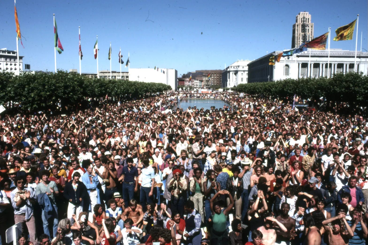
It should also be noted that the discriminatory “California Proposition 6: Ban on Lesbian and Gay Teachers Initiative” was coming up for vote on the state ballot just a few months later, which may have given a sense of urgency and a need for collective visibility, unity, and coordination to that particular Gay Freedom Day. According to the group, Segerblom and the committee proposed 18 smaller flags to line the reflecting pool at the San Francisco Civic Center, and two larger 30’ x 60’ flags at the Market Street end of the pool. There was a team of “well over 30 people” who hand-dyed the fabric on the roof of 330 Grove and assembled and sewed the flags collectively. And in their account, they crucially describe how Gilbert Baker went on to wrongly take sole credit for the flag as it became a cultural icon, claiming that he wrote Segerblom and others, as well as the overall collective effort, out of the story.
Baker died in 2017, leaving his official version of the flag’s creation in his memoir Rainbow Warrior (2019), which The Gilbert Baker Foundation excerpts in a section on their website titled “Rainbow Flag: Origin Story.” This account makes no mention of Segerblom, McNamara, Freedom Day, or the large communal effort to make the flags for the event. Instead, the Foundation presents the idea of the rainbow flag as solely Baker’s, having been revealed to him in a series of revelatory moments after a breakup and while tripping on LSD:
“This was our new revolution: a tribal, individualistic, and collective vision. It deserved a new symbol . . . we rode the mirrored ball on glittering LSD and love power. Dance fused us, magical and cleansing. We were all in a swirl of color and light. It was like a rainbow. A rainbow. That’s the moment when I knew exactly what kind of flag I would make.”
Baker characterizes the new revolution’s vision as being tribal, individualistic, and collective all at once. He repeats these again in that same account:
“After the orgy of bunting and hoopla surrounding the Bicentennial, I thought of flags in a new light. I discovered the depth of their power, their transcendent, transformational quality. I thought of the emotional connection they hold. I thought how most flags represented a place. They were primarily nationalistic, territorial, iconic propaganda—all things we questioned in the ’70s. Gay people were tribal, individualistic, a global collective that was expressing itself in art and politics. We needed a flag to fly everywhere.”
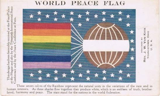
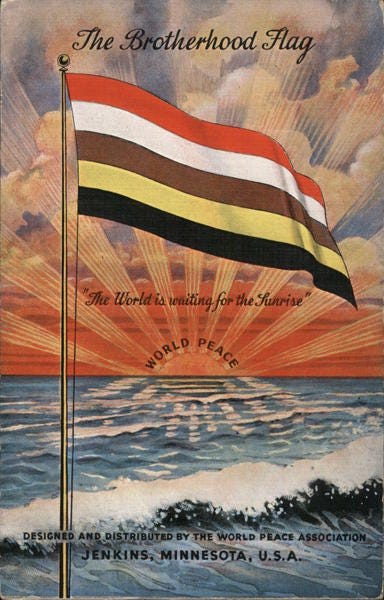
These deeper, intentional messages may or may not have actually informed the rainbow flag’s creation, but they matter today; they’re a part of the flag’s accumulative legacy and meaning and continue to inform its evolution as a design artifact that travels through queer time and space. Rainbow flags weren’t new in 1978, and we don’t know if the creators were aware of any precedents, but the International Cooperative Alliance flag (1925), the proposal for the Armenian flag by Martiros Saryan (1919), the World Peace Flag (1913), and the Brotherhood Flag (1938) are all important to note as part of a deeper history and ancestral context for the design of this icon. Rainbow Gatherings were also an important part of counterculture in the 1970s, and may have contributed to the general idea of the rainbow as a symbol of joy. In each of these cases the rainbow messaging is consistent, signaling values like communal peace and unity.
Tribal, individualistic, a global collective. In his memoir, Baker repeats these words to describe “gay people” and the “new revolution” during the 1970s. Are these the qualities that informed the original LGBTQ+ rainbow flag? By Segerblom’s account, they were making bright, colorful decorations for a parade, not a new symbol for a global collective. Baker writes that gay people were individualistic, but the rainbow is collective in its very definition: a gathering of different colors and light into a single formation. Baker’s use of the word tribal introduces unnecessary colonial associations. A rainbow is meant to signify diversity and a spectrum of possibilities, but Baker’s characterization seems to flatten: one flag for the global collective to fly everywhere.
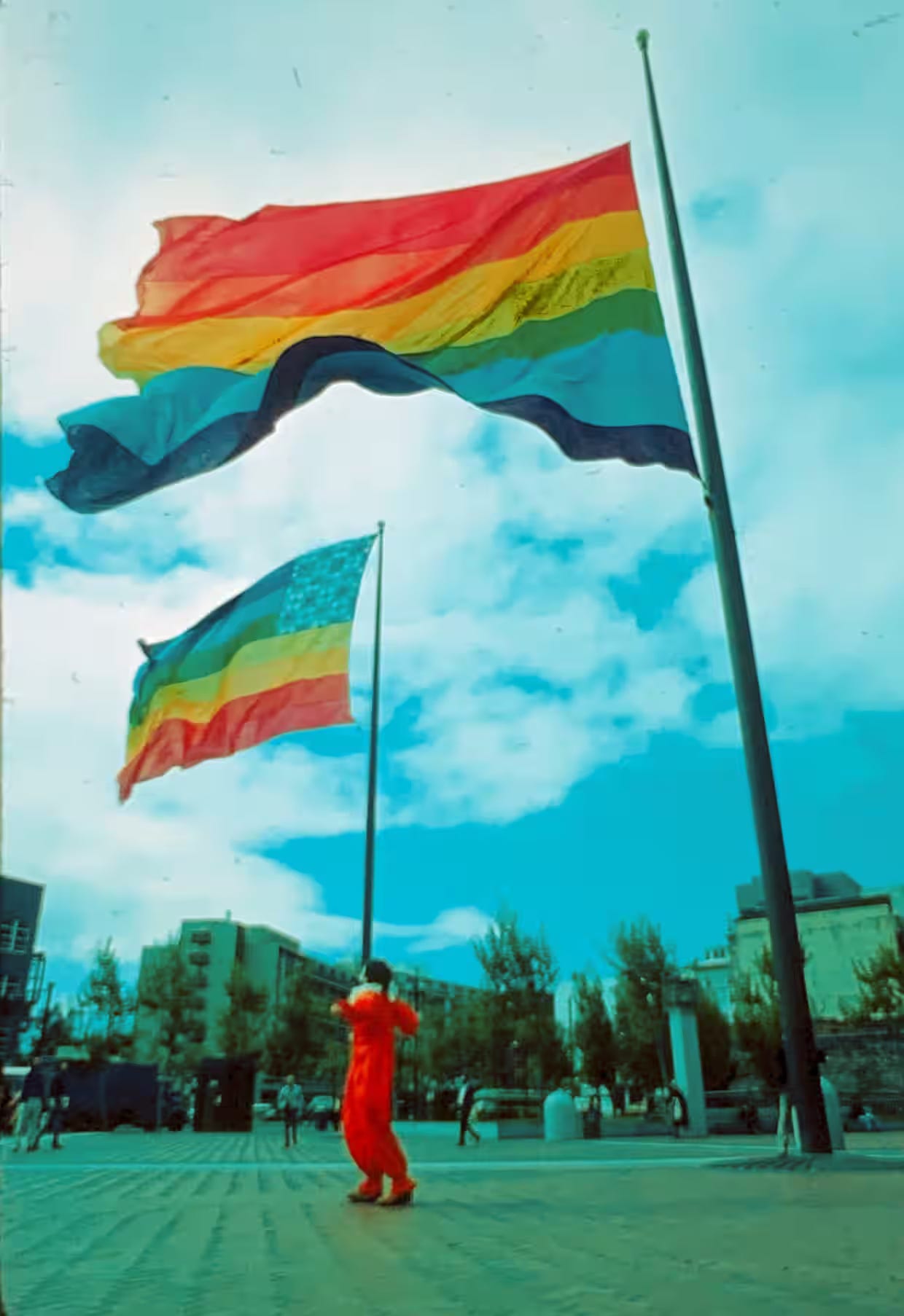
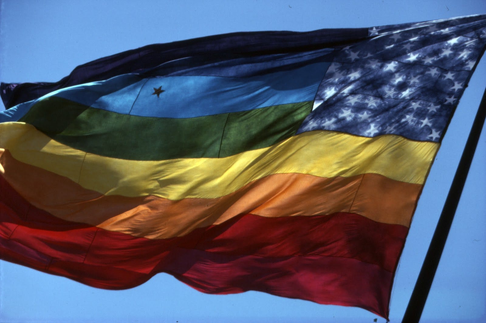
In fact, there were two. What is known today as Baker’s iconic rainbow flag was part of a pair of larger flags made for the Freedom Day Parade. The other one, according to their oral history, was “a revisioning of the American flag with rainbow stripes. This rainbow flag became known as Lynn’s Flag and the New American Rainbow Flag.” Conceived by Segerblom, this other rainbow flag was never seen again, and I can only find a couple of photos where it’s clearly visible. It has rainbow stripes like the other one, but the order of the colors was flipped—purple on top and pink on the bottom. A blue canton contained a field of white stars, similar to the US flag, but with the stars arranged in circles. And then, there’s this remarkable detail: in one photograph, a lone, queer star is visible on the aqua blue stripe. Lynn described it like this:
“I sewed a lamé star into the stripe. I had lamé left over from my Angels of Light costume. On one side of the aqua blue stripe, there's a star that's silver lamé. When you flip the flag over, and you look at the other side, it's gold lamé. I just wanted a touch of magic, a touch of glitter, a little bit of Angels of Light. One or two of the photographs by James McNamara shows the star stitched on there. That was just like an afterthought.”
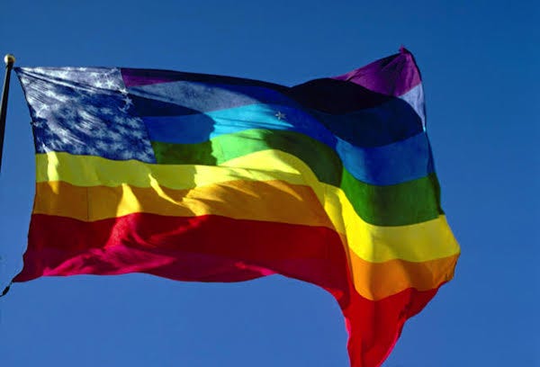
Regardless of how the flags were actually conceived and made, we somehow lost Lynn’s starred flag along the way. Not only was it never seen again after the parade, but the fact that it existed at all is mostly unknown. We lost the collective spirit of the making of the flags, replaced with Baker’s widely celebrated narrative of the single iconic flag. We lost the “afterthought” of the queer star straying out of—or into—the field on its own, and the upside-down re-ordering of the colors. When asked if the two flags were meant to complement each other, Lynn replied:
“Yes. Oh, yes. They're a pair. That's why I didn't want them to look exactly the same. You have a pair of eyebrows, but they're each different.”
As a pair, the two flags were a hybrid mix of symbols, pattern, and color, more like an odd system of loosely flowing design elements than the crisp, singular icon that we know today. From a post on ACT UP NY’s Instagram account: “The two original rainbow flags also had opposite orientations, abandoning the idea of a proper top or bottom to the flag because ‘We are a versatile people,’ in the words of James McNamara.”
I really mourn Lynn’s flag as the missing companion to the original rainbow flag. I miss the intuitive power of the afterthought, and the urgent making of this world-word pair that evoked a larger, more poetic image of collectivity. If there was ever something queer about the rainbow flag, it was there in the duo of flags that briefly made a queer landscape legible at San Francisco’s Civic Center on June 25, 1978—a less rigidly ordered upside-down world of stripes and stars holding space for the errant, wayward figure who wanders away (or approaches?) the collective field. We really need this missing flag today, at least in spirit.
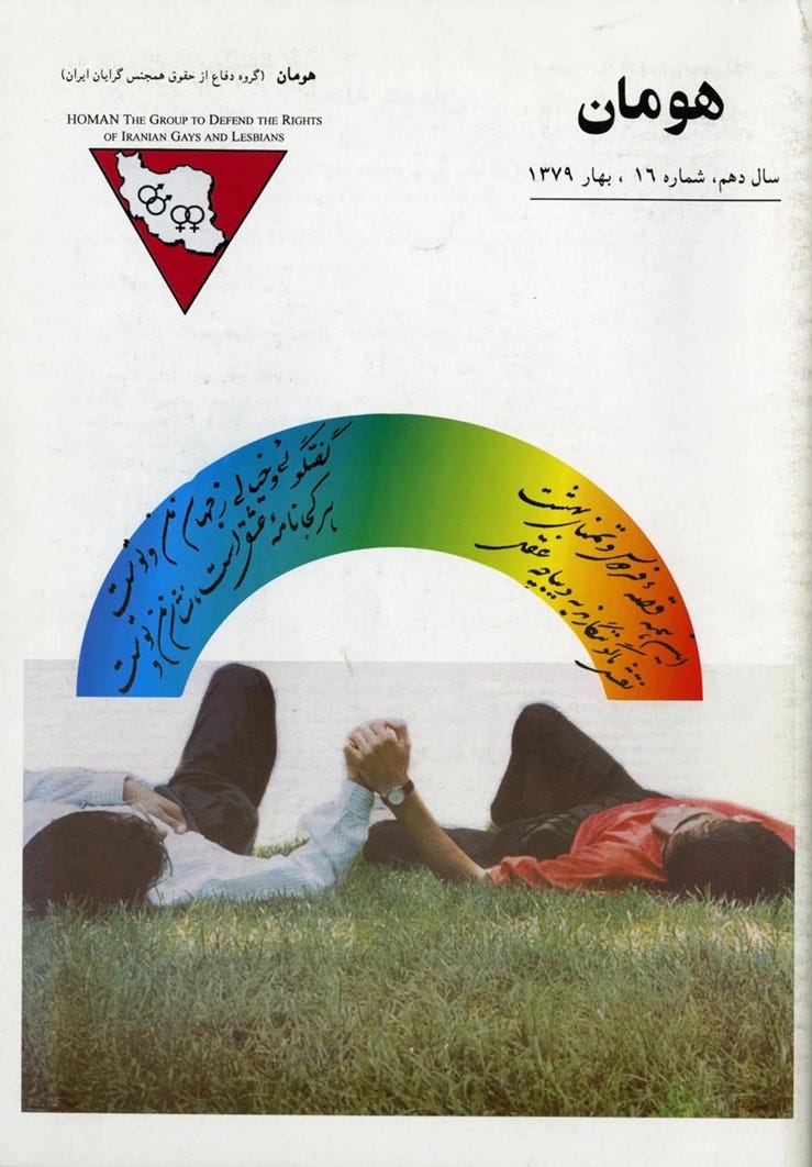
Baker worked at Paramount Flag Company at the time, which sold a 7-stripe version of the rainbow flag after the parade (the pink stripe was eliminated because the color was unavailable). In 1979, the aqua and indigo stripes were merged into a single blue stripe. Through Baker’s promotion, the singular 6-color rainbow flag that we know today entered the public domain and went on to spread globally, not just as a flag but as an endlessly mutable design motif. This is powerful branding; the rainbow is now instantly recognizable globally as part of an LGBTQ+ design vocabulary, “flowed” into an unlimited array of shapes, letterforms, logos, and patterns as a way to signify pride, without necessarily using the actual flag. This works well when conditions require the visual display of queer-coded material to be less legible, especially in contexts where homosexuality is illegal. For the Spring 2000 cover of Homan, a magazine that advocated for the rights of Iranian LGBTQ+ people living abroad (1991–2002), a graphic shape filled with a rainbow gradient was used to contain a love poem by Persian poet Hushang Ebtehaj, written in Farsi, floating over two masculine figures viewed from behind, laying down and holding hands. It’s a powerful design that presents queer-coded material without the instant recognition of faces or flags (although the logo is striking in its clarity: a silhouette of Iran within a red triangle (in earlier issues it was pink), with linked “male” and “female” symbols within).

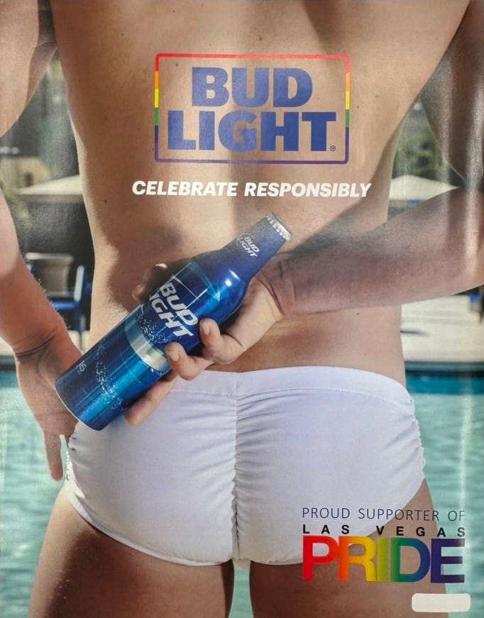
In the west, as LGBTQ+ rights were more formally recognized in the early 2000s, an expanding neoliberal market quickly responded by capitalizing on a more “acceptable” consumer audience. Rainbow capitalism accelerated with gay marriage and the right to serve in the military legalized in the US and throughout the west in the 2010s. Selling the stylistic idea of LGBTQ+ pride—as an aesthetic to be applied to consumer goods—became extremely profitable, and the rainbow design motif was an easy way to apply “diversity branding” to products. What was once seen as an idea that emerged from counterculture “in a swirl of color and light” was now being used by banks, oil conglomerates, weapons manufacturers, retail giants, computer software companies, and every other Forbes 500 company to sponsor annual pride events, bring product campaigns to market, and promote brand strategies to “pinkwash” their offers and maximize profits. What was being sold? Certainly not liberation, hope, or any kind of collective vision. Rainbow capitalism was about corporate expansion and the bottom line. One result was that these other values have now been fed back into the meaning of the rainbow flag itself, complicating its rich history and meanings with negative “corporate pride” associations, for many.
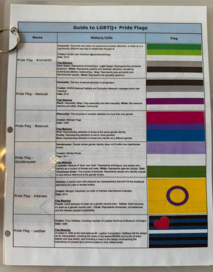
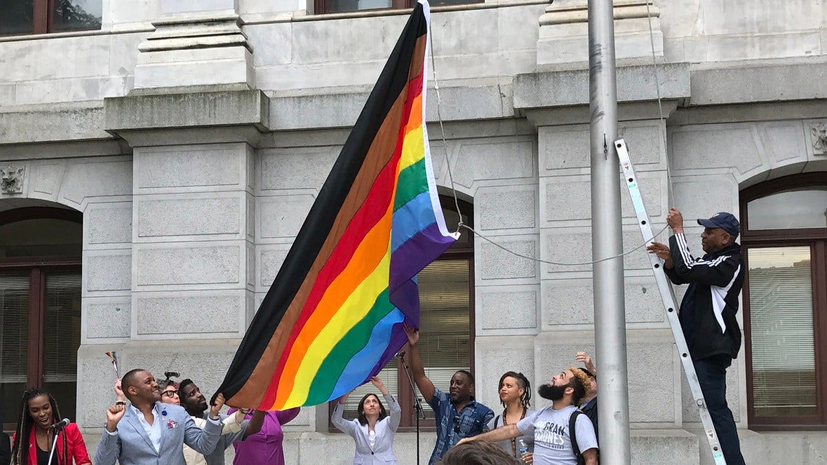

In an effort to more fully represent the LGBTQ+ community, young designers have modified the rainbow flag through the years by adding new stripes and other designs. As part of the Philadelphia Mayor’s Office of LGBT Affairs, Amber Hikes led the effort to create an 8-color flag for Philadelphia Pride in 2017, with the addition of black and brown stripes to represent marginalized people of color. Shortly after, designer Daniel Quasar started a Kickstarter campaign and successfully raised over $25,000 for the production of a new 11-color Progress flag. Quasar’s design includes a chevron emblem with stripes representing transgender and non-binary people, marginalized people of color, and those living with AIDS, overlaid onto the original 6-color flag. Quasar continues to promote the design on pins, stickers, tote bags, shirts, and notebooks and sells them on an e-commerce website (progress.gay). Unlike the original rainbow flag and many other affinity flags, the Progress flag is not in the public domain. Quasar includes a detailed “terms of use” page on progress.gay that protects the flag’s use with a Creative Commons license (BY-NC-SA), to “make sure that it is used properly, that it still supports the message of the flag, and supports the creator of the work.” These new “more inclusive” flags with additional stripes work well in awareness campaigns, to signal allyship, and for merchandising. They seem to communicate more generalized messages of diversity, alignment, and pride, rather than identification with any single community.
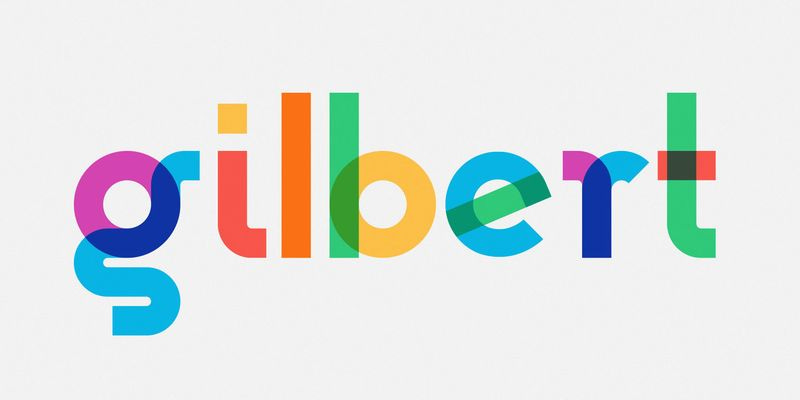

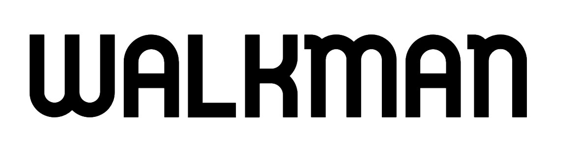
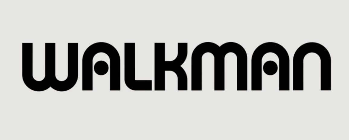
As soon as I began my search for queer typographies I encountered Gilbert, a font created just after Baker’s death by the corporate advertising agency Ogilvy, part of the WPP Group global agency network. Gilbert is “a typography project that celebrates the life of artist, LGBTQ activist and Rainbow Flag creator Gilbert Baker,” according to the font’s dedicated Instagram account. The typeface comes in a standard form as well as a color version, with transparent rainbow flag colors embedded in the letterforms, and was used by software companies Fontself and Adobe to promote a new SVG “color font” technology when it launched in 2018. The Gilbert font received a lot of attention, and although the website that originally hosted the free typeface (typewithpride.com) has since expired, the font is still available for free download at Adobe Fonts. When it was released, Ogilvy Creative Director Chris Rowson was quoted as saying that “the rounded, fluid forms of the letters are a tribute to the design styles and colors of the 1970’s, when the Sony Walkman was popular and Baker created the Rainbow Flag.” I thought it was odd that the Walkman was mentioned, since it’s such a specific reference but isn’t associated with queer history in any way. I glanced at the original 1979 Sony Walkman logotype and suddenly understood why he (perhaps mistakenly?) mentioned it—the font appears to be a retracing of the Walkman letterforms, with slight modifications.
Why? Who knows. Somehow, Gilbert Baker ended up with a corporate typeface named after him, designed by a giant corporate agency, perhaps as a tech PR event, derived from a famous corporate consumer brand, and only available now from the largest design software corporation in the world, with assets of $30 billion. At least it’s free! Was the Gilbert font part of a big silicon valley pinkwashing publicity stunt? I’m not sure what to make of any of this, except that it is certainly not queer typography; it feels out of touch with the values typically associated with the original rainbow flag, and more like the product of corporate pride posturing, firmly embedded in capital, market play, and neoliberal “feel good” performativity.
I’m still looking for queer typographies, and I feel like I find it again and again in the intersecting acts, stories, mutations, and trajectories of meaning and language that shapeshift through queer time and space. Queer typographies take so many different forms; mutability, contamination, fluidity, and transformation are at the heart of it. It’s remarkable to consider the depth of meaning that’s accumulated in and around the LGBTQ+ rainbow flag as an evolving world-word during the last 50 years, at once a single glyph without a fixed form and an endless flow of formations, large enough to carry the meaning of multiple cultures, economies, and histories. Today, as I write this at the start of a new US government administration, rainbow capitalism may officially be over, or at least on hold, as DEI initiatives are being declared illegal, HIV funding is being slashed, and transgender rights are under severe attack. Removing queer world-words from view only deepens these oppressions by creating permissive conditions for cruelty that further push queer and trans people to the margins, and worse.
The US government’s most recent “one flag policy” is only one small part of those permissive conditions of hatred and cruelty, joining a long history of iconic words and symbols weaponized within larger, coordinated efforts to impose oppressive order on vulnerable populations. In terms of queer life, 64 countries currently criminalize private, consensual, same-sex sexual activity. The rainbow flag’s power to signal LGBTQ+ support can lead to arrest, imprisonment, or worse in many of these places. On September 22, 2017, several people were arrested and imprisoned for “inciting homosexuality” by flying LGBTQ+ rainbow flags at a concert in Cairo, Egypt. The group performing that night was Lebanese band Mashrou’ Leila, whose lead singer Hammed Sinno is openly gay. Soon after, the BBC reported that several men were arrested, and “a woman suspected of raising a rainbow flag at the concert has also been charged with ‘promoting sexual deviancy’ and ‘habitual debauchery.’” That woman was Sarah Hegazi (1989–2020), an Egyptian socialist, writer, and lesbian activist who was imprisoned and tortured by the Abdel Fattah el-Sisi regime for flying the LGBTQ+ rainbow flag at the concert.**

Tragically, Hegazi did not survive. She was released in January 2018 and eventually sought asylum in Canada, but continued to struggle and suffer from depression and PTSD. She died on June 14, 2020, confirmed as a suicide. She left this note:
“To my siblings—I tried to survive and I failed, forgive me. To my friends – the experience was harsh and I am too weak to resist it, forgive me. To the world—you were cruel to a great extent, but I forgive.”

Hegazi’s terrible story is forever embedded in the ongoing struggle for queer liberation and should be more widely known, a painful reminder that joyful displays of pride are themselves brave acts of resistance. The courage to display one’s pride by waving a flag is still powerful enough to threaten the most oppressive of regimes, as relevant now as it was in 2017 when Hegazi displayed her joy in Cairo. Today, I’m thinking about how the transgender flag, designed by Monica Helms in 1999, continues to take on new layers of meaning and power, as transgender rights are suddenly being attacked and removed in an effort to deny the existence of trans life in the US. I think about how this particular flag will be flown, worn, waved, and signaled to future queer kin in the coming days and months, as trans life will persist.

In 1988, the gay Cuban-American artist Félix Gonzáles-Torres painted Forbidden Colors, four 20 in. x 16 in. monochrome canvases in white, green, red, and black—the colors of the Palestinian flag—in order to draw attention to the fact that the display of the Palestinian flag was prohibited in Israeli-occupied Palestinian territories, as well as other forms of oppression, including the discrimination of people with HIV/AIDS. In a statement that accompanies the artwork, he wrote:
“. . . This work is about my exclusion from the circle of power where social and cultural values are elaborated and about my rejection of the imposed and established order. It is a fact people are discriminated against for being HIV positive. It is a fact the majority of the Nazi industrialists retained their wealth after war. It is a fact the night belongs to Michelob and Coke is real. It is a fact the color of your skin matters. It is a fact Crazy Eddie’s prices are insane. It is a fact that four colors red, black, green and white placed next to each other in any form are strictly forbidden by the Israeli army in the occupied Palestinian territories. This color combination can cause an arrest, a beating, a curfew, a shooting, or a news photograph. Yet it is a fact that these forbidden colors, presented as a solitary act of consciousness here in SoHo, will not precipitate a similar reaction. . . .”
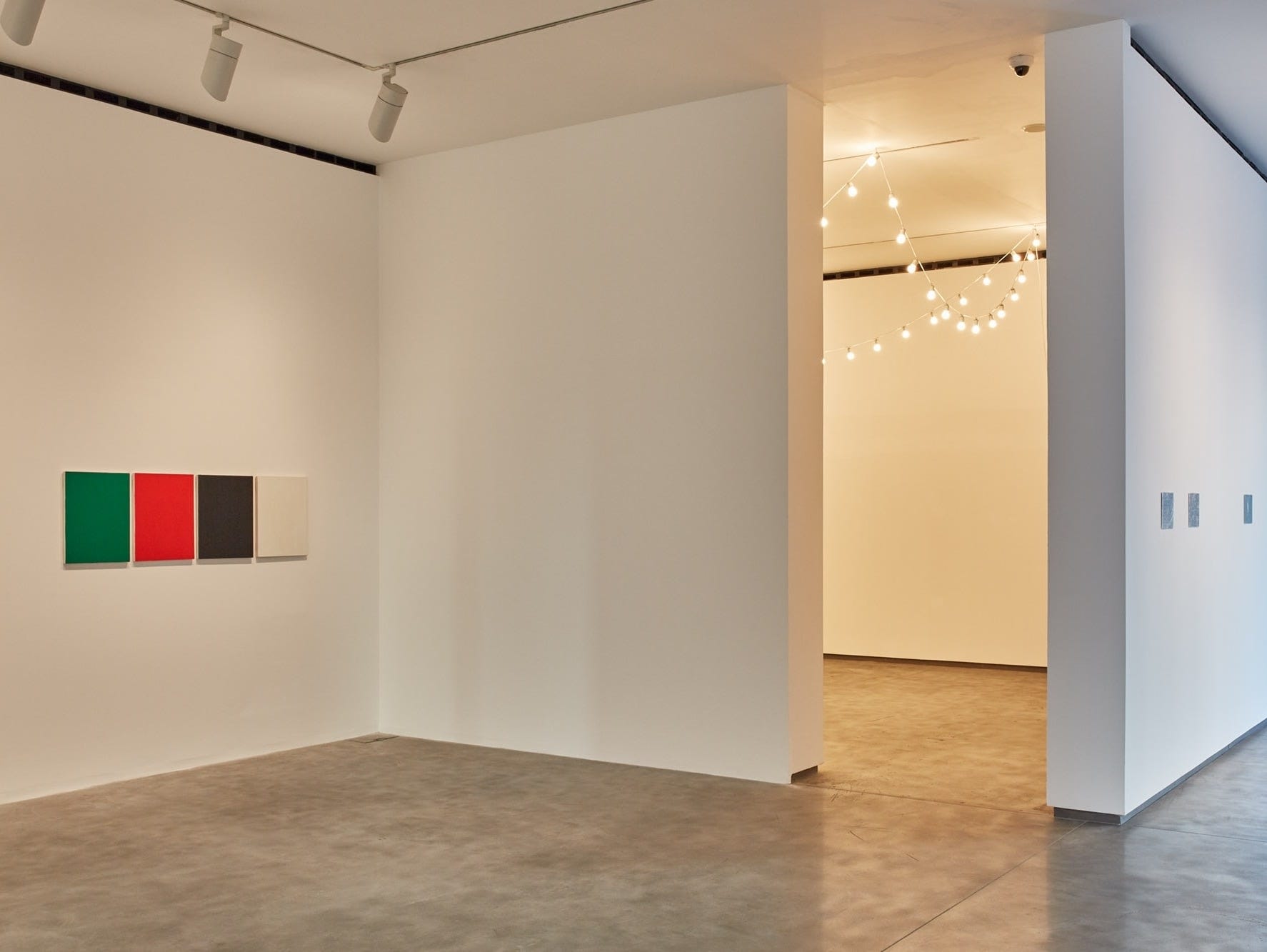
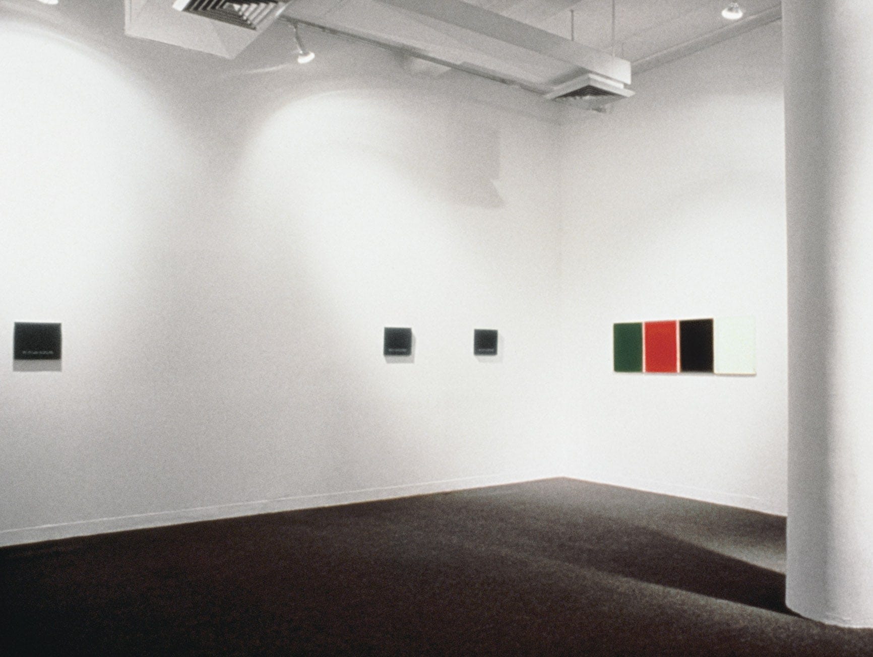
Forbidden Colors was a “rejection of the imposed and established order” by Gonzáles-Torres, a simple act of literal flagging, in that the display of these particular colors served as a call for solidarity by conjuring, imagining, realizing, visualizing, and speaking the world-word of the oppressed, without actually depicting the flag in question. Gonzáles-Torres used code to evoke a missing, banned message of survival during crisis, displayed at The New Museum (and elsewhere since) to point towards those who are wayward, errant, and illegible, elsewhere but also here; here and there, for those for whom flying a flag is not possible. It was an act of making legible that which could not be seen—that which was not allowed in sight—by amplifying those specific visual ingredients that would speak to some, but not others:
“. . . From the first moment of encounter, the four colour canvases in this room will ‘speak’ to everyone. Some will define them as an exercise in color theory, or some sort of abstraction. Some as four boring rectangular canvases hanging on the wall. Now that you’ve read this text, I hope for a different message.
For all the PWAs.” (Gonzáles-Torres)
This act of navigating legibility through coded, liberatory messages in public shows me how Forbidden Colors is in fact queer typography. How can four monochrome canvases be typography? I can hear myself questioning this, as I’m sure others will. I know, I know. And yet I’m uninterested in the formal definitions, which don’t help us here; rather, what I wish us to see are the coded acts of flagging—signifying, meaning—that make landscapes legible during crisis, across queer time and space. Whether it be an actual space like the San Francisco’s Civic Center in 1978, or non-geographical spaces shared by those who are most vulnerable, conjured within an art gallery in 1988 (or in 2025), we need to keep looking for (and making) the iconic symbols, signs, fields of color, hankies, flags, stickers, and letterforms that shape emancipatory language. Queer typographies are always urgent, always in formation, always necessary, always right now. Queer typographies are as powerful now, and in the future, as they ever were.
*Many thanks to Mo Asebiomo for the title, which they suggested here at Salmon Creek Farm in Albion, California, where this piece was written : )
**Grateful here for Andy Campbell, who first told me about Sarah Hegazi during a conversation we had about rainbow flags and other queer icons and symbols, back in October 2024, in Los Angeles.
Fantastic read; I look forward to more on the subject.
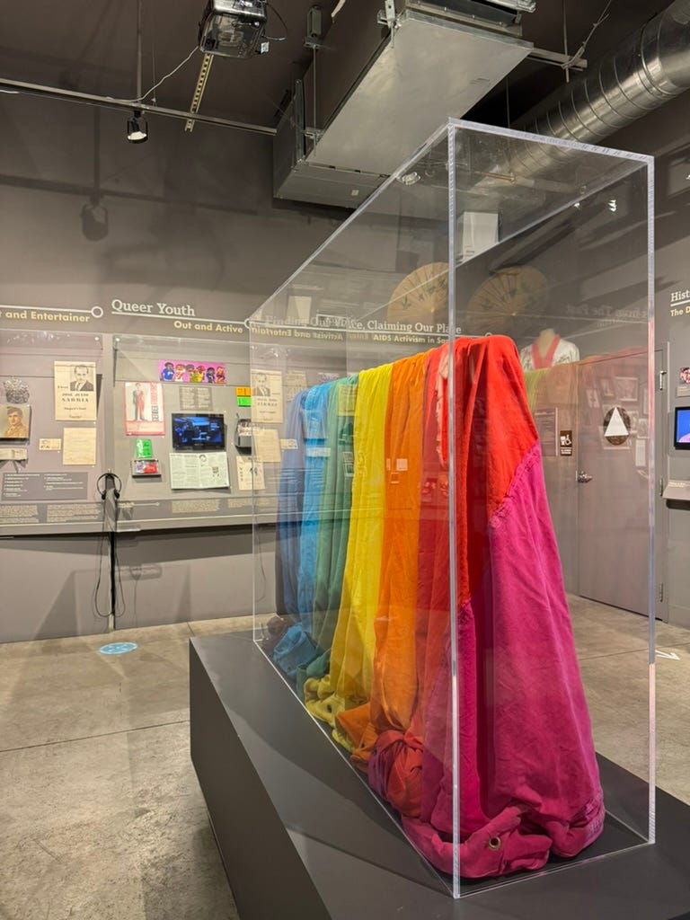
I visited the GLBT Historical Society last year and was surprised by how much impact the extra colours had. It was the material properties, not unlike the AIDS Memorial Quilt, disparate fabrics sewn together. This contrasts how most pride flags are made these days, which are mass-printed/produced on singular sheets of fabric - a literal flattening of the image.
Thank you for this. Sarah Hegazi’s story will stay with me for a long time…