Cruising
Holding on to something until we can reach each other

What brings you into the space of the archive might be a desire to get lost, the kind of driving known as cruising.
Cruising is a way of moving with ‘no specific destination;’ the ultimate goal is ‘to get lost [ . . . ] in webs of relationality and queer sociality.’1
Cruising wasn’t on my mind when a stranger walked into the reading room at the One Archives and sat down at the table next to mine, just as the doors opened at 9AM. I saw him waiting for several boxes of material to be wheeled over in a cart, and I probably didn’t notice him again until I came back from lunch. At some point, he stood up and started photographing folios of oversized prints and collages, his back to me, and I was intrigued. I had already been at the archive for a week, mostly alone in the reading room, so certainly I was curious about this new body suddenly sharing the space with mine, yes—and curious about some of the artifacts he was looking through as well, from what I could glimpse. He was going quickly, turning things over in fast motion, not really examining the pages closely. I found myself comparing his research tactics to my own, judging his carelessness, but who knows, maybe he was in a rush, perhaps he was searching for a particular item. I was curious if there was something in those boxes for me too, as if he was also looking for queer typography, or what. I really wanted to know what was driving him, and this is what drove me into an encounter.
I miss cruising in physical space. I know that it still happens, but the parameters have changed. Cruising before the apps was an important part of sexual life and community for many queer bodies, a chance to connect under the protection of anonymity, a way to privately claim space for wayward activity in public, at the piers, in the parks, in the bathrooms, in bars, in libraries, left over from when sex was outlawed. Cruising was the only form of communion for some, an extension of community for many. From the first reporting of HIV/AIDS as a “gay cancer” in 1981 until the arrival of PrEP (Pre-Exposure Prophylaxis) in 2012, the specter of disease and death shaped many aspects of cruising in physical space—the behaviors, environments, accessories, permissions, and meanings produced in and around sex in public. For some, it was also a way to resist isolation, an escape, to get to know a place (or create a place), to know who was around, to learn, to drift, to get lost. Driving closer to those connections, to cross queer time and space, was a kind of liberation for me, and I suspect for others, too. Another kind of survival network. It was also very risky.
A quantum encounter
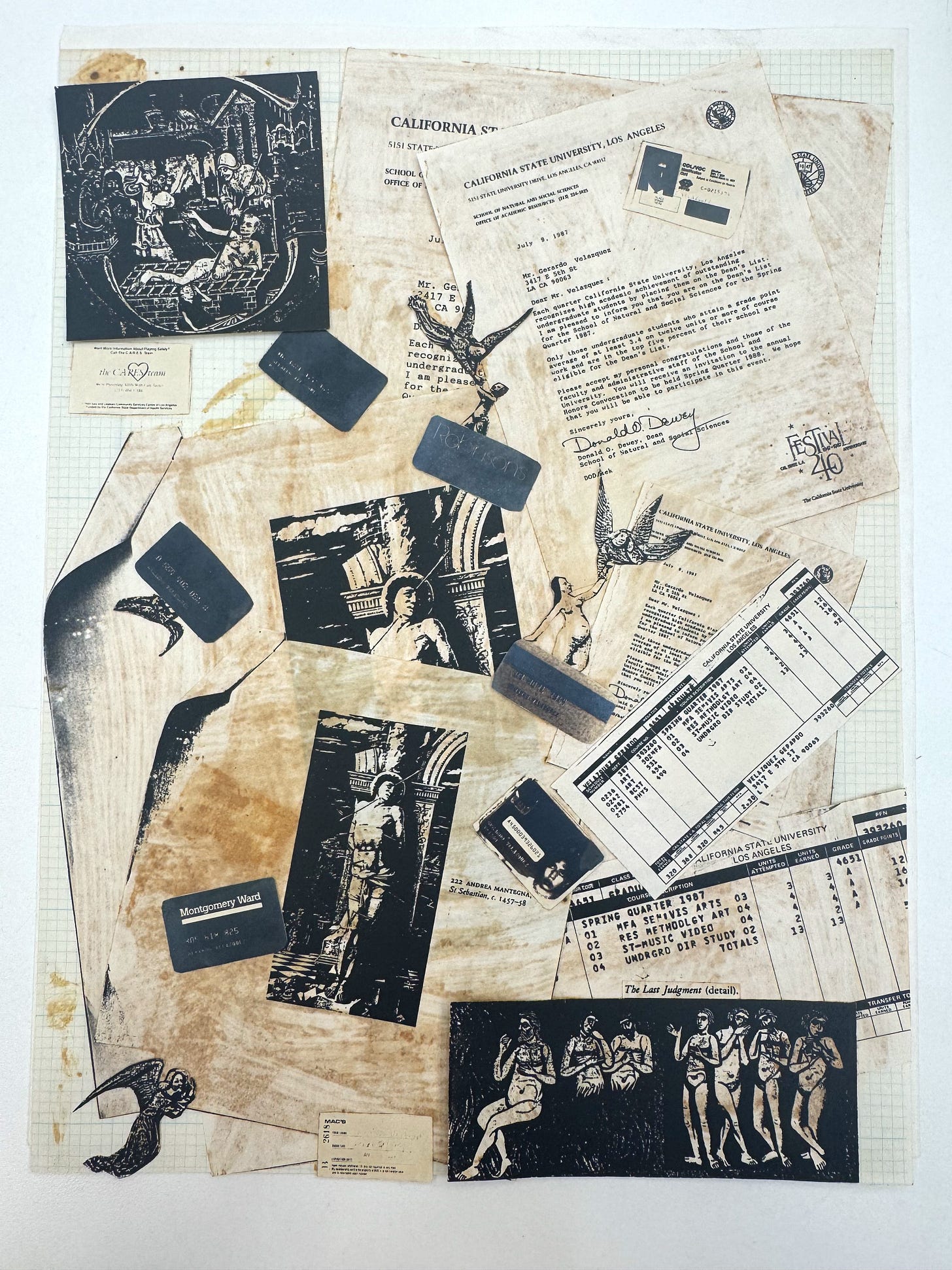
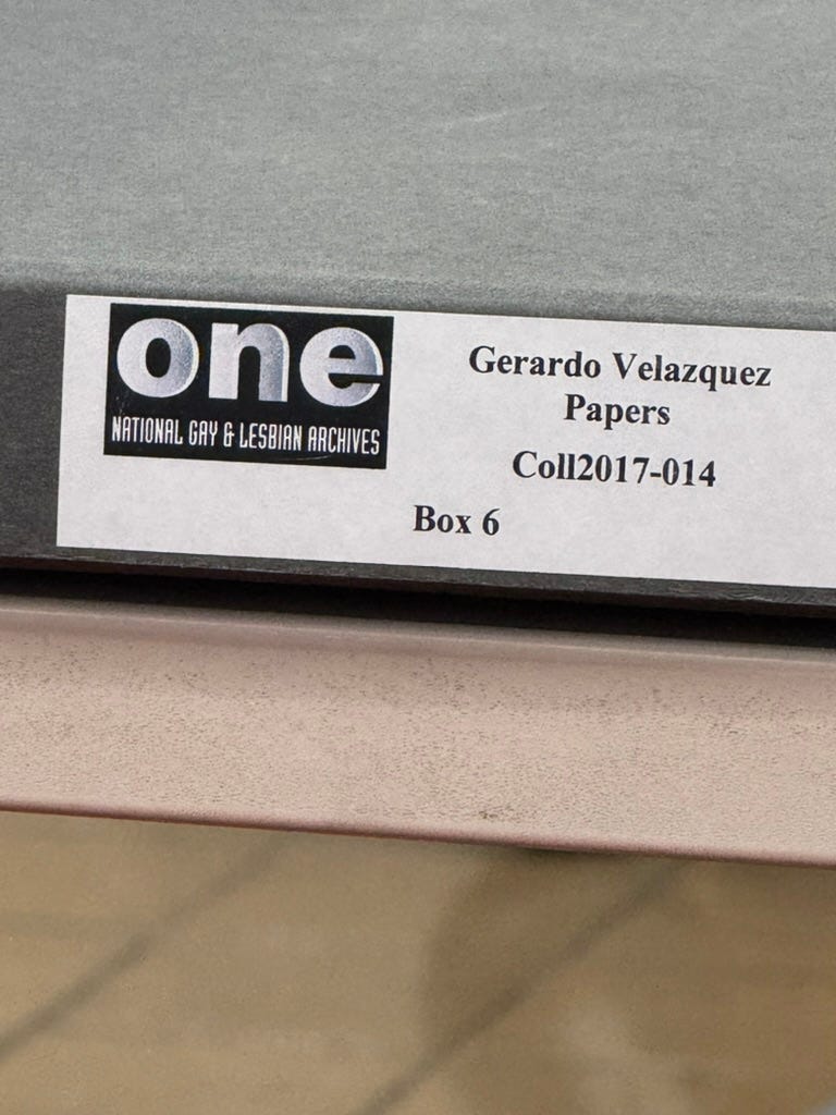
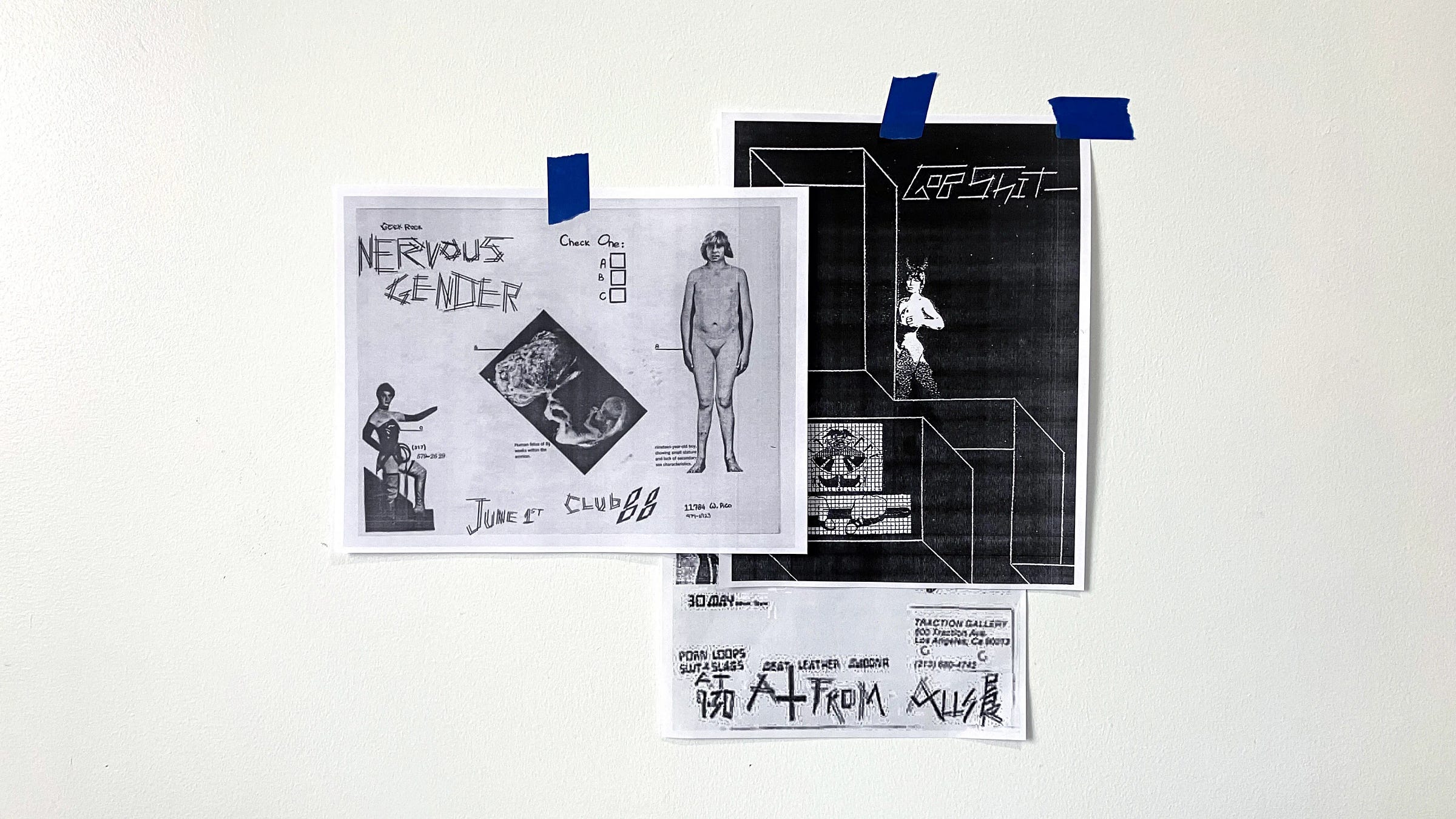
I wasn’t thinking about cruising in the archive on that particular day in Los Angeles when the stranger walked into the reading room, but the story turns in that direction. Curious to know more, I used my phone to zoom in and take a photograph of the label on one of the boxes on his table. I saw the words: Gerardo Velázquez Papers. The name looked familiar, perhaps because I’d seen the finding aid on the archive’s website. I typed it into Google and one of the first results to appear was a font designed by alphabet artist Nat Pyper.2 That’s when everything started to unfold—Nat had used source material from Gerardo Velázquez (1958–1992) as the basis for one of their fonts, in a project titled A Queer Year of Love Letters (AQYOLL).3 Maybe the source material had even come from one of these boxes on the stranger’s table! Eventually, Nat’s project grew to contain 12 fonts, each one informed by acts of writing, design, and publishing in queer history. I looked at the Velázquez letterforms again on my screen, the extended double-strokes splayed out at rough angles. They voiced a particular texture: jagged, queer, punk, taking up space, spreading out, jumping off the screen. Oral and active and raucous.

I quickly texted Nat, thrilled with where my curiosity was taking us. The stranger, their research, Nat’s research, my own, convening here in the reading room. “hey I’m at the one archives, and just realized that gerardo velázquez’s papers are here, is this where you found your source material?” Unknowingly, the stranger next to me had set up the conditions for a quantum encounter. A reply: yes! Of course, I had to let the stranger know. I apologetically interrupted his research to gesture to my screen, where he could see Nat’s font, and asked him if he knew that Velázquez’s materials had been used to create these letterforms. His answer surprised me: yes, he knew about the font from Amalgam, a design journal published by Pouya Ahmadi, who I also happen to teach with at RISD. That was issue #4, which contained an essay that I had contributed: “What is queer typography?” In the essay, I wrote about Nat’s work, and featured images of the fonts. I explained—yes, that essay where you read about the Velázquez font, it was written by me. And I’m here right now in this reading room, for an entire month, to expand those ideas about queer typography into a book.
Later in the week, over dinner, the man, no longer a stranger, described his research to me, which was focused on the Chicano punk music scene, and this is what had brought him to Los Angeles. I told him that because of our encounter, I had requested the same boxes he had, so I could also go through Velázquez’s papers after he left. I never found the club flyer that was the source for Nat’s font, but thanks to the encounter in the archive I learned a lot about Velázquez, his punk band Nervous Gender, and his life in Los Angeles in the late 1970s and 80s. He died of complications related to HIV/AIDS in 1992.

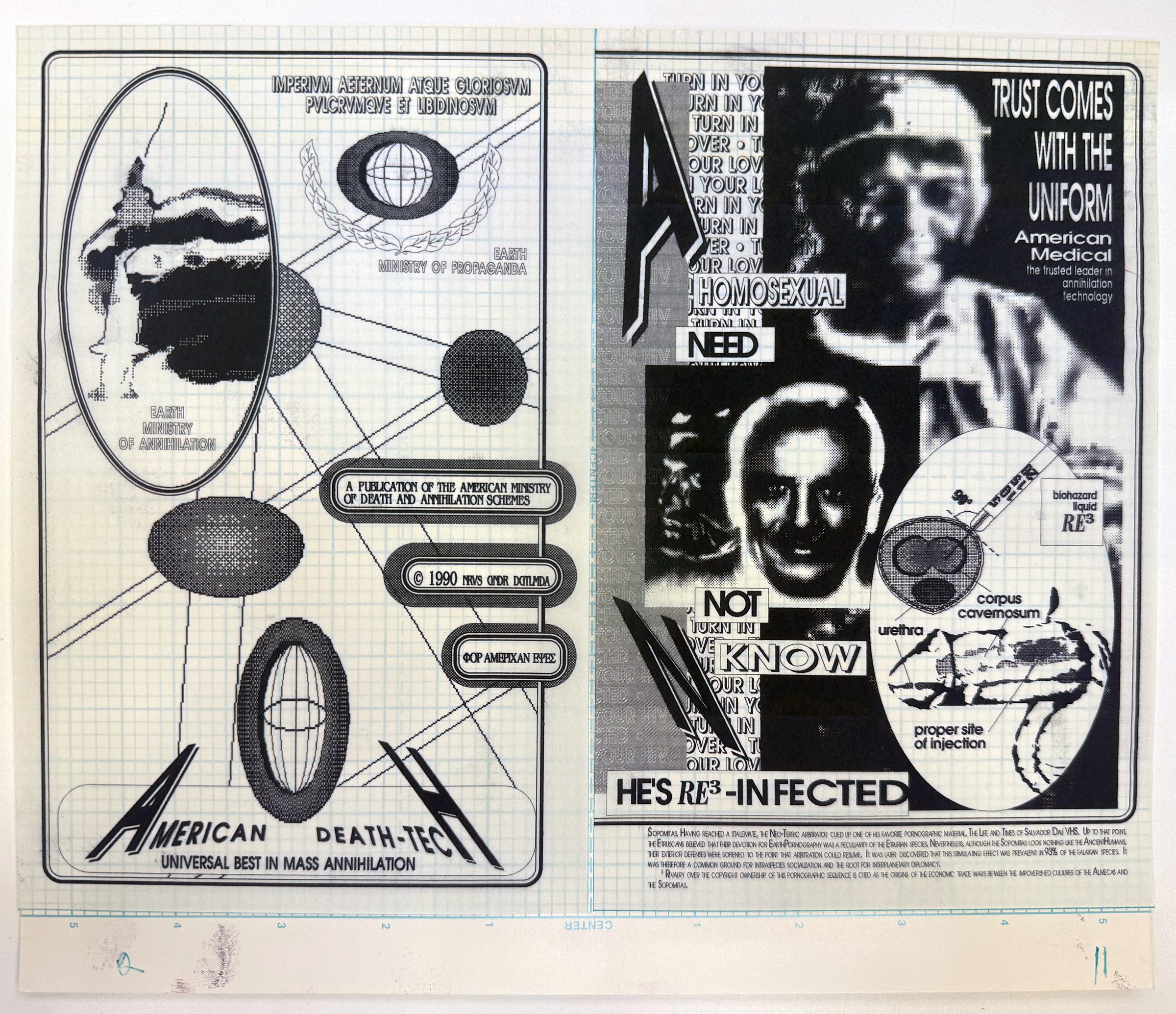
I saw Velázques’s zines and the artwork that he created for Nervous Gender using Letraset rub-down letterforms and textures, and read through lots of “filth poetry.” Velázquez published zines “with titles like The Annals of Selective Annihilation and The Gay Death List that used acidic satire to chronicle his experience as a gay man living with HIV.”4 He kept sex journals, and they’re all there, stored in folders in the boxes. He kept notes about hook-ups, cruising, phone numbers, comments about the encounters he was having, sometimes just a single word. I opened one book, titled “JOURNAL OF SEXUAL ACTIVITY VOL I OCT 20, 1985.” On a page dated 11-12-85, he wrote “Remember these?” at the top, and it reminded me of that one page in L.S. Alexander Gumby’s scrapbooks titled “Your History.” Velázquez had pasted small slips of paper with names and phone numbers in the journal, presumably men he’d met. One was a receipt with “Have a beer on me” written on the back. His annotation: “+$5 bill under the stall (toilet prostitute?).” Were the funds given or received? No way to know, but lots to imagine. These pages were so deeply intimate, so incredibly personal, that I had to stop photographing. And then I had to stop reading, because it felt invasive.
Later, while visiting Nat in Brooklyn, I told them this story about the stranger and the encounter in the archive, and how this led me not only to Gerardo Velázquez, but also back to Nat. And Nat told me that when they were researching in the archive they found a napkin inside one of the sex journals. Nat said that Velázquez had written in the journal
that this person in the next stall was jacking off, and that when they were done, he took the napkin and wiped the cum off the wall. And that was the thing. And then he was writing below it. And at first I was like, what am I touching? You know, but then it was also incredible, this literal document of these two people. So he already had this kind of archival spirit in his own work.5

Love Letters
That archival spirit is also in Nat’s work. It’s what draws me to their practice, which I’ve been following for years, since they were a graduate student in graphic design at Yale. AQYOLL connects queer acts of writing, found in the archive, to contemporary acts of queer typing, in the form of type design and font files, and this project was one of the foundational inspirations for this book. To get lost in the archive with the work, the poetry, the journals, the cum, to cruise through these moments in the reading room beside this stranger, was just one of the surprises that Nat has given me throughout the evolution of their project. I would describe it as a kind of desire, even—a lustful drive to connect, in that each of Nat’s fonts sets up the conditions for an illicit encounter, a convening in queer time. As Nat describes it, “so much of the work is about reaching across this abyss,”6 the void of HIV/AIDS, which left so many of us, and those before us, cut-off from each other behind the limits of straight, linear time and the conventional constructs of history. In reaching across the abyss, this “being long” across queer time and space, a gathering occurs.7 I see it as a form of time travel, a quantum queerness where acts of writing, and bodies, can connect, protect, and persist.
A total of nine individuals and two collectives are the subjects of Nat’s project, which shapes its own archive of renegade acts and lives (two of the fonts are based on projects from one collective). AQYOLL points towards ways of living, working, publishing, and surviving that are barely visible outside of queer history, or sometimes even within. Nat frames the entire project with a love letter, addressed to a dear writer, and refers to the fonts as time machines.
These machines take me back—to Robert Ford and Black gay and lesbian underground publishing in early 1990s Chicago; to the Lesbian Alliance, a socialist-feminist enclave in 1970s St. Louis, Missouri; to G.B. Jones and queer punk filmmaking in 1980s downtown Toronto—but they also take me forward to unknown futures through the act of writing itself. In use, these fonts engage the past as a provocation. They engage the past as a verb.
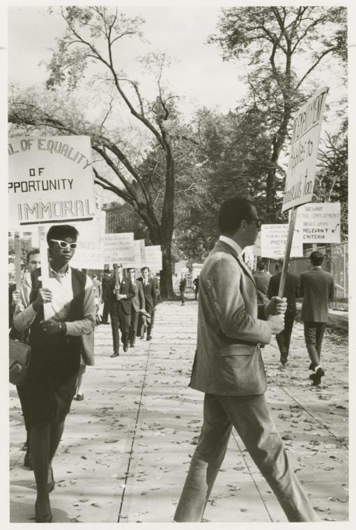
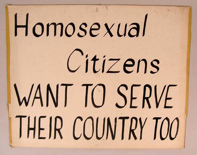
One of the subjects of AQYOLL is Ernestine Eckstein (1941–1992), a Black lesbian activist who was an outspoken member of the Daughters of Bilitis, the first national civil rights organization for lesbian women in the US. In October 1965, Eckstein participated in one of the first Annual Reminder protests. These were early homophile demonstrations organized by Frank Kameny and the Mattachine Society of Washington in response to the Lavender Scare. Eckstein carried a hand-lettered sign in front of the White House that displayed the message “DENIAL OF EQUALITY OF OPPORTUNITY IS IMMORAL.” In photographs taken by Kay Tobin Lahusen that day, Eckstein appears to be the only Black woman participating in the demonstration, and her courage as a visible figure in the early movement for gay and lesbian liberation—particularly for Black women, two decades before the concept of intersectionality was to be formally defined—is astounding.
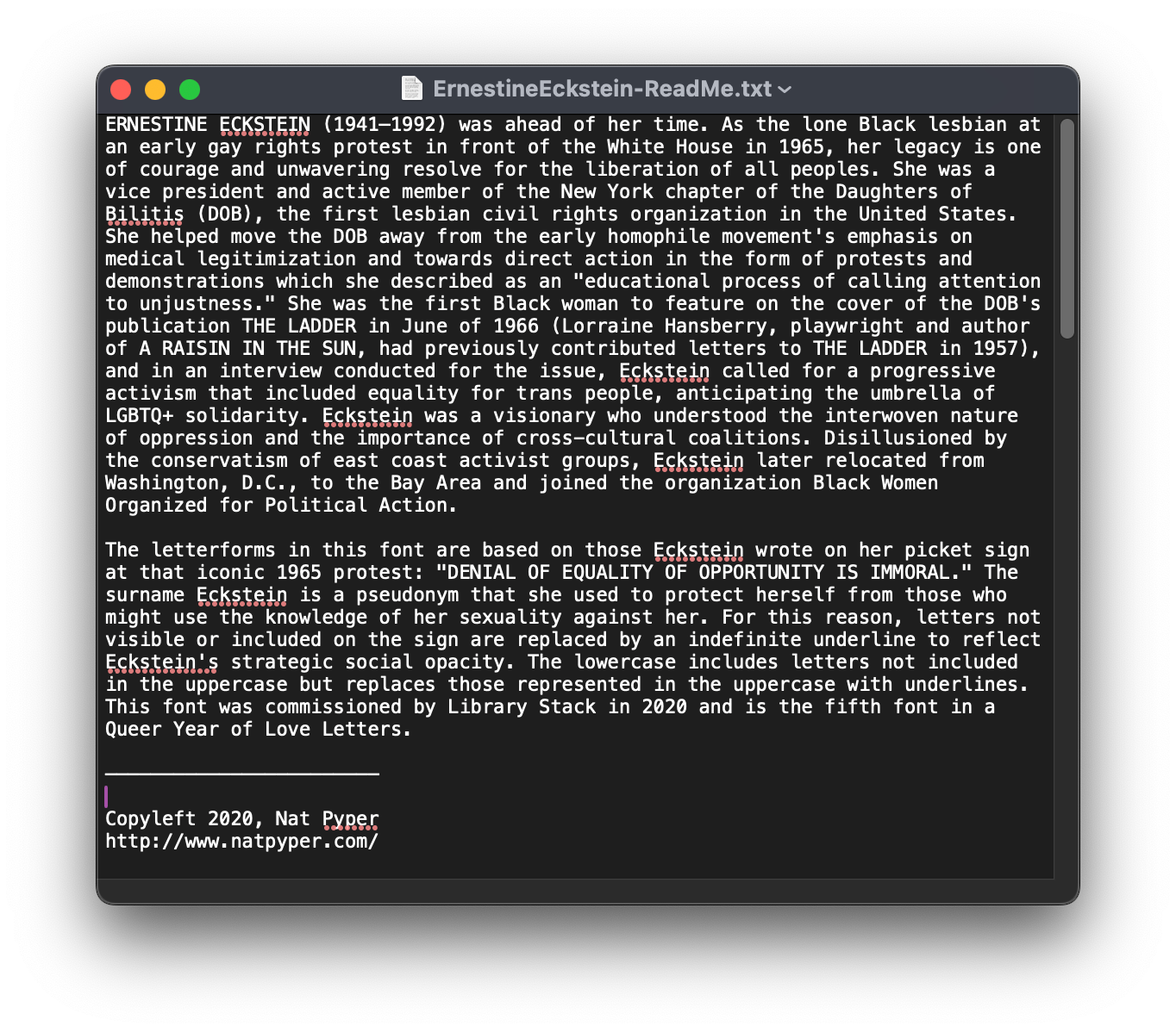
Nat used Eckstein’s hand-lettering on her White House sign, as seen in those photographs, as the basis for the fourth typeface produced in the series, titled “Ernestine Eckstein.” There are 15 uppercase letterforms in the font, representing all of the letters visible on Eckstein’s sign in the photograph that’s most associated with her action that day. Nat completed the alphabet by imagining a set of 11 accompanying lowercase letters. The numbers 1–9 are depicted as multiple Eckstein figures picketing with her sign; the asterisk is represented by Eckstein herself. The idea of opacity is also present in the font, represented by underline glyphs, which stand in for absent letterforms, and nod towards Eckstein’s own survival tactics:
The surname Eckstein is a pseudonym that she used to protect herself from those who might use the knowledge of her sexuality against her. For this reason, letters not visible or included on the sign are replaced by an indefinite underline to reflect Eckstein’s strategic social opacity.8
Some of the letters appearing in the words DENIAL and EQUITY, which Eckstein drew along a curve at the top of her sign, appear similarly askew in Nat’s font, their positions in time and space fixed and transmitted directly from Eckstein’s score into the future. When combined with the non-tilted letterforms, the visual effect is rhythmic, like a kind of walking, stepping, or marching from letter to letter, across time and space.
I have no interest in saying how people should or shouldn’t use the fonts, and that’s kind of the idea too, that I don’t know what will happen. I want these to be used in new ways and I don’t know what those ways are yet, so I don’t want to prohibit use beforehand. They’re just fonts. That’s kind of the font’s superpower—you can use the font, but you don’t own it. The font persists. You have that history in your computer.9

When I downloaded “Ernestine-Eckstein-font.zip,” it unzipped into two files: the .otf font file itself and a .txt file titled “ErnestineEckstein-ReadMe.txt.” The text file contains a brief narrative about Eckstein, telling of her significance as “a visionary who understood the interwoven nature of oppression and the importance of cross-cultural coalitions,” and information about how the typeface was designed. There’s also a copyleft notice, giving users the right to freely distribute and modify the work, as long as the same license is retained. These notes about the font, the conditions for sharing it, and the remarkable history that inspired it all travel within the .zip file, deposited onto every computer where it’s downloaded, which means that the distribution of the software and the circulation of these histories get to extend far outside of either Eckstein’s or Nat’s control. And this is essential in understanding the intention of the project—that it’s very much about the future creation of new, unknown language.
I feel like an impulse that I’m always fighting against is control, and wanting to have control over the way things happen. In one way, this is just the starting point. The fonts in and of themselves are just fonts. It can’t end there, you know? And that’s when the fonts become powerful—when they’re used for writing. That’s why it’s so important that they’re fonts and why I want people to use them, because that’s when they gain power. That’s when they become these really interesting things—when people use them to make the world.10
The Ernestine Eckstein font is not a tracing of her hand-written forms, nor is it a “revival” typeface, not only because the source material wasn’t a typeface, but because Eckstein’s original letters never died. As I think through this, I’m inspired by type designer Robin Mientjes’ work around revivals and the language that we use to categorize and qualify type design that uses historical source material. Mientjes suggests that we consider these type design projects as acts of translation, rather than as “copies” or “improvements,” and this is a useful framework for thinking through AQYOLL.11 Nat’s fonts are interpretations of inspiring, lesser-known moments of language in queer history, translating their original contexts (and ideologies and technologies and meanings) into newer ones, “and that, by definition, changes the thing. That’s the secret behind every translation: when you read a translation of a text, you now read the words of two writers.”12 With Nat’s project, we might extend that logic even further: in AQYOLL, Eckstein’s public act circulates in relation to the other figures in the collection, in a generous act of publishing, becoming entangled across time and space. As active, collaborative end-users—in using the font itself to type new language—we enter this polyphonic conversation in multiple senses and tenses. Webs of relationality and queer sociality, for sure—past, present, and future ways of writing, speaking, and being.
Font files as archives
Font files are persistent—they’re installed on every computer. A font file is always already an archive. Each one contains a history of its making in the form of drawings, names, technical specifications, code, and marketing materials that point to myriad historical references, design influences, and intentions. But to consider font files as carrier bags of queer histories—voices and stories that reference liberated language outside of type design—is a different proposition. The power of “fonts as queer material” that “engage the past as a verb” opens up an endless potential for the distribution of counter-histories across time and space, especially when the files circulate freely under more generous rights agreements. The work of Emily Sara (“504 Font,” 2023), Erin Moore (“Five Fonts Inspired by Lesbian Hand Lettering,” 2022), and Paul Chan (“Alternumerics,” 2001–2005) should all be noted here, each engaging with the past as a provocation, and to be expanded upon in a future post.
Zuzana Licko may have been one of the first to design a typeface that contains its own embedded counter-history. “Mrs Eaves” (PDF specimen) is Licko’s interpretation of Baskerville (1757), which she named after Sarah Eaves, a woman who had a complex, life-long relationship with John Baskerville in the 18th century. Sarah Eaves was Baskerville’s live-in housekeeper, mistress, and assistant in printing. Later, upon the death of her husband Richard Eaves, she married Baskerville, and eventually, after his death in 1785, became the proprietor of his printing and publishing business.13 Licko designed Mrs Eaves in 1996 and the font is still sold and distributed today through Emigre, the type foundry that Licko co-founded with her partner Rudy VanderLans in San Francisco in 1985. By prominently naming Baskerville’s hidden partner, Licko surfaces new connections to the kinds of labor that are frequently forgotten, dismissed, and erased in history, particularly the work of women and femmes under heteropatriarchical domination. Each time Mrs Eaves is named, purchased, used, and read, a counter-history is recalled and sustained. This is cruising, yes, a queer history told through the radical translation of a legendary work, a re-writing of typographic lineage through a feminist act of framing and citation.
“Naming names” is a crucial practice in the work of Tré Seales, who designs and distributes fonts to “represent, recognize, and inspire meaningful change” at Vocal Type. On the website for his type foundry, Seales writes that “by placing marginalized histories at the heart of our designs, we contribute to a more inclusive, reflective, and powerful design culture.” This includes “Marsha,” one of Vocal Type’s 17 typefaces that reference outspoken activists and freedom fighters like Carrie Chapman Catt, Rubén Salazar, Martin Luther King Jr., and Eva Perón. “Marsha” is a single-weight display font based on the lettering on the Stonewall bar sign as seen in photographs around the time of the Stonewall riots. The typeface is named after Black trans activist Marsha P. Johnson, and is available for $30–$120, depending on license type. A brief history of the bar and Johnson’s significance is included on the Vocal Type site.
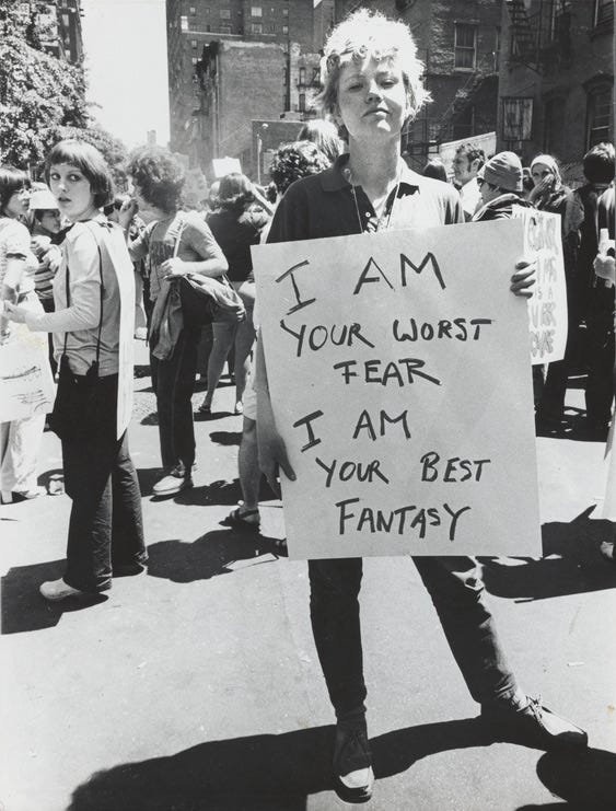
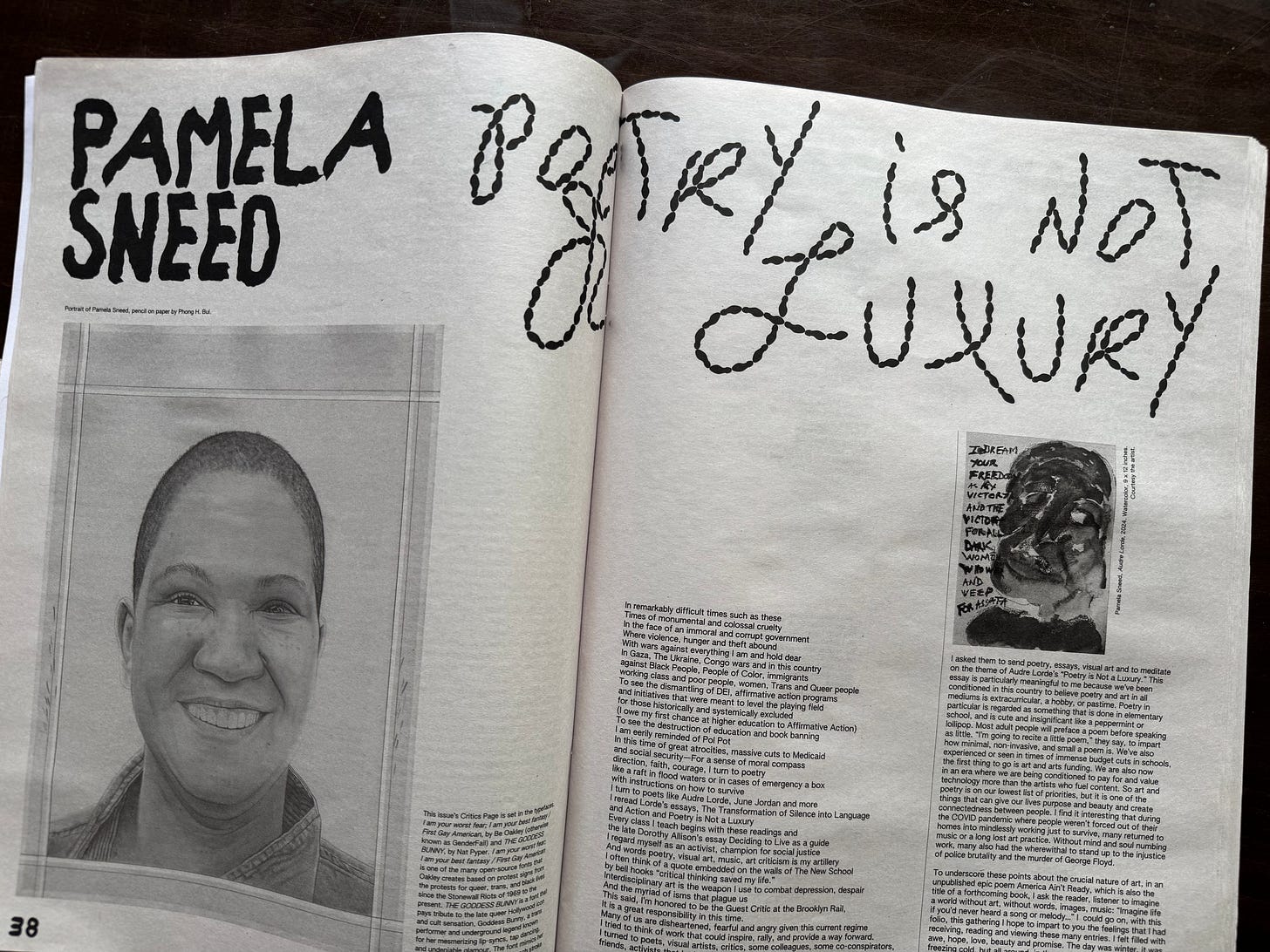
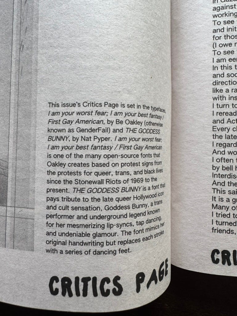
GenderFail’s Protest Fonts, which Be Oakley creates from hand-lettering that they find in photographs of protest signs, are less interpretive and more like tracings, with a direct visual connection to the original forms. There are a total of 14 freely-available fonts in Oakley’s project so far, including “I am your worst fear; I am your best fantasy / FIRST GAY AMERICANS,” which references two different handwritten signs from early gay rights protests. One is a photograph of lesbian activist Donna Gottschalk carrying the message “I am your worst fear; I am your best fantasy” on a hand-lettered sign at the Christopher Street Gay Liberation Day parade in NYC in 1970; this was the first ever “pride parade,’ marking the one-year anniversary of the Stonewall riots. Gottschalk was a photographer who documented early gay activism in the 1970s, as well as the life of her trans sibling Myla. Gottschalk exhibited her life’s work in “Brave, Beautiful Outlaws” at the Leslie Lohmann Gallery in 2018. Gottschalk is identified by name on a poster that’s displayed on the GenderFail download site. But the histories conjured up by the project, from Stonewall to the first pride parade to Gottschalk’s role in queer history and her presence in the photograph, do not travel with the font; this seems to be consistent with all of GenderFail’s fonts, which download only as a single .otf file. The other sign used in this font, “FIRST GAY AMERICANS,” is from a photograph taken at the National March on Washington for Gay and Lesbian Rights on October 14, 1979, with the photo credited to Joel Rinne and Earl Colvin; the authors and carriers of the sign are not identified. Curious, I searched for more information about the photographers Rinne and Colvin, and found many of the couple’s photographs documenting gay life in the 1970s and 1980s; this 2015 obituary for Colvin is quite moving in how it traces his little-known involvement in early gay and lesbian activism.
These “archive fonts” take on a powerful charge for those who use them as writing tools. When they’re deliberately framed with information about the source material they set up the possibility for further encounters and deeper relationships in queer time. These connections might also be available to the reader, further down the line, especially if there’s a “note about the type” to accompany the material and associate it with the referenced histories. Still, while “I am your worst fear; I am your best fantasy / FIRST GAY AMERICANS,” is prominently cited here in the April 2025 issue of The Brooklyn Rail (paired with one of Nat’s fonts)—Donna Gottschalk’s name is not.
So, what about consent? How does permission work when cruising around with those who are no longer able to speak for themselves? Who can lay claim, or not lay claim, to these irregular works, these raucous histories? Nat responds:
I’m not interested in the sort of authorship that lays claim to something. Most of these fonts (AQYOLL) are about people who aren’t around anymore, and they can’t speak for this work. They can’t take accountability for it—and likewise, I’m making a font that looks like their work, but I can’t take accountability for their work either. I started to think about authorship less in connection to authority, but more so in relation to caretaking. I’m putting this stuff out there and I’m not going to lay claim to it, but I will take care of it when it’s out in the world. That’s the commitment I’m making to the work.14
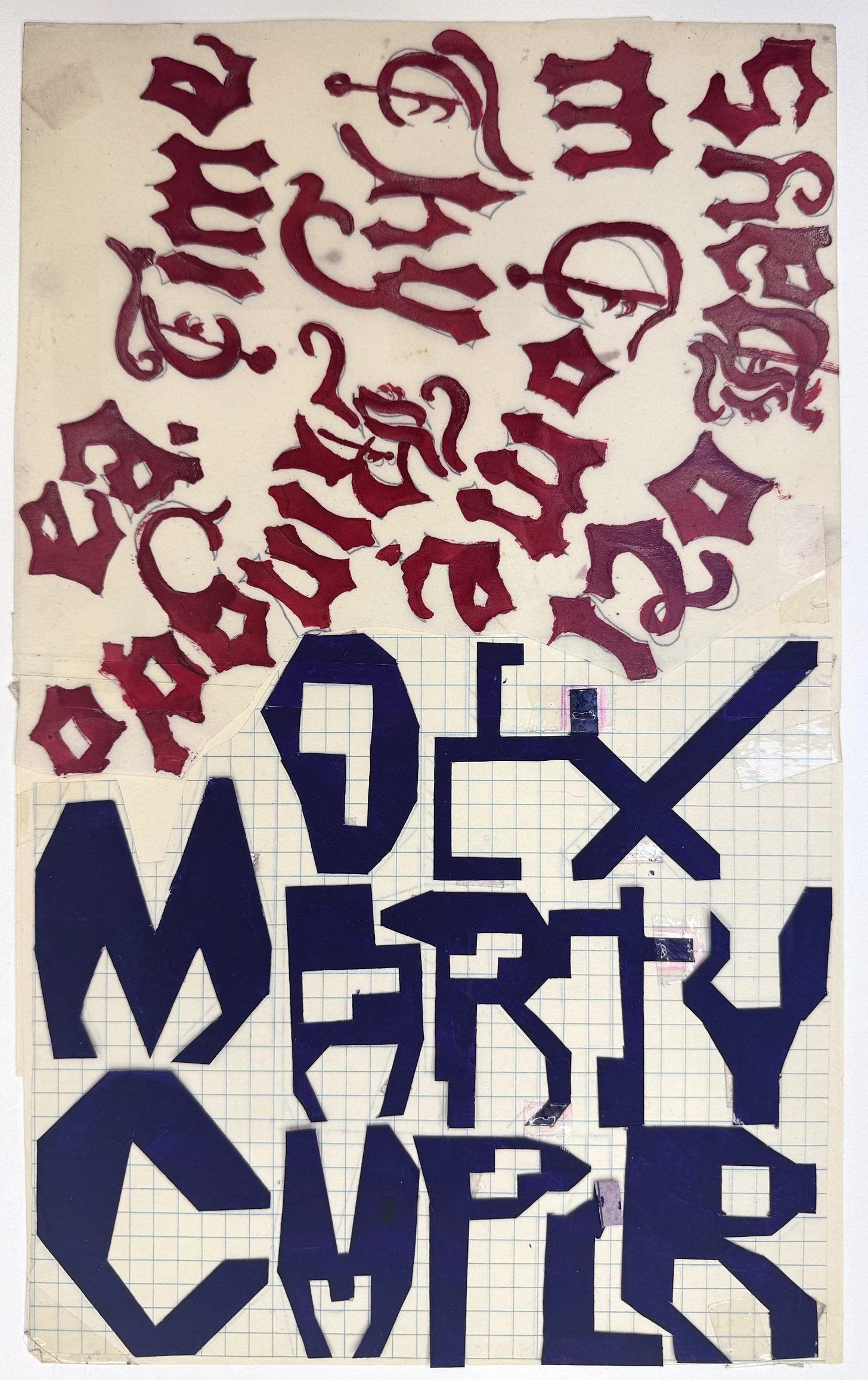
In caretaking, it’s possible that the act of publishing itself, whether it be books, fonts, zines, music, images, or other media transmitted into the world, might set up the conditions for an encounter, a stirring of curiosity or desire, or an embodied connection, even. Publishing as an intimate, relational proposition is an idea that Nat borrows from lesbian singer, songwriter, and musician Gwen Avery,
who said, ‘you’re putting out something that we can hold on to until we can reach each other.’ I think that’s a beautiful way to think about publishing—we put out this thing that we can hold onto until we can actually connect. This is the thing that we can have in the meantime.15
There’s so much abundance to be found in the drive to an encounter, an unfolding of relations set into motion by the things we circulate in the world. We might discover the possibility of sharing across time and space, and maybe it’s there that queer typographies emerge, where language connects us. The possibility of contact, this desire to touch, to be in some relationship with significant others, with neglected ancestors who were difficult, who made trouble, who didn’t fit in. Nat says that
this work is so meaningful for me, because in all of these different ways, these people that I’m interested in were resisting isolation and resisting alienation. And they were finding ways to persist against that, in unconventional ways, in ways that made sense for them, and going back to Ernestine and these incredible acts, an inability—or a refusal—to be isolated.16
Mutuality
In my conversation with Nat, I learned that caretaking can be a counter force to control. What I’m learning is that it’s possible to model an art or design practice (perhaps any practice) like this, as a set of relationships that centers radical empathy and affective responsibility, and that there seems to be something particularly queer about this, about stepping away from control towards each other. On a parallel track, addressing archival studies, Michelle Caswell and Marika Cifor ask these questions:
What happens when we scratch beneath the surface of the veneer of detached professionalism and start to think of record-keepers and archivists less as sentinels of accountability [ . . . ] and more as caregivers, bound to records creators, subjects, users, and communities through a web of mutual responsibility? Furthermore, what if each of these four relationships—archivist and record creator, archivist and record subject, archivist and record user, and archivist and community—was marked by radical empathy?17
I’d like to borrow Caswell and Cifor’s inquiry and bring it closer to design, even as a way to think through queer design. What if a design or writing or publishing practice focused on the ways people are linked to each other and larger communities through webs of responsibilities, a practice that emphasizes “particularity, connection, and context rather than abstract moral principles?”18
Stepping away from control towards each other feels queer because embracing control is one of the hallmarks of virtuous design. As an educator, I can’t help but consider AQYOLL and other “archive fonts” against the heavy burden of traditional design history and the ways the design canon has been written to favor certain forms of success. Design exceptionalism demands its own kind of isolation, imposed on those who are perceived as visionary, in the form of hero worship. For so long, designers have learned to view certain type designers as singular genius figures who perfectly embody everything about a particular style or way of working. In western education, until very recently, those icons have mostly been white, cis-gender, European or North American heterosexual men who were celebrated on their own as isolated heroes, apart from the labor practices, social conditions, and political contexts that helped construct their success.
Recalling the “silent partnership” of Sarah Eaves in Baskerville’s success, Mientjes breaks down our relentless fixation on hero worship in the type industry, and how it leads to “unquestioning belief:”

Claude Garamond didn’t work alone in his foundry. No foundry where hot type alloy was melted was operated by the one designer, punch cutter, matrix justifier, floor sweeper, lunch chef, and also a salesman. It asks for too much to believe that he worked alone. But as a consequence of his celebrity, what we primarily have is the idea that Garamond was a singular visionary who is the sole cause of the success of his work. Hero worship also leads to unquestioning belief. “When in doubt, use Caslon.” This is of course an exaggerated example, and I don’t know any designers who say this, but the idea that the name Caslon has become so strong and so singular is not based on merit, but on celebrity. The various incarnations of the Caslon type foundries have had many, many type choices available for typographers, varying in purpose and quality, and a blanket statement like this ignores that complexity.19

Virtuous design
When in doubt, use Caslon. Massimo Vignelli (1931–2014) and other Modernists did say almost exactly that. Vignelli was a mentor for me, of sorts. I came to an early understanding of typography in the 1990s by working closely with designers who had worked side-by-side with him and Lella Vignelli at Unimark and Vignelli Associates. I learned about graphic design from those who inherited his values and built their own practices around the logics of extreme control, classical restraint, and rules-based “high design” with great rigor (and success). By association, I quickly came to believe in their beliefs, and took on a Vignellified way of doing design that I still find difficult to shake, with an unwavering reliance on Helvetica, grids, flush-left justification, and white space. Having never gone to school for graphic design, I didn’t know how to look beyond the “master’s principles” that were given to me, and I absorbed them uncritically.

In a 1991 interview with Vignelli and Ed Benguiat in the September/October issue of PRINT magazine, on the occasion of retrospectives for each of them at the School of Visual Arts, Philip B. Meggs introduced Vignelli by saying that “he probably did more than anyone else in what has been called the ‘Helveticazation’ of America, converting countless major corporations to Helvetica and grids.”20 Captivated by the self-proclaimed greatness of the cult of Vignelli as practiced by many design firms in NYC at the time, I was myself converted, easily mimicking his forms, and using them in my own client-based work well into the 2000s.

The title of Vignelli’s 1991 exhibition at SVA was “A Few Basic Typefaces,” showcasing the man’s career through the four typefaces that he’d used for the majority of his work: Bodoni, Century, Garamond, and Helvetica. On the poster for the event, Vignelli proclaimed that
in the new computer age the proliferation of typefaces and type manipulations represents a new level of visual pollution threatening our culture. Out of the thousands of typefaces, all we need are a few basic ones, and trash the rest.21
This declaration went on to become one of Vignelli’s most enduring statements, forever associated with his particular brand of Modernism, and the ways in which he shaped and influenced design in the US and Europe. Later, Vignelli expanded the dictum to include two more typefaces (Futura and Times New Roman), for a total of six, which he published in The Vignelli Canon in 2009.

Heteropatriarchy persists through the celebration of itself; it prioritizes the perpetuation of power through its own reproduction. Vignelli’s status as one of the most iconic designers of the 20th century was built upon his own perpetuation of the exclusive standards, beliefs, and principles of “high (white) culture” that he practiced throughout his career, and the celebration of those values in the typographic work of a few European and American men—namely Giambattista Bodoni (Bodoni), Linn Boyd Benton (Century), Claude Garamond (Garamond), Max Miedinger & Eduard Hoffmann (Helvetica), Stanley Morison (Times New Roman), and Paul Renner (Futura). When questioned about American pluralism, Vignelli said this:
The fact that we have pluralism is a terrific thing. It’s the nature of the country. It’s the nature of the cultural output. The fact, however, that this cultural output is not as high as it should be is another, completely different, matter. So I think that out of this plurality of people, the common efforts should continue for the improvement of quality at every level.22
I’m considering Vignelli’s characterization of the “plurality of people” in relation to the queer Black, brown, Asian, trans, femme, disabled, immigrant people gathered by Nat and others in their archive fonts. I can’t help but look at Vignelli’s call for the “improvement of cultural quality at every level” in relation to the white men who designed his legendary typefaces. And when thinking about moving away from control towards each other, I juxtapose Vignelli’s six typefaces with the 12 fonts of AQYOLL, and realize how I’ve always been searching for the queer counterforce to virtuous design; I’ve always been on a quest for queer typographies.
In prescribing cultural supremacy with a set of restrictions, we elevate ourselves into a false position of purity and universal authority, as Vignelli did in asserting that all other typefaces should be trashed, and in that same interview, declaring that the type foundry Emigre “is a factory of garbage” (later, famously, he collaborated with them).23 In publishing his beliefs in the form of a manifesto, he encouraged others to follow, and guaranteed his own canonization. Vignelli’s perpetuation of “superior quality” in the form of design perfection, control, and restriction is in direct opposition to the movement and energy of cruising across queer time and space. Holding on to something until we can reach each other means nothing in relation to Modernism’s legacy, because the end-user of “high design” is powerless, unable to translate or collaborate with the individual greatness of the patriarch’s work, which remains enshrined in the canon, pointing only towards itself and its own reproduction. In hero worship, the most appropriate form of reverence is mimicry, and the false perpetuation of the hero’s genius: “So long as I copy this surviving design, surely I am also copying its virtues.”24

The matrix of domination—capitalism, white supremacy, settler colonialism, and heteropatriarchy—demands virtuous design and hero worship because power is perpetuated under the falsehood of purity. Virtuous design is precise and controlled—it contains, restricts, dictates, segregates, and isolates with “superior standards”—which might look like an all-white group of honorees at the National Design Awards in one regime or like an executive order “Promoting Beautiful Federal Civic Architecture” in another. As an educator I’m searching for ways to resist the grip of virtuous design’s totalizing reality, and to share other ways of making the world, especially those ways that resist the reproduction of structural domination.
Designing across
“The here and now is a prison house. We must strive, in the face of the here and now's totalizing rendering of reality, to think and feel a then and there,” writes José Esteban Muñoz on the very first page of Cruising Utopia.25 Ernestine Eckstein, Gerardo Velézquez, Robert Ford, G.B. Jones, the Goddess Bunny, Martin Wong, Third World Gay Revolution, the Lesbian Alliance, Sarah Eaves, Donna Gottschalk, Joel Rinne, Earl Colvin, Marsha P. Johnson, and the other subjects named in these archive fonts—artists, designers, publishers, printers, dancers, filmmakers, zine makers, activists—resist alienation with queer acts that point elsewhere. Queer typographies set us up to collaborate in a web of mutuality that goes on and on. I’m coming along for this drive.
Queer typographies can’t be found from above, but rather across.
In cruising together towards unknown destinations, we encounter other legibilities, understandings, utterances, and languages—the mess of plurality over purity. This is what fuels my drive, my driving desire to get lost in the wayward voices, approaches, qualities, forms of expression, and ways of living that might be found in cruising queer spaces. This is where I might reach across the abyss towards a typographic encounter with a stranger, a new body in the reading room, which needs a kind of horizontal movement, a stretching, an opening out and across in our survival towards those significant others, seen and unseen, who are doing things differently. We produce and share the abundance of cruising in the annotated sex journal, in the toilet stall, in the rub-down letters on the club flyer, in the camera’s view, in the unexpected touch across the void, in the vulnerability of stepping out—in the circulation of love letters. Queer acts invite collaboration. Queer acts move us away from totalizing control towards each other. Queer acts are a freedom to move back and forth and across, and to persist across time and space with love, extraordinary care, and agreement, driving together towards something else.

Joshua Chambers-Letson, Tavia Nyong’o, and Ann Pellegrini, “Before and After,” foreword to Cruising Utopia: The Then and There of Queer Futurity, 10th Anniversary Edition, José Esteban Muñoz, New York University Press, 2019: xiii.
Nat Pyper, “Gerardo Velálzquez,” Library Stack, 2022.
Nat Pyper, A Queer Year of Love Letters, Library Stack, 2018.
Pyper, 2022.
Private conversation with Nat Pyper, Brooklyn, NY, May 10, 2025.
Ibid.
The concept of “being long” is borrowed from Elizabeth Freeman, Time Binds: Queer Temporalities, Queer Histories, Duke University Press, 2010.
Nat Pyper, “Ernestine Eckstein,” Library Stack, 2020.
Nat Pyper, 2025.
Ibid.
Robin Mientjes, “Reconsidering Revivals,” 2020,
Ibid.
Alain Hurtig, “Ode to the ‘Mrs. Eaves,’” cited by Loraine Furter in “Crystal Clear,”
Nat Pyper, 2025.
Ibid.
Ibid.
Michelle Caswell and Marika Cifor, “From Human Rights to Feminist Ethics: Radical Empathy in the Archives,” ARCHIvARIA 81 (Spring 2016): 23–43.
Ibid.
Mientjes, 2020.
Julie Lasky, “Massimo Vignelli vs. Ed Benguiat (Sort Of),” Design Observer, September 15, 2010.
“A Few Basic Typefaces,” exhibition poster, School of Visual Arts, 1991.
Lasky, 2010.
Ibid.
Mientjes, 2020.
José Esteban Muñoz, “Feeling Utopia,” Introduction to Cruising Utopia: The Then and There of Queer Futurity, 10th Anniversary Edition, New York University Press, 2019: 1.


