
Reading

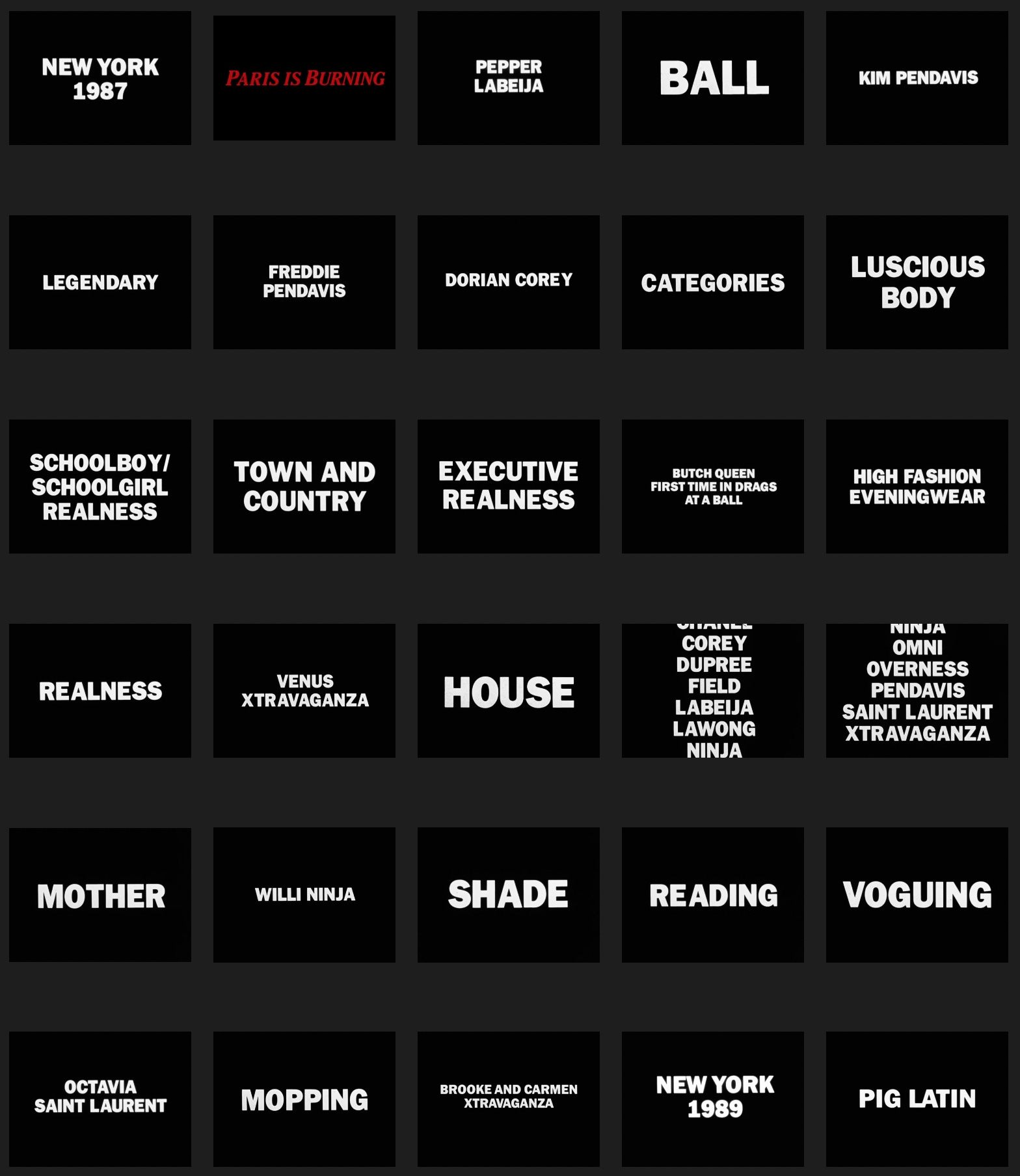
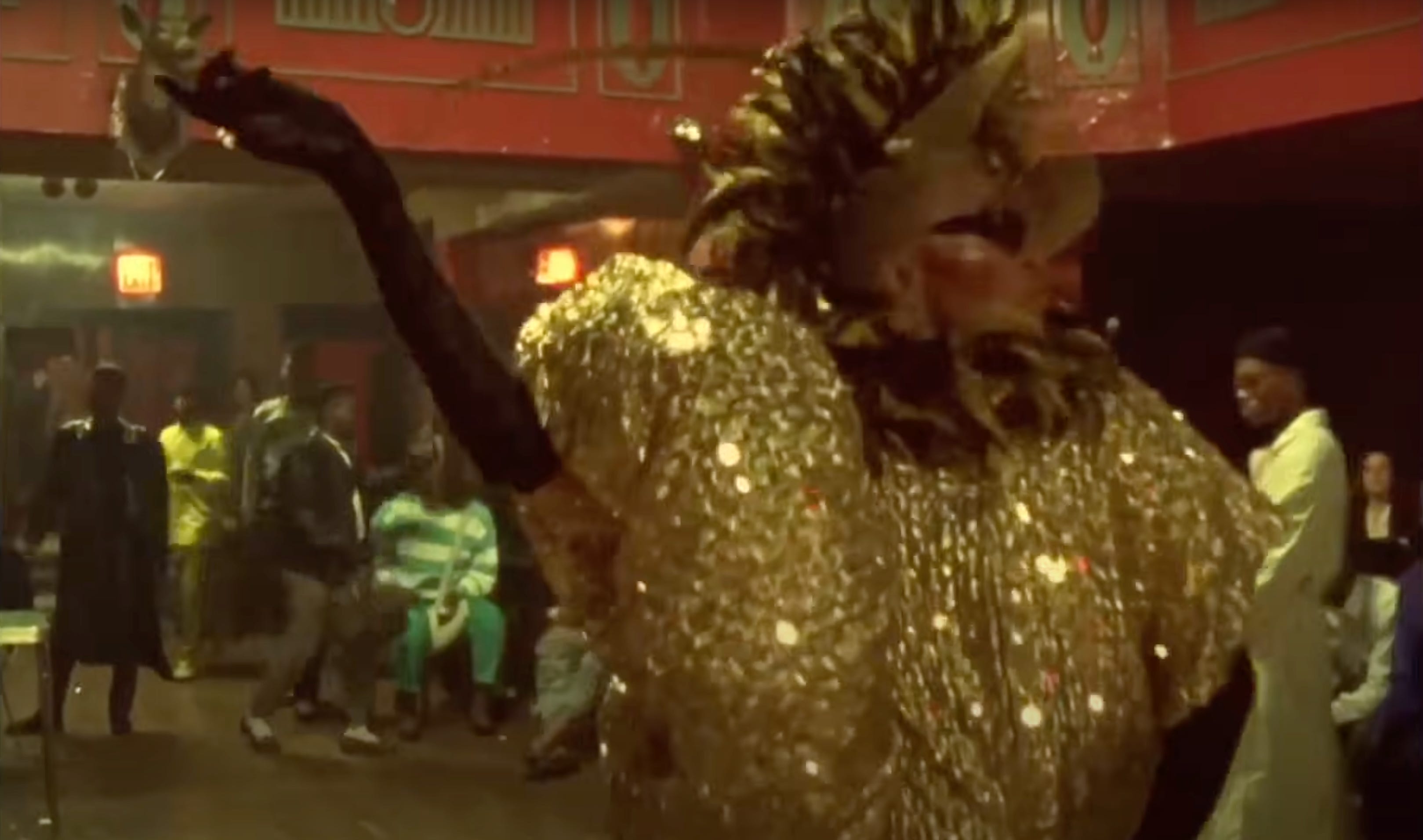
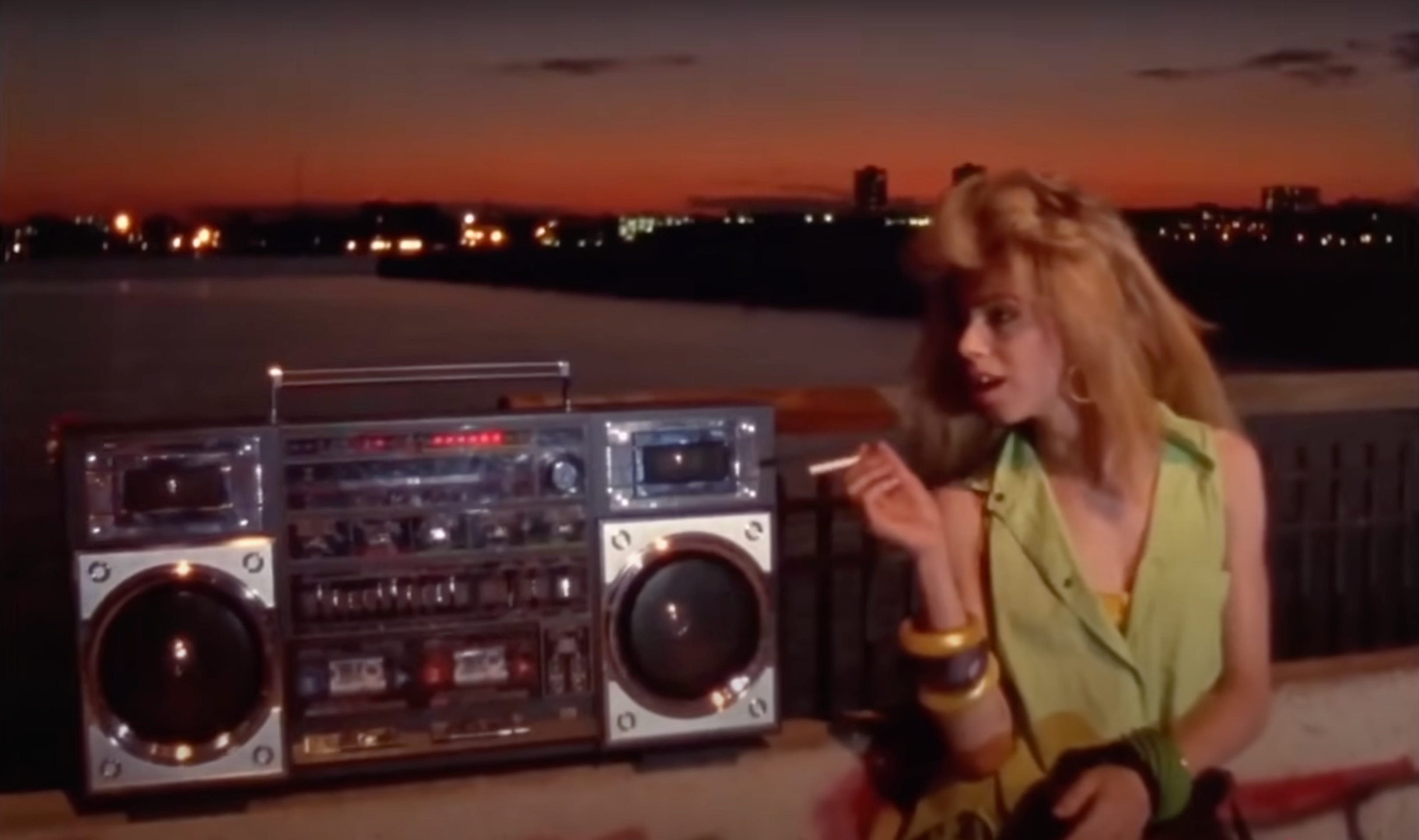
Paris Is Burning (1990), the notorious documentary by Jennie Livingston centered on ballroom culture in New York City in the mid- to late 1980s, is organized into 28 “chapters.” Each one is framed by a typographic moment—title cards containing individual words, names, or short phrases, plus one scrolling list. The film opens with the first of these titles, establishing the scene with “a statement of time and place:” NEW YORK 1987.1 The white letterforms are set in all-caps, in the early 20th century American typeface Franklin Gothic Heavy, centered on a black background. The words appear on the screen for about two seconds, before cutting to the NYC skyline and establishing shots of city street life. About a minute into the film, a voice begins the narration, talking about growing up as a gay Black man, while the camera takes us to Harlem. At a minute and a half, we get to the actual title of the film—Paris Is Burning (set in a different style from all of the other titles in the film: italicized, serif, red)—as Pepper LaBeija, mother of the House of LaBeija, arrives at the Imperial Elks Lodge, walking onto the floor for the first of the film’s many ballroom scenes.

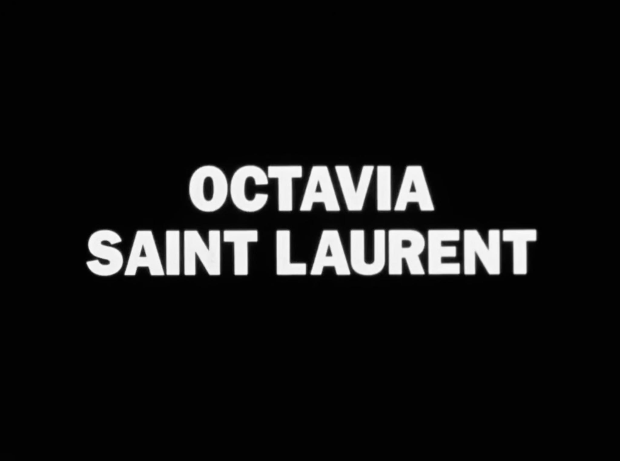
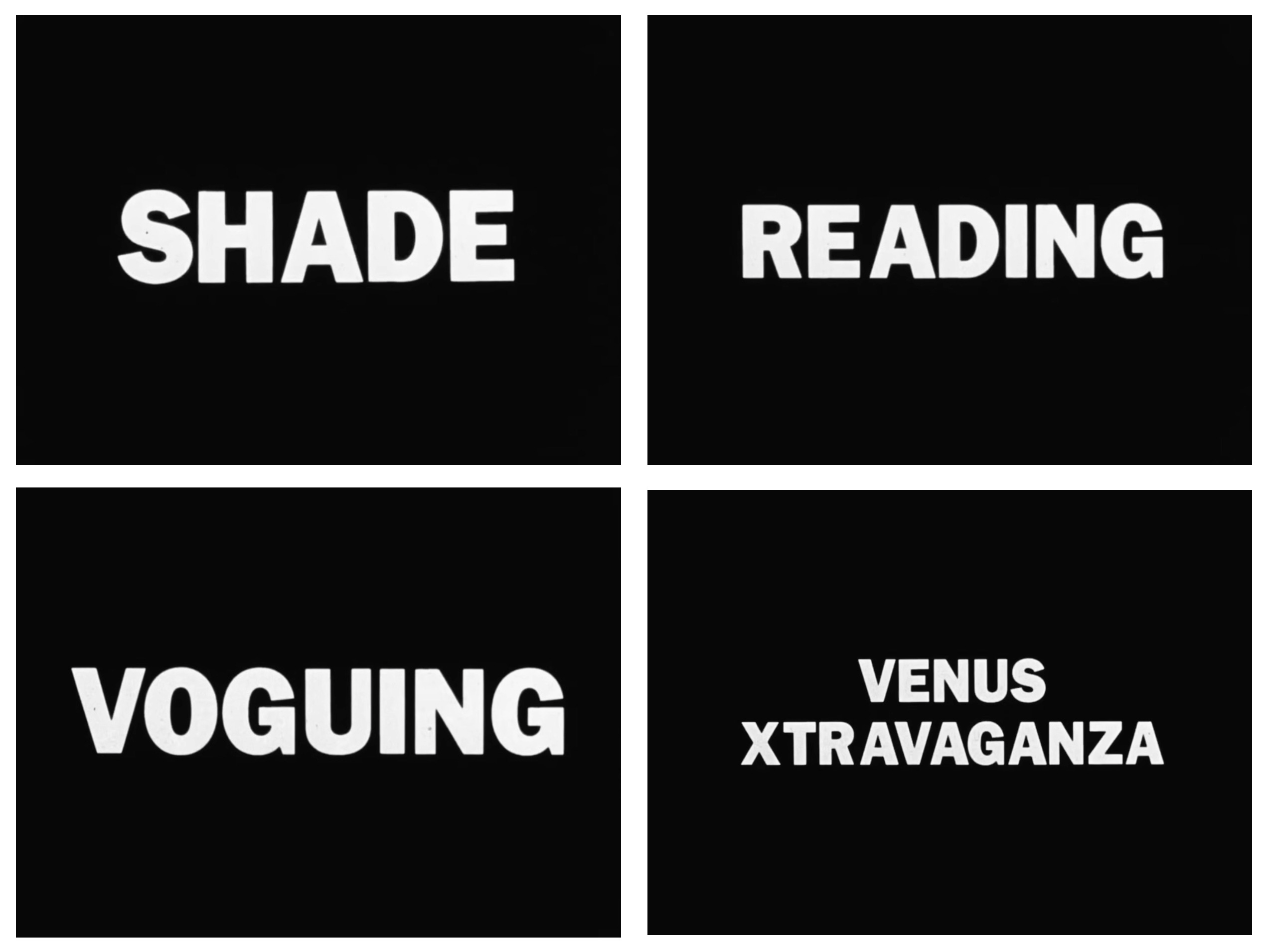
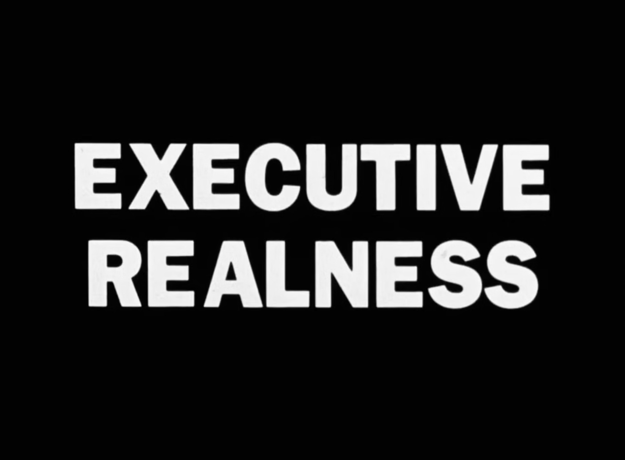
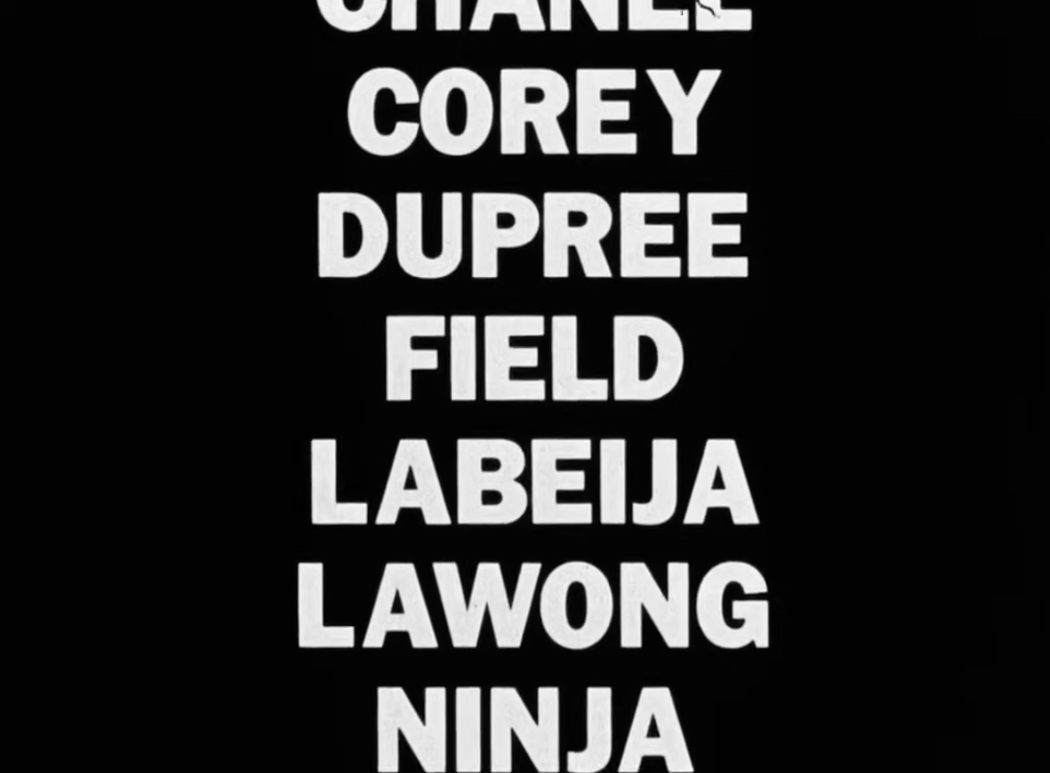
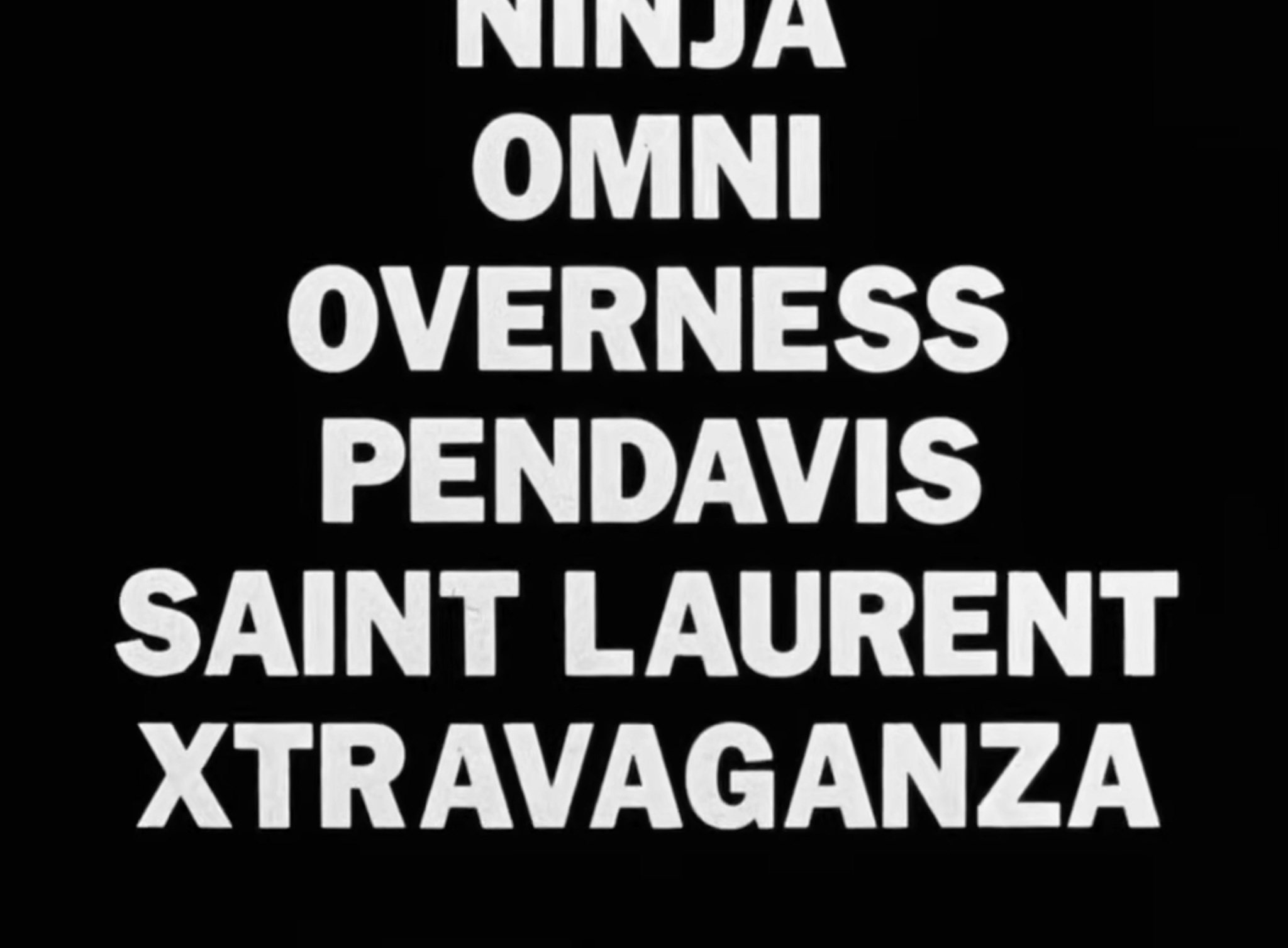
After that, 27 more typographic moments appear throughout the 76-minute film, each title card announcing a keyword (MOPPING, MOTHER, BALL, VOGUING), a competition category (EXECUTIVE REALNESS, TOWN AND COUNTRY, BUTCH QUEEN FIRST TIME IN DRAGS AT A BALL), or a name (VENUS XTRAVAGANZA, OCTAVIA SAINT LAURENT, DORIAN COREY). Each card appears on the screen in the same typographic style. Even though the entire film is structured around these distinct moments of written language, the narrative flows in and around them from one section to the next. The words interrupt the filmed story in order to label what we’re seeing and hearing, sometimes even mid-sentence. They operate less like chapter titles and more like visual cues that alert the viewer to what’s important—here’s what’s being said or here’s who’s speaking—supporting the film in the same way a heading or caption or footnote might be used in a book. They tell us to take note. They occur all the way until the very end of the film, with the last one, PIG LATIN, placed in the middle of a 14-second filmed clip that itself appears in the middle of the closing credits.
These titles function like on-screen annotations and have become one of the visual signatures of Paris Is Burning. Even though Livingston, the director of the film, is never seen on screen, these title cards speak in her voice; that is, they speak in a voice of white, all-seeing authority to interpret, translate, and explain what’s been filmed for the benefit of a majority white audience. Interviewing Livingston in 2020, a journalist told her that “I think the reason this movie speaks across generations and cultures is you break it down in such an elementary fashion: by vocabulary words.”
These vocabulary words are the formal markers of the narrative, inscribed onto the screen by the director—imposed over the action and speech of the film’s subjects, who are almost all queer, trans, and gender-nonconforming people of color. The collection of spelled-out words serves as an interpretive aid for a very wide, mainstream audience (the film was originally distributed by Miramax, a Hollywood production and distribution company with enormous reach). The title cards “break it down” and “spell it all out,” creating multiple ways to read the film, primarily as a text to be read—a literal list of words—but more significantly as a device that establishes a very specific imperial outsider looking in logic in relation to its Black and Latinx subjects. Certain keywords and names are named, while others—like the ballroom category “BUTCH WOMEN”—were cut, in effect creating a “controlled vocabulary” of terms that help to construct the reality of the film through this particular director’s lens.2 That our “read” of the film has been shaped by Livingston’s outsider whiteness is a sharp critique that was famously made by bell hooks in “Is Paris Burning?” (1992):
“Jennie Livingston approaches her subject matter as an outsider looking in. Since her presence as white woman/lesbian filmmaker is ‘absent’ from Paris Is Burning, it is easy for viewers to imagine that they are watching an ethnographic film documenting the life of black gay ‘natives’ and not recognize that they are watching a work shaped and formed from a perspective and standpoint specific to Livingston. By cinematically masking this reality (we hear her ask questions but never see her) Livingston does not oppose the way hegemonic whiteness ‘represents’ blackness, but rather assumes an imperial overseeing position that is in no way progressive or counterhegemonic.”
Franklin Gothic was designed in 1902 by Morris Fuller Benton, who also designed News Gothic (1908) and Century Schoolbook (1919); these and other Benton typefaces (as well as those designed by his father, Linn Boyd Benton) are part of the American tradition of large, complete families of type in multiple widths and weights that endure because of their ease of use, legibility, and accessibility. In deciding to structure the film with these uniformly styled, easy-to-read “flash cards” set in Franklin Gothic Heavy all-caps, the director frames the colonizing gaze with written language that performs an “elementary,” school-like function to support the outsider looking in imperial view. The controlled vocabulary interrupts the action to help with the read of the film and make it more legible; the film’s names and terms are literally “spelled out” in black-and-white. The stark appearance of the cards was designed to be didactic, unambiguous, explanatory, a form of instruction. They clearly frame, caption, and label the view.
Critically reading Paris Is Burning alongside hooks’ “Is Paris Burning?” (as well as Judith Butler’s “Gender Is Burning” (1993)) is a necessity if we want to analyze the film and understand its cultural significance. Additionally, another way to read the film is to examine it as an archival artifact, as the footage in Paris Is Burning records a precarious time and place in queer history that otherwise wasn’t well documented. In this sense, the film is precious. I’ve been doing a “close read” of the historical material that appears on screen in order to find other ways of being, reading, and seeing that might be revealed in particular passages and clips. In this close reading, the role of the title cards became more apparent to me, as did the concept of “reading” itself and the care involved in providing a good “read.”
Indeed, one of the Paris Is Burning title cards is for the word READING. It appears in the latter half of the film, in-between SHADE and VOGUING. READING names a form of spontaneously spoken insult that’s been popular in queer and trans culture for decades, especially in the Black and Latinx drag and ballroom spaces depicted in the film (and later popularized in RuPaul’s Drag Race as the “Reading Challenge”). What exactly “reading” means in the context of Paris Is Burning is brilliantly explained in a sequence featuring Dorian Corey, a trans woman performer who plays a kind of cultural critic and queer historian role as she’s interviewed throughout the film, intercut with shots of Venus Xtravaganza and others performing “reading”:
[Corey, in dressing room] “Shade comes from reading. Reading came first. Reading is the real art form of insult.
[Venus Xtravaganza, outside] “Now you want to talk about reading? Let’s talk about reading.”
[Title card] READING
[Venus reading Pedro . . . ]
[Corey] “You get in a smart crack, and everyone laughs, and kikis, because you found a flaw and exaggerated it, then you’ve got a good read going. . . If it’s happening between the gay world and the straight world, it’s not really a read, it’s more of an insult, a vicious slur fight. But it’s how they develop a sense of how to read. They may call you a faggot or a drag queen, you’ll find something to call them. But then when you are all of the same thing, then you have to go to the fine point, in other words, I’m a Black queen and you’re a Black queen then we can’t call each other Black queens, that’s not a read, that’s just a fact. So then we talk about your ridiculous shape, your saggy face, your tacky clothes. Then reading became a developed form where it became shade. Shade is I don’t tell you you’re ugly, but I don’t have to tell you, because you know you’re ugly. And that’s shade.”

Just as Corey finishes with this extended definition of reading and shade, the film cuts to a ballroom competition and we see two and then three performers walking the floor and dancing. A new voice begins describing VOGUING:
“Voguing is the same thing as taking two knives and cutting each other up but through a dance form.”
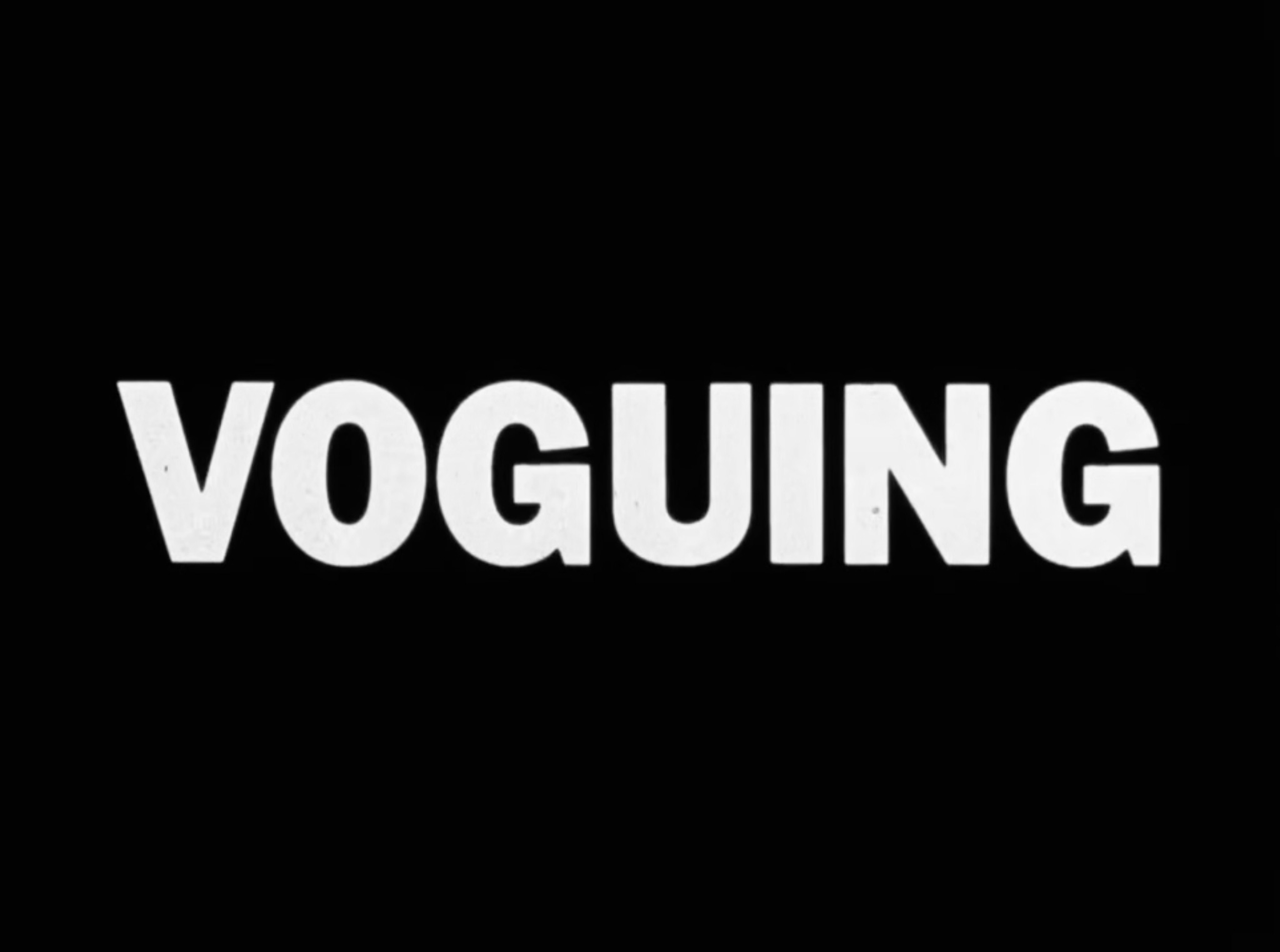
[Title card] VOGUING

It’s an incredible cinematic sequence where the narration, filmed footage, and title cards are cut together to trace a powerful connection from SHADE to READING (“shade comes from reading”), then back to SHADE (“and that’s shade”), and then to VOGUING, which is described as a kind of physical manifestation of reading and shade (“cutting each other up”) on the ballroom floor. Here, I started to see how Paris Is Burning, while centered on ballroom culture, is also about the deeper kinds of nurturing and care that were necessary for survival in these spaces. The rituals portrayed in the film, even those characterized by competition and insult, like casting shade and reading, were part of what it meant to survive in these Black and Latinx queer, trans, and gender-nonconforming spaces in New York City in the 1980s. How reading and other forms of interpersonal dialogue, conversation, and communication were portrayed in the historical footage shows how orality and spoken language in general served as relational glue in maintaining those survival networks on the street and in the ballroom. This was especially the case then, as HIV/AIDS, poverty, racism, transphobia, and homophobia were at crisis levels, routinely and systematically silencing queer and trans life. These survival networks take different forms, but are always at work under the matrix of domination.
The notion of mutuality and care is right there in the origins of reading and shade, which is sketched out and expanded upon by C. Namwali Serpell in a remarkable text, “Notes on Shade” (Post45, Issue 5: Formalism Unbound, Part 2, 01.15.21). Early on in the piece, Serpell traces a Black history of shade and pins its origins to the concept of signifying from Henry Louis Gates, Jr.:
“3. The black roots of shade lie in signifying, crowned by Henry Louis Gates, Jr. as ‘the black trope of tropes, the figure for black rhetorical figures.’ This may seem a highly textual endeavor but it is in fact a live, oral practice in the sources Gates quotes, which define it as: ‘a highly motivated rhetorical act, aimed at figurative, ritual insult’; ‘making fun of another’s appearance, relatives, or situation’; and ‘communicating (often an obscene or ridiculing message) by indirection.’"
Serpell goes on, by the end of their notes, to portray the “figurative, ritual insult” of shade and reading as an act of care, a sharp, relational disclosure (and exposure) that reveals a tender kind of close attention:
“57. The tenderness of shade is not about sweetness but about mutual vulnerability. You’re made tender; you’ve been tendered a ‘cutting,’ ‘scathing,’ ‘excoriating’ read — a sharp-edged disclosure. Yet, you’re also being tended to by being closely attended to. When you snatch someone’s wig, you expose them, you humble them, you peel back the surfaces you know they have taken care to layer, precisely because you yourself engage in the same glamorous self-protection.”


This kind of mutual vulnerability recorded by Livingston in Paris Is Burning and deepened by Serpell in their study of shade is illuminating, and points to the shared, oral commonality that’s cultivated (and necessary) in so many kinds of queer and trans spaces, especially during crisis. Tenderness and “close attending” certainly characterize other queer rituals too, including textual ones, like queer acts of reading and writing and the powerful idea of “spreading the word” in community via survival networks. I think of queer and trans publishing during this same time in the late 1980s and early 1990s, and the kinds of care shown for the reader in the writing, design, and distribution of these DIY publications—zines, newsletters, club fliers, stickers, buttons—which had very specific audiences (typically other queer, trans, and gender-nonconforming folks with shared interests, communities, or values) and purposes (to inform, to connect, to organize). For example, “Idle Sheet” was a community newsletter printed and distributed in 1986–88 right there in the ballroom scene, created by Marcel Christian Princess LaBeija, featuring poetry, gossip, illustrations, and information for folks to peruse while waiting around, “idling” time before or after the ballroom events. Shots of Marcel’s Idle Sheets appear in the Paris Is Burning extended outtakes released by Criterion in 2019.


Compare these DIY materials with the clarity of the title cards in Paris Is Burning. In the distribution of these urgent artifacts, knowledge was communicated across the network through the messaging and design of the printed materials themselves, which frequently involved a non-conventional read, a hybrid legibility that would be recognized by some, but not all. The creators of these zines, fliers, and newsletters seemed to be crafting a different kind of reading experience, one that shaped language into an intimate, slower, and more considered agreement between the authors and the very specific readers who would recognize and appreciate the care involved in being addressed and “closely attended to.” In queer and trans zine publishing of the 1980s and 90s, the agreements were specifically between those involved in producing the zines and those reading them, who were usually of the same extended community or sometimes even the same people. Safety and trust were paramount in the shared experience of tender writing, making, circulating, and reading. This was way before there was a popular “market” for DIY zines like we see today in zine fests and art book fairs; they were less legible then, to those outside of the survival networks in which they circulated. The crafting of legibility to create a safe space for exposure and disclosure in the form of a printed publication strengthened those survival networks by enabling a shared commonality through the careful circulation of queer knowledge contained within them.
Queer publishing is possible because of the agreements that are already there between queer kin, materialized in the design of the thing itself—the understanding described by Corey as when you are all of the same thing. It’s not necessarily a take-down, as we hear it in Paris Is Burning, but it can be an “undoing” of legibility based on a fundamental agreement between everyone involved. The dynamic black-and-white typography and hand-lettering of these zines—cut up, overlaid, textured language—is a part of the sharing in “survival by sharing,” signaling difference and non-conformity to others in order to build trust. These are queer typographies because the language emerges from a space of mutual vulnerability, closely attending, making, writing, and reading along known survival networks; in the examples shown here, the agreements form around the writing, design, circulation, and reading of printed pages in community.
Back to the title cards in Paris Is Burning. Are they queer typography? At first, I thought so, mainly because of the iconic status of the film in queer history, and because the director is lesbian. The typography was obviously an important factor in the design of the film and has become a part of its identity as an LGBTQIA+ work of art—so maybe. But also, in reading the film more closely, I’ve come to see how the design of these “flash cards” helped to frame and position the Black and Latinx queer, trans, and gender-nonconforming subjects of the film as being outside of the film’s agreements. The agreements are revealed instead to be between the director, the producers, and the mainstream audience. The flash cards don’t construct a queer dialogue “in community;” rather, as typographic dividers, they work to label, construct, and instruct, and extend a legible “read” of the film to the audience as it circulates outside the space of the Harlem ballroom, outside queer and trans spaces, to be “read” in the white, patriarchal worlds of Harvey Weinstein, Miramax, and the Hollywood industry. The typographic voice spoken by these title cards was inscribed onto the screen for the audience’s benefit, giving the spectator access and positioning them as an outsider looking into another world—”not of the same thing”—like the absent director. The clear typographic voice of Paris Is Burning exposes the spectator’s inability to properly read the time and space of ballroom culture. In other words, the typography does exactly what it was designed to do—it labels and makes legible the most vulnerable voices and stories of the film for the purpose of entertainment.
This point about where the agreements are in “reading” Paris Is Burning was further deepened when I learned that the 13 cast members were offered minimal compensation for their participation in the project. Together, they divided and shared $55,000, offered by the producers only after they sold the film to Miramax for $275,000. The film went on to gross $4 million. Left out of the more official agreements—the crafting of formal contracts and negotiations with industry executives—the subjects of the film were unable to participate in shaping, structuring, or circulating their own voices, let alone the film’s profits or success.
“. . . all but two of the movie’s surviving principals—Willi Ninja and Dorian Corey—hired lawyers to try to cash in on the film’s success. The largest claim came from Paris DuPree, who sought $40 million for unauthorized and fraudulent use of her services. Though she is never named on camera and appears for less than three of the movie’s 76 minutes, her 1986 ball, called Paris Is Burning, provided the title for the film and is extensively featured in it. But like all of the others, she had signed a release, and her lawyer dropped the matter.” (Paris Has Burned, The New York Times, April 18, 1993)
Almost all of the cast members have since died, including Venus Xtravaganza, who was murdered before Paris Is Burning was even completed, announced at the end of the film in a blunt addendum. Her murder has never been solved.
Paris Is Burning continues to inspire newer generations of young people who desperately want to connect with queer ancestry. Even with its deeply complicated 35-year history, the film endures as a precious queer artifact, allowing us to witness and listen to these voices again and again. It provides profound evidence of queer, trans, and gender-nonconforming life, boldly and quite literally spelling out the names of Black and Latinx legends on the screen, like typographic pride flags that fly through time and space. The typography of Paris Is Burning is a crucial part of the film’s power, helping to keep those names alive and visible, even if it’s clear that the film was never intended to be a survival network for those who are named, spoken, and labeled in the film.
I’ve learned so much from the design of this film. “Spelling it all out”—proudly naming names to be read through time and space—is a powerful way to endure, pay tribute, and inscribe knowledge and life in the things we make. But creating objects to be read—by whom?—requires a deep understanding of the agreements that give power to our urgent artifacts and how they are received and circulated into the future, and how they impact others. Who is being attended to? Who and what are being made legible? At what cost?

“Spelling it all out” is crucial right now, as we see our own US federal government working to undo the grammar of queer, trans, and gender-nonconforming life on a daily basis. This is happening in all kinds of ways, including the cruel manipulation of language that erases decades of progress and visibility in an instant, as scripts are deployed to crawl across .gov websites, tagging and deleting banned vocabulary words and removing letters from acronyms. As I’m writing this (2/20/25), I’ve learned that the National Park Service, under the direction of the Trump administration, has removed the webpage for Marsha P. Johnson from the official website of the Stonewall National Monument. In its place, this message is displayed: “Page In Progress. This page is currently being worked on. Please check back later.” I assume it will either return with words like “transgender” scrubbed out, or just not return at all.
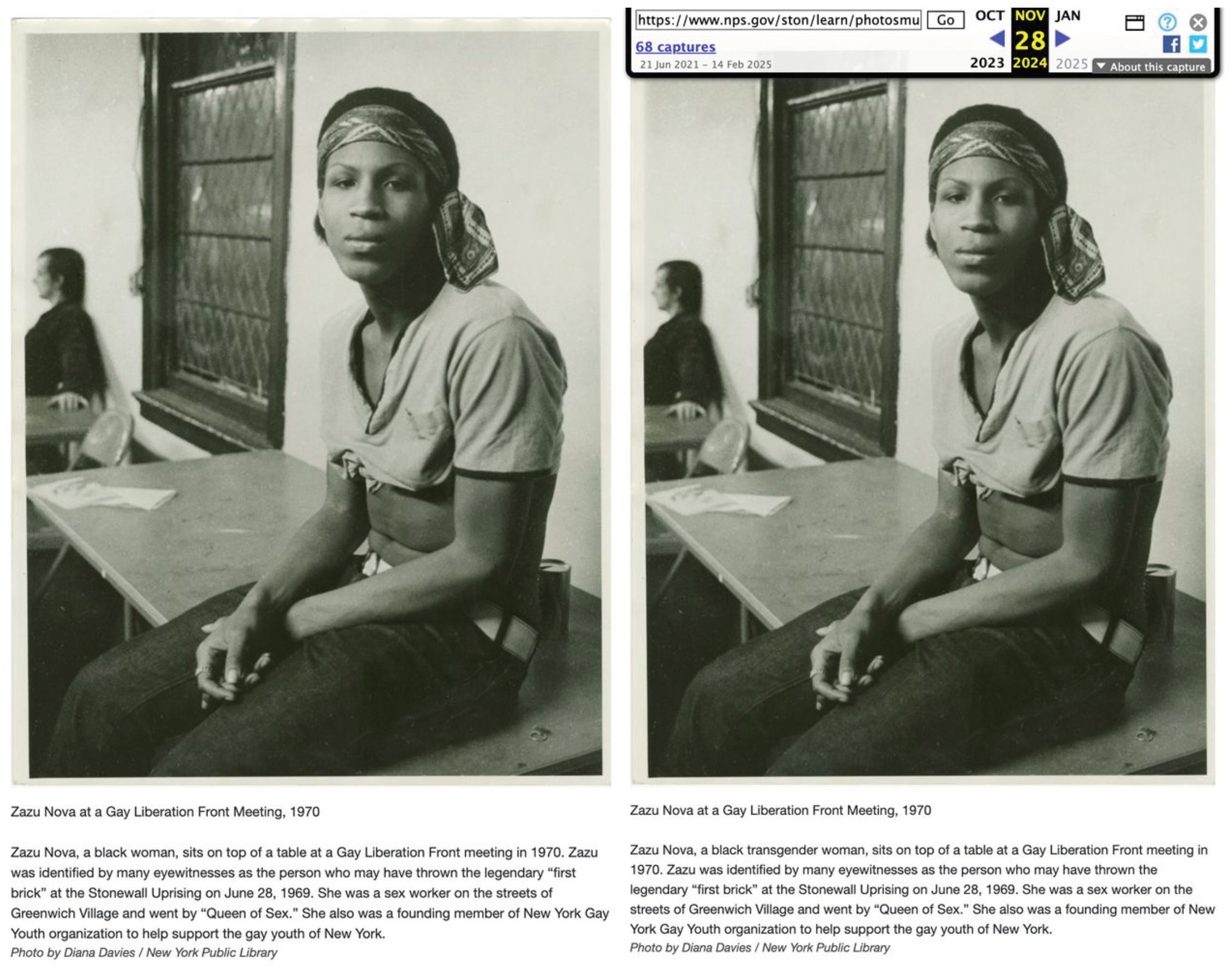
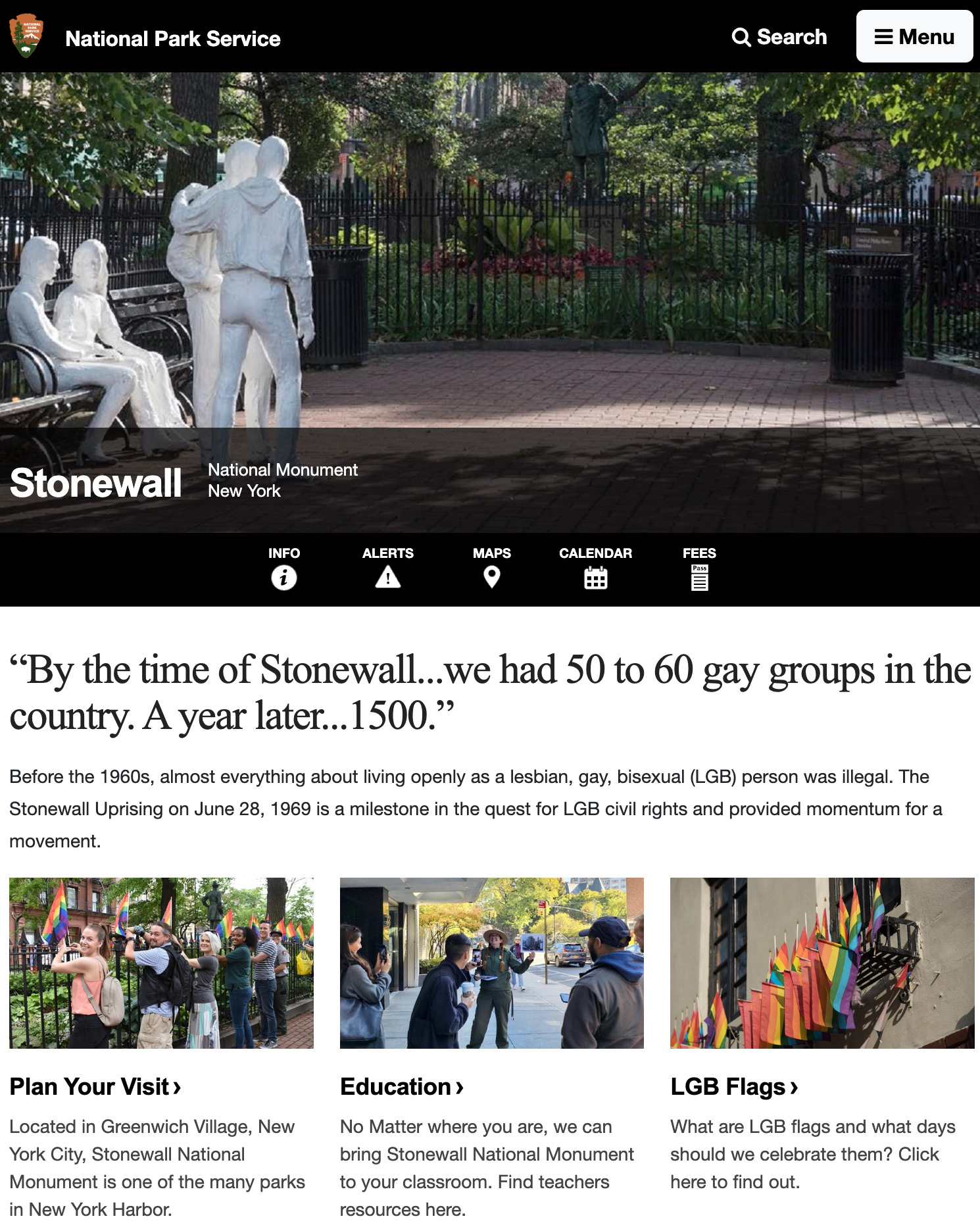

This comes just one week after the word “transgender” and the letters “T” and “Q” were removed from “LGBTQ” on the website for the Stonewall monument. At the same time, the US State Department announced that it will no longer offer the gender marker “X” as an option on passports for non-binary, intersex, or gender-nonconforming citizens. Evidence of queer, trans, and gender-nonconforming life is being erased from many other federal websites, archives, databases, documents, and policies, in real time. These manipulations occur without agreement—rather, they operate so painfully because of the cruel conditions of disagreement, denial, and erasure that they create. No one should ever be left out of how they choose to be named (or unnamed), spoken about (or silenced), or labeled (or not). No one should ever be left out of the crafting, creation, and circulation of their own stories, or deciding how to be “read,” or not. Agreements are currently under attack. Targeting the most vulnerable through the erasure of history and language is a predictable part of fascism’s playbook; removing the most vulnerable from the timeline makes it easier for fascists to deny that they ever existed, and then to deny future existence. I’m so scared for our ancestors, and for all queer kin right now, especially queer, trans, and gender-nonconforming people of color. As we prepare to become future ancestors, we bring with us and speak to future kin with the precious artifacts that we collect, make, publish, and preserve, as evidence of life lived—a 35-year-old film, a monument, a bio, a link, a photograph, a flag, a name. Our data must be preserved; the names named, the words spelled out. “Fascists, authoritarians, dictators of all stripes destroy archives— books, museums, databases, &c—because those things provide windows onto a plurality of other ways we might organize the world. And so preserving, defending, and spreading that knowledge harms those regimes.”3
Lucas Hilderbrand, Paris Is Burning, A Queer Film Classic, Arsenal Pulp Press, 2013, p 35.
Ibid, p 50.
Dr. Damien P. Williams, Blue Sky post, February 19, 2025.