The future of typography is queer
Some past, present, and future approaches to liberated language
I mentioned John Cage’s Empty Words (1974) in my last post, and it triggered a memory. Many years ago I attended a performance of Empty Words put on by the John Cage Trust at Bard College. It was a special all-night event, and we were encouraged to bring bedding and sleep-appropriate clothing, so we could fall asleep listening to a 12-hour recording of Cage performing the work, which draws from the journals of Henry David Thoreau. A special macrobiotic menu of soup, rice, vegetables, and tea specified by Cage was served during a series of intermissions spread out through the night, and the performance was timed to conclude at dawn.
The work is a recording of Cage speaking, gradually stripping away meaning and syntax from Thoreau’s writing, until there’s nothing left but letters and sounds (the written version can be accessed here, published by Wesleyan University Press in 1981, and a page from the book appears below). Even though the event was very much a listening experience—the sound of Cage’s voice reading non-syntactical language—I’ve been thinking about it again in relation to queer typography. Is Empty Words queer? What do experiments in queer language and legibility look, sound, and feel like? Where does queer design and typography come from? Is it possible to liberate meaning and politics from language, while also shaping it? I guess this was Cage’s fantasy with Empty Words.

He describes the language as “demilitarized” in this interview clip, referring to the pleasurable loss of control that Empty Words proposes. As an experiment in indeterminacy and the shaping of non-normative language, Empty Words is certainly queer. I remember drifting in and out of a dream state that night, listening for hours as Cage’s voice evolved into strange, illegible fragments and guttural sounds, with a live overlay of real snoring coming from all around me in the large space where we’d made our beds. As an embodied experience, this was something that actively worked against many of the ways that language controls, orders, and assigns meaning.
Despite Cage’s claim about the demilitarization of language into liberated nonsense, I think Empty Words might be especially political—not less so. After all, there are politics in the sound of a voice, certain presumptions about the body that the voice belongs to, who it addresses, the source material, the conditions under which the work was created, performed, published, etc. There’s also the design of the published work on the page, and how it references certain typographic histories, design standards, and expectations (a square page, a grid, a monospace typeface, lots of white space). All of this creates a politics, of course—the politics of art-making, of design, of reading, of performance, of listening and attendance, of attunement. There’s no escaping it.
I love that Cage frames this work as a response to the militarized nature of language. Language is the controlled ordering of the world, the inescapable condition of control that we deal with on a daily basis in ordinary communication. I’m inspired by the piece because I can imagine how “empty words” might be a destination to move towards, a place of queer, poetic potentiality, where language is liberated and totally “disarmed.” I’m curious though—what happens when we use empty words as a starting point, instead? and go the other way? All the way to precise communication and control. What’s to be done with militarized language?

All language is armed, I suspect, even Cage’s. Communication has been weaponized for as long as states have existed, to control and regulate populations. Yes, with propaganda, but even just common statements like “I do” or “you’re guilty” have the power to determine all kinds of agreements, relations, and economies, depending on when and where they’re spoken, and to whom they are uttered. In addition to the power of particular statements, there are also structural politics that are just inherent to language itself, constantly evolving to maintain the matrix of domination and its militarized logics of success—namely heteropatriarchy, white supremacy, settler colonialism, and capitalism—by ordering knowledge within the highly regulated boundaries of gender, racial, and class structures. Almost half of all languages use the same gender binary to conceptually organize the world. Design is a part of this; it’s difficult to imagine how the visual shape of language, and the design of reading experiences, might somehow operate separately from these oppressive forces.

I’m interested in how language can be visually armed to give us the power to utter, address, and attune in ways that counter these logics of success. Spending time with various liberation movements of the past and present, we can find examples of language that have been “loaded up” and shaped with a surplus of meaning, above and beyond conventional standards of “good” typography and design. Intersectional movements deploy language across a spectrum of design legibilities to address, organize, and take action as a matter of survival. Language is shaped, reclaimed, weaponized, disguised, coded, drawn, set, amplified, and circulated—to spread the word. The deployment of liberated language can happen efficiently but unevenly, as those counterpublics who need it the most are addressed with coded messages that aren’t meant to be discerned by everyone. This is the realm of queer typography.
I’ve been looking for evidence of armed and loaded language in various queer contexts, to see how meaning is written, visualized, and read during crisis, and what I’ve found is striking. There’s a spread in the printed zine “WE WILL NOT PROTECT YOU” by Pink Tank (2004) that I encountered within Avram Finkelstein’s papers at NYU that mimics the visual and written language of the Declaration of Independence in order to declare a new kind of freedom. By addressing the reader as “We the Radical Queers of the United States” in a reverse italic blackletter typeface, the anonymous authors claim and redefine the militarized language of “We the People” and all of the violence and assumptions embedded within the legacy documents of state control and empire building. Pink Tank mutates and subverts the meaning of the Declaration of Independence by claiming its power over language and design for itself, with incredible intention and specificity. The design cannot be separated from its message and political context. This is what I’m calling queer typographies—visual approaches to liberated language. These approaches make use of typefaces, letterforms, lettering, typing, drawing, stylistic references, symbols, and other meaningful expressions to emancipate language and spread the word.


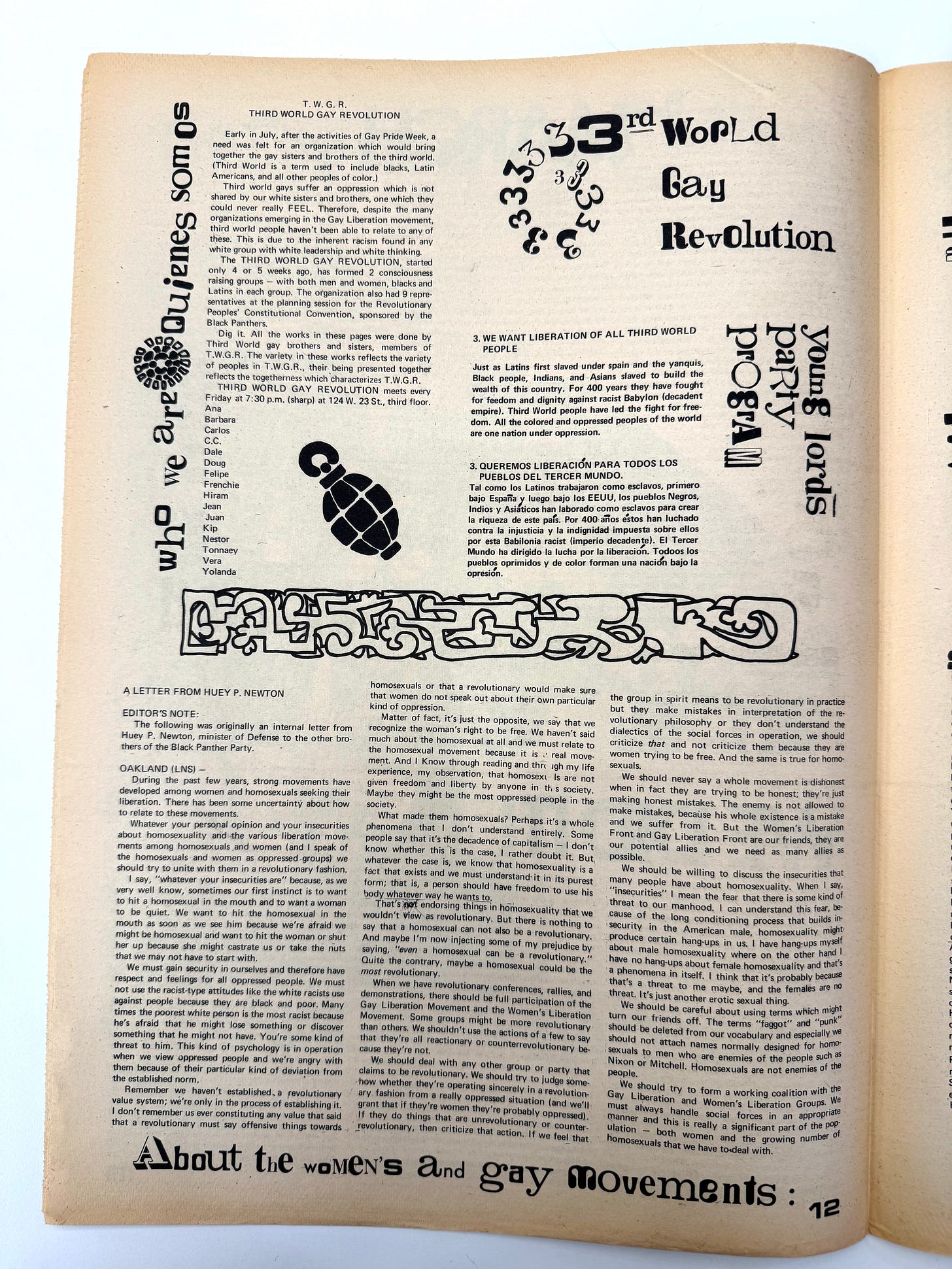
Earlier, in the years just after Stonewall, an approach by the NYC-based group “Third World Gay Revolution” (T.W.G.R.) made use of typographic hybridity in order to signal difference. TWGR was a group of Black and Latinx gay and lesbian people that formed in 1970 to address racism and oppression within the gay movement. They held weekly meetings on West 23 St in Chelsea, and in the design of their announcements and texts, published in local newspapers and flyers, they used a dramatic mix of typefaces, sizes, and styles for their headlines and messages. For the back cover of the Dec-Jan 1970 issue of Come Out!, they drew each letterform as its own entity, vibrating collectively with energetic lines and adorned with faces, flames, ears, and squiggles. Whether set or hand-drawn, this kind of mixing of typographic styles slowed down the read and reduced traditional legibility, while at the same time raising a very distinctive flag that came to be recognized; it seemed to say: we are different, we are varied, we do not conform.
The rhythm and variation of T.W.G.R.’s letterforms, combined with illustrations of weapons (a grenade, a doubled femme holding a rifle), and decorative icons used as border treatments (arrows, stars, circles, and other shapes), was a kind of transformation of traditional design elements into something else. Their visual non-conformity proposed a real clarity of message (intersectional liberation) through a hybridity of design tactics—in itself, a feat of legibility that transcends much of what conventionally good graphic design proselytizes: precision, control, and uniformity. In reading through the members’ names signed below one of their published texts—Ana, Barbara, Carlos, C.C., Dale, Doug, Felipe, Frenchie, Hiram, Jean, Juan, Kip, Nestor, Tonnaey, Very, Yolanda—I’m moved by how this group deployed their collective power into the future, reaching us today. Nat Pyper builds upon these beautiful transmissions with their own type design work, A Queer Year of Love Letters (2024).

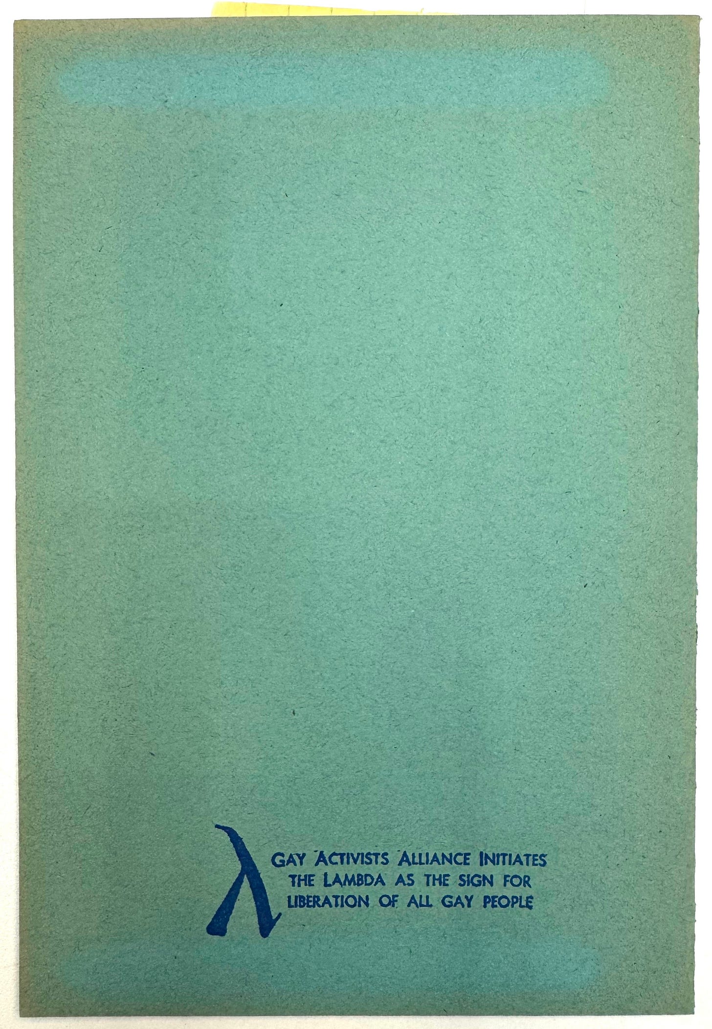
Meanwhile, while T.W.G.R. was organizing and Cage was experimenting, the pink triangle was starting to be deployed as a symbol for gay liberation. This was happening internationally as gay, trans, Black, immigrant, feminist, and anti-war movements motivated by Stonewall became more activated, and communicating quickly was a crucial way to maintain survival networks. Easy-to-use typographic glyphs were helpful for identifying new groups and causes, and became a kind of shorthand for communicating communal safety and trust. The pink triangle was reclaimed from its Nazi origins as a symbol of gay oppression, while the lambda (Greek letter “λ“) was borrowed from chemistry to represent “action,” first used by the Gay Activists Alliance in NYC in the early 1970s.


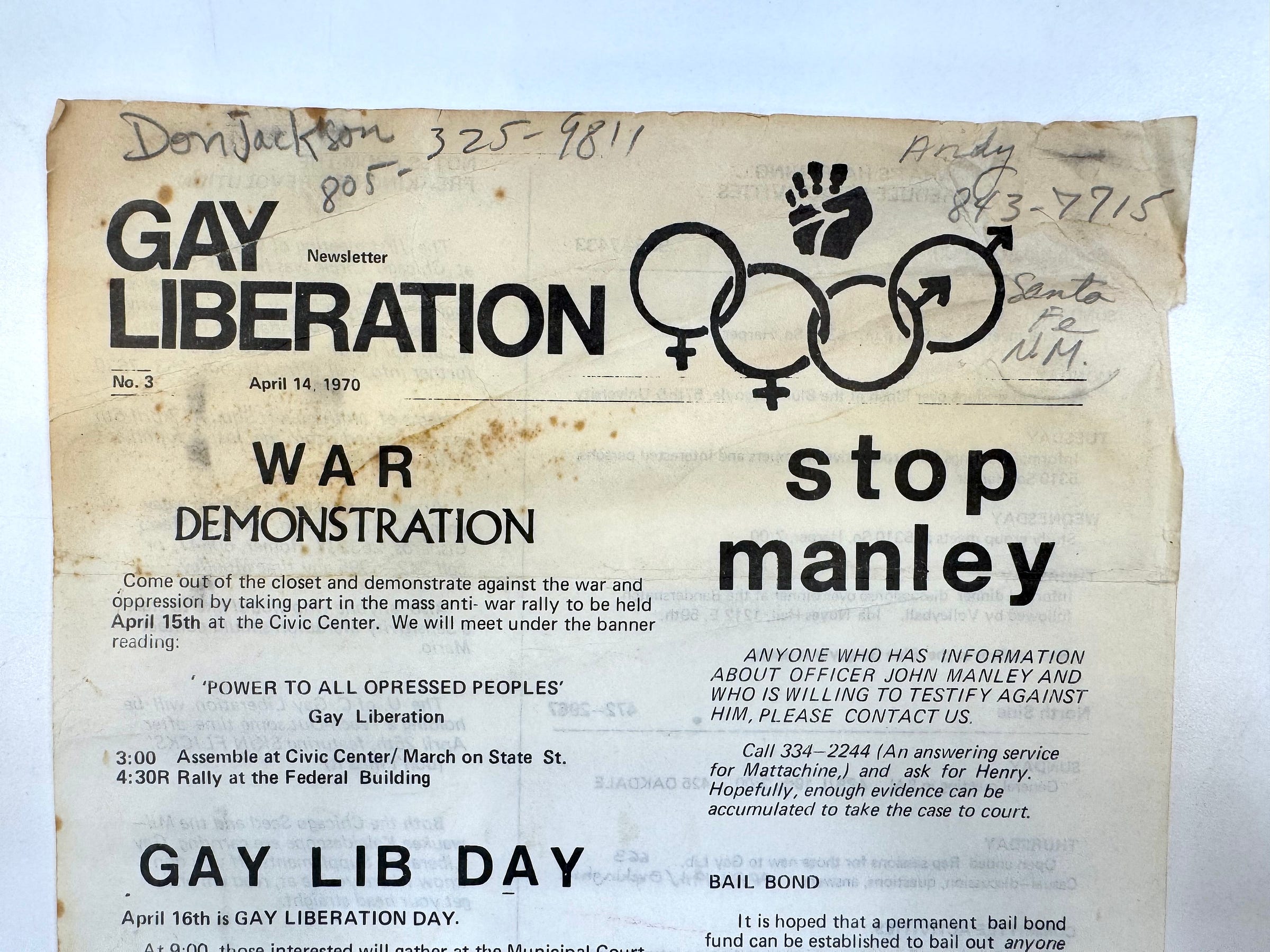
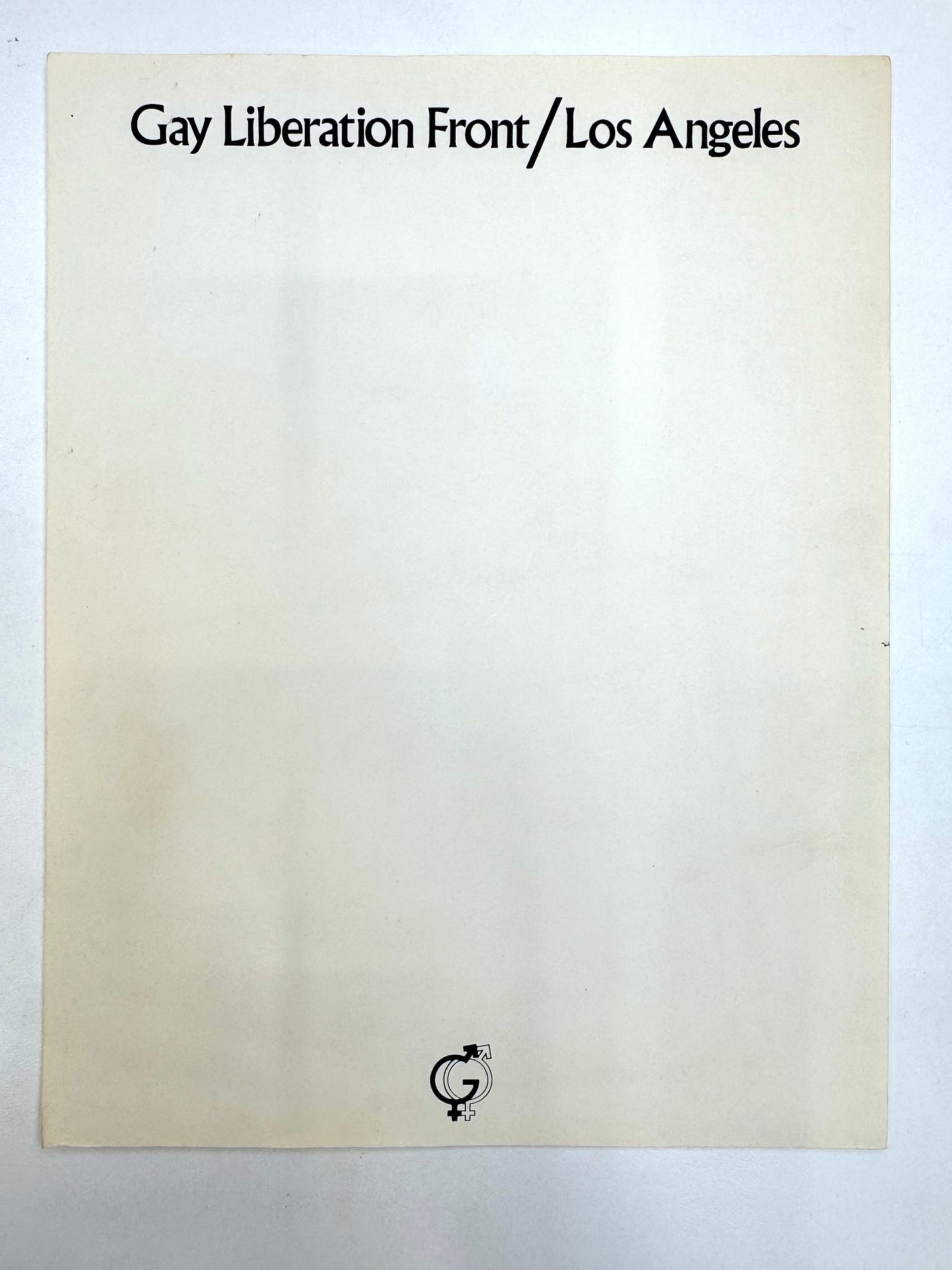
This was also the moment when traditional “female” and “male” symbols were being used to create new visual ideas from old forms. The origins of these symbols as biological markers can be traced back to the 18th century, when the symbols for Venus and Mars were first used to designate the sex of flowers, with the cross and circle of Venus representing a woman’s hand-mirror, and the arrow and cross of Mars representing a man’s shield and arrow. These symbols recall deeply embedded stereotypes that have reinforced the gender binary over millennia, except they were now being freely doubled, overlayed, linked, or otherwise combined to create new representations for gay men, lesbian women, and homosexuality in general. Sometimes other elements were added, like the peace symbol or the raised fist, or letterforms, like the “G” in the logo for the Gay Liberation Front.


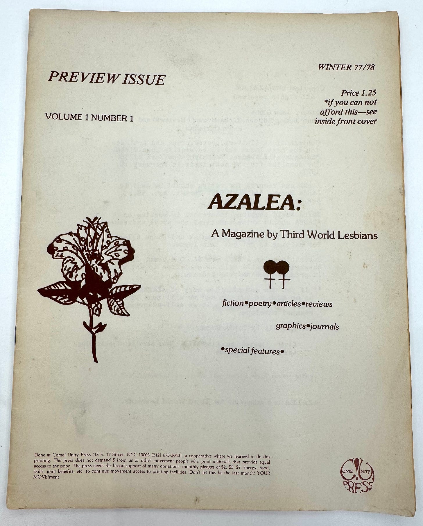
When the transgender activist group Street Transvestite Action Revolutionaries (S.T.A.R.) formed shortly after the NYU sit-in at Weinstein Hall on Sept 25, 1970 (led by Sylvia Rivera and Marsha P. Johnson and originally calling themselves Street Transvestites for Gay Power), they distributed a flier that was printed with a hand-drawn symbol in the lower left corner that combined and doubled the Venus and Mars symbols. This signaled a real attempt to represent transgender identity in some kind of visual way; I need to do more research, but this may have been a first. When I found a physical copy of the flier at the One Archives in Los Angeles in 2024, filed among the papers of the Gay Activists Alliance, this particular copy was marked with another symbol that was hand-drawn in red ink in the lower right corner: a single circle that combined the arrow and cross in one move. Later, in the winter 1972 issue of Come Out!, published by the Gay Liberation Front, Silvia Rivera authored a short declaration of transgender liberation (“Transvestites—your half sisters and half brothers of the Revolution”), illustrated with hand lettering and that same trans symbol, this time multiplied and linked three times to form a new symbol that points in all directions. It’s a deeply meaningful move that mutates and builds upon known designs into something different, broadcasting a new kind of plurality and power.

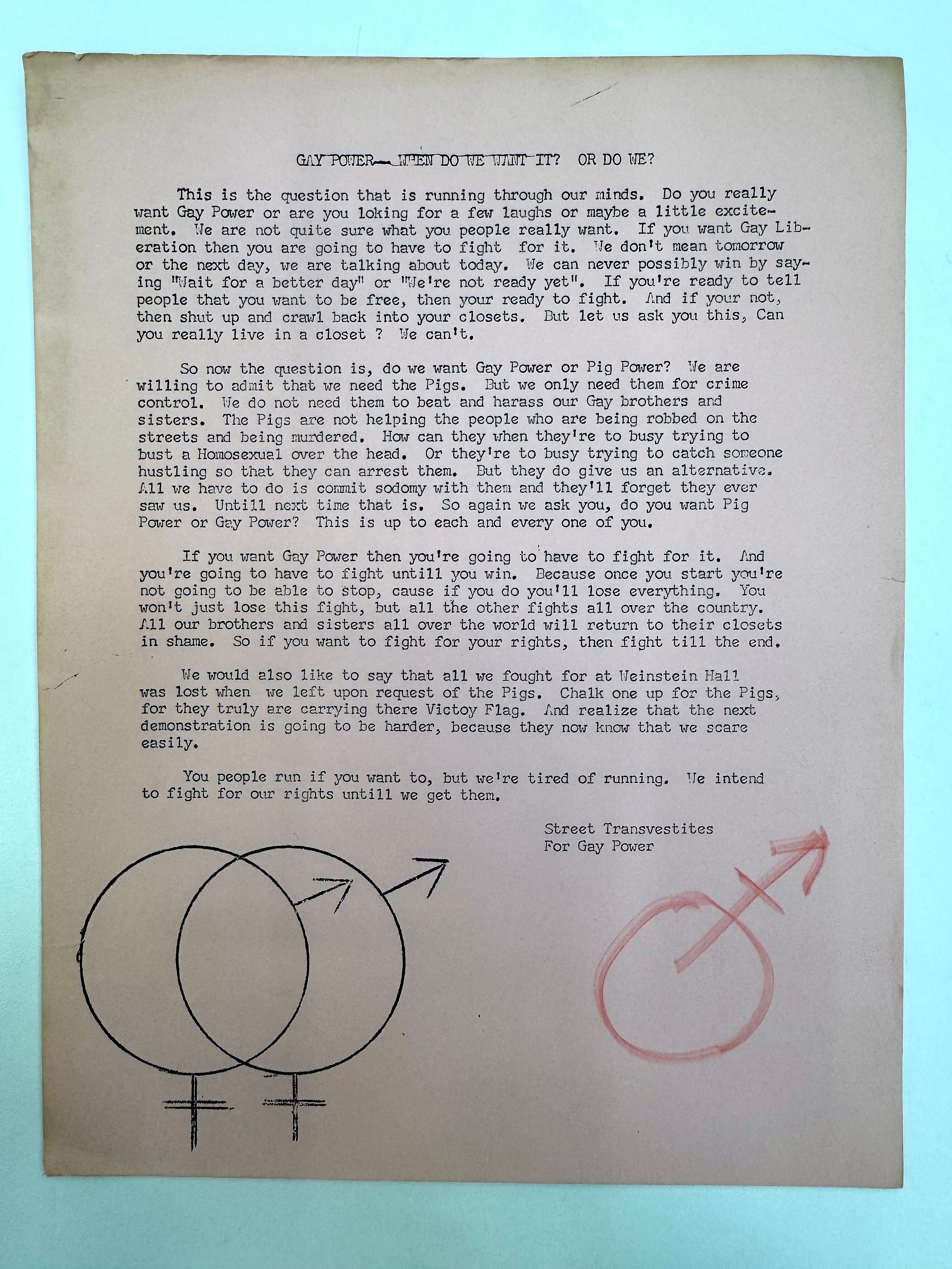

Maybe it’s odd to juxtapose the queerness of Cage’s singularly-authored work in “demilitarized language” with the hardcore queer typography and symbols collectively being used in gay liberation at that same moment. But I think there’s real value in exploring how experiments in shaping liberatory language tried to challenge the militarized language of oppression, even if they approached from radically diverging directions. At the same time that Cage proposed the liberation of meaning and a move towards artistic embodiment and pleasure, gay liberation fighters were building a kind of armed and loaded queer vocabulary to liberate society—typography, design, and symbolic glyphs grounded in previous meanings but attempting to go beyond the confines of history. The triangle, lambda, S.T.A.R. symbols, and T.W.G.R. typography contained a surplus of meanings and associations that were meant to signal and bring about collective action. This new queer vocabulary had a power that spoke to its intended audience with fullness, specificity, and intent. In the face of militarized oppression—the fight for basic rights, life and death survival, and liberation—these symbols were armed and loaded, ready to fight. And they worked so well because they were able to mutate through time and space. They could be adapted and changed endlessly, to suit an enormous range of contexts.
This idea of mutation is crucial when thinking about queer approaches to design and typography. Making typographic moves in order to change, shift, and signal difference across time and space is one of the powers of liberated language, and it continues today. This is remarkably evident in the work of the contemporary Belgian type collective Bye Bye Binary and their powerful experiments in non-binary typography, and how they actively change the French language by designing new glyphs that mutate, alter, and transform the gendered endings of words.
I had a chance to meet up with the BBB collective in Brussels recently and was given a complete tour of their work. This group of about 20 members (half of them are type designers, but others are graphic designers, writers, educators, and philosophers) indexes their own work here, as well as the work of other type designers who create non-binary fonts. Many of their fonts are freely available for anyone to download and use.


During my visit, Camille Circlude, one of the founding members of Bye Bye Binary and author of La Typographie post-binaire (2023), beautifully demonstrated exactly how their fonts work. It’s about changing the way we type in order to adjust, adapt, and make language do more. Again, it’s about a surplus of meaning, or perhaps in this case the extension of meaning into other realms. In Camille’s demo, instead of typing “amoureux” (lover—feminine) or “amoureuse” (lover—masculine), they typed “a-m-o-u-r-e-u” and then two periods “. .” and the new glyph “x•s•e” appeared, completing the new, non-binary version of the word: “amoureuxse.” The x•s•e glyph is a ligature that “falls” below the baseline of the word, its descent signaling a wayward difference, a shift, a break. It’s a queer act of typing that produces change, mutation, and difference. In other fonts that they design, the x•s•e ligature might rise above, or combine in other ways; each one is different. Like the hand-drawn symbol on S.T.A.R.’s flier, it uses the existing, inherited “armed language” (in this case the built-in gender binary of the French language) to mutate into something new; it’s a combination of coded forces that’s activated by the user/author who is empowered to create these designs in the act of writing/typing itself.


Bye Bye Binary’s work is radical and transformative; it changes language and speaks to the future. I see direct and irrefutable connections between the early queer typographies of the gay and trans liberation movements of the 1970s, 80s, and early 90s and their work today. These connections are a trajectory of intention and meaning that moves with great energy and urgency across time and space to connect authorship (language) »» to action (design) »» to publishing (circulation) »» to survival (liberation). These queer typographies emerge from liberated language because liberated language spreads most urgently under crisis conditions when survival networks are needed. And as we think about what it means to become future ancestors, we must consider our future kin. How shall we communicate? What messages are we sending to them in the future? These other legibilities—queer acts of reading, writing, typing, drawing, and speaking sent into the future by Cage, S.T.A.R., T.W.G.R., Pink Tank, Bye Bye Binary and many others—show us how.
They show us that the future of typography is queer.

PS
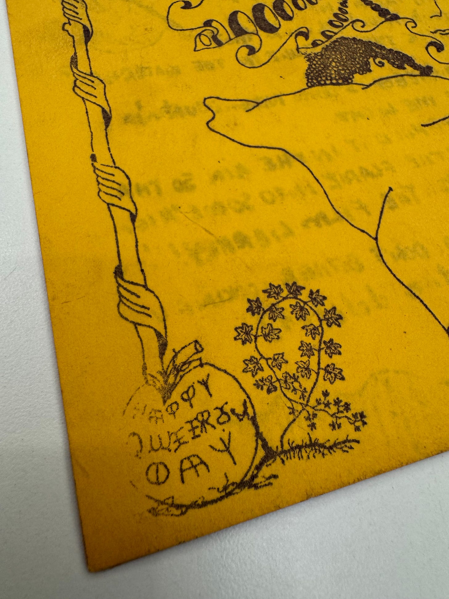
I’ll write about the mutated, doubled letterforms of “HAPPY QUEERS DAY” on the cover of this issue of Gay Post (1974) in a later post!


