
The Permeable Closet
Early queer publishing and the right to variability


Beatrice Warde, the American type scholar, writer, editor, and Monotype publicist, wrote that good type should be invisible, a window to be looked through, not at. “The book typographer has the job of erecting a window between the reader inside the room and that landscape which is the author’s words,” she delivered in her legendary address “Printing Should be Invisible,”1 making use of several metaphors to explain her concept of invisible typography. Warde’s canonical “crystal goblet” theory, familiar to anyone who has studied graphic design in the US, proposes that good typography must be neutral, like a clear glass for holding the red wine of the author’s content. Now, we look back and see that Warde presented us with an odorless, anonymous glass of liquid in a vacuum, totally neglecting the social, political, and material conditions of drinking (and of reading, writing, and designing). Consider what happens when we zoom out from Warde’s glass so that the entire scene comes into view. What else is on the table? Who’s serving the wine? Are we drinking in a restaurant or a house or at a state dinner? Is it morning or night? Who made the glass? Who’s drinking with us?
Multiple realities come to life.
Warde’s lonely crystal goblet doesn’t serve all, or anyone, really. Graphic design as a perfectly neutral backdrop, separated from social and political dimensions, is a dangerous falsehood. Declarations of graphic design’s neutrality like Warde’s are easily debunked, linked to colonialism and whiteness, as Jen Wang wrote in 2016:
Graphic design is no more neutral than any other product of society. More than that, as an arm of Western cultural development, it is implicitly a function of neocolonialism and all that it has engendered. When Paul Rand declared that design and social issues be kept separate, his statement implied that aesthetic judgements were akin to universal truths that form in a vacuum. Ignoring the social context that informs aesthetic choices, and the political role of art and culture, exemplifies a privilege of whiteness—a privilege that enables the white person as the voice of authority.2
Warde’s ode to neutrality makes use of another metaphor to convey the concept of clarity of transmission—the human voice. She writes in “The Crystal Goblet” that “type well used is invisible as type, just as the perfect talking voice is the unnoticed vehicle for the transmission of words, ideas”3 (emphasis mine). Here, Warde aligns perfection with invisibility—the unnoticed. That which is reduced, unheard, unseen. She conjures up the human voice again soon after, in the essay “On the Choice of Typefaces,” first published in The Monotype Recorder in 1933:
The legibility of a typeface has an exact parallel in the audibility of a human voice. . . . The smallest variation in serif-construction is enormous compared to the extent to which a disc of metal, in a telephone receiver, vibrates to electric shocks produced by one voice and another; yet we find it easy to deduce from one such set of vibrations that an old friend is asking us to ‘guess who this is’!4
This is yet another dimension that was considered, another axis for measuring legibility: the audible spectrum of addressability. Warde (and others) drew a line from silence (unnoticed, quiet tones, unheard) to loudness (amplified voice, signals, shouting). Again, I think about the conditions of conversation, addressivity, and listening, and the endless variables absent from Warde’s tableau—who’s conversing? What’s being transmitted—a secret? an agreement? a manifesto? Who else is speaking? Who goes unnoticed (reduced, neglected, removed) in the pursuit of design perfection?
Let’s reconsider Warde’s “clarity of transmission” and her impossible quest for transparency, for neutrality—which has gone on to influence generations of designers and design educators—through the dimensions of gender identity and queer visibility. Wayward techniques for survival under heteropatriarchy and capitalism disrupt the simple axes drawn out by Warde, making use of strategies like refusal (refusal to go unnoticed, refusal to use a name . . . to express an identity . . . to show a face . . . to reveal one’s agenda), variability (to shift, to switch, to mask, to change one’s volume, to kill off, to reveal), and confrontation (of material conditions, of lived realities, of messiness, of plurality). These strategies, among others, are needed for negotiating the constant turmoil of oppressive conditions under the matrix of domination, which seek to reduce. “The opaque is not the obscure, though it is possible for it to be so and be accepted as such. It is that which cannot be reduced, which is the most perennial guarantee of participation and confluence” (emphasis mine).5
In queer terms, we might consider this right to variability to be a logics of the permeable closet, with legibility taking on greater dimensions. The permeable closet encompasses both visibility and invisibility at the same time—silence and signal, transparency and opacity, knowledge and ignorance—rather than the fixed binary axes of Warde’s model. When we see transparency and opacity as integral to each other, like variable dialects or codes, a deepened fluency and range of language is unlocked. “There is not one but many silences,”6 like the names that aren’t spoken that reveal others heard in a different register, like the words and images that aren’t seen that might signal secret knowledges and networks inscribed in their absence. What kinds of design methodologies might allow for this spectrum of variable voices, these fluid possibilities in creative expression and survival?
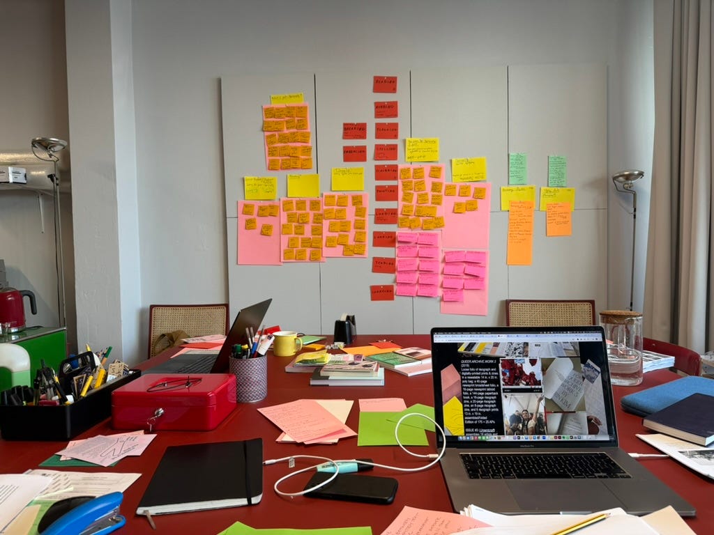
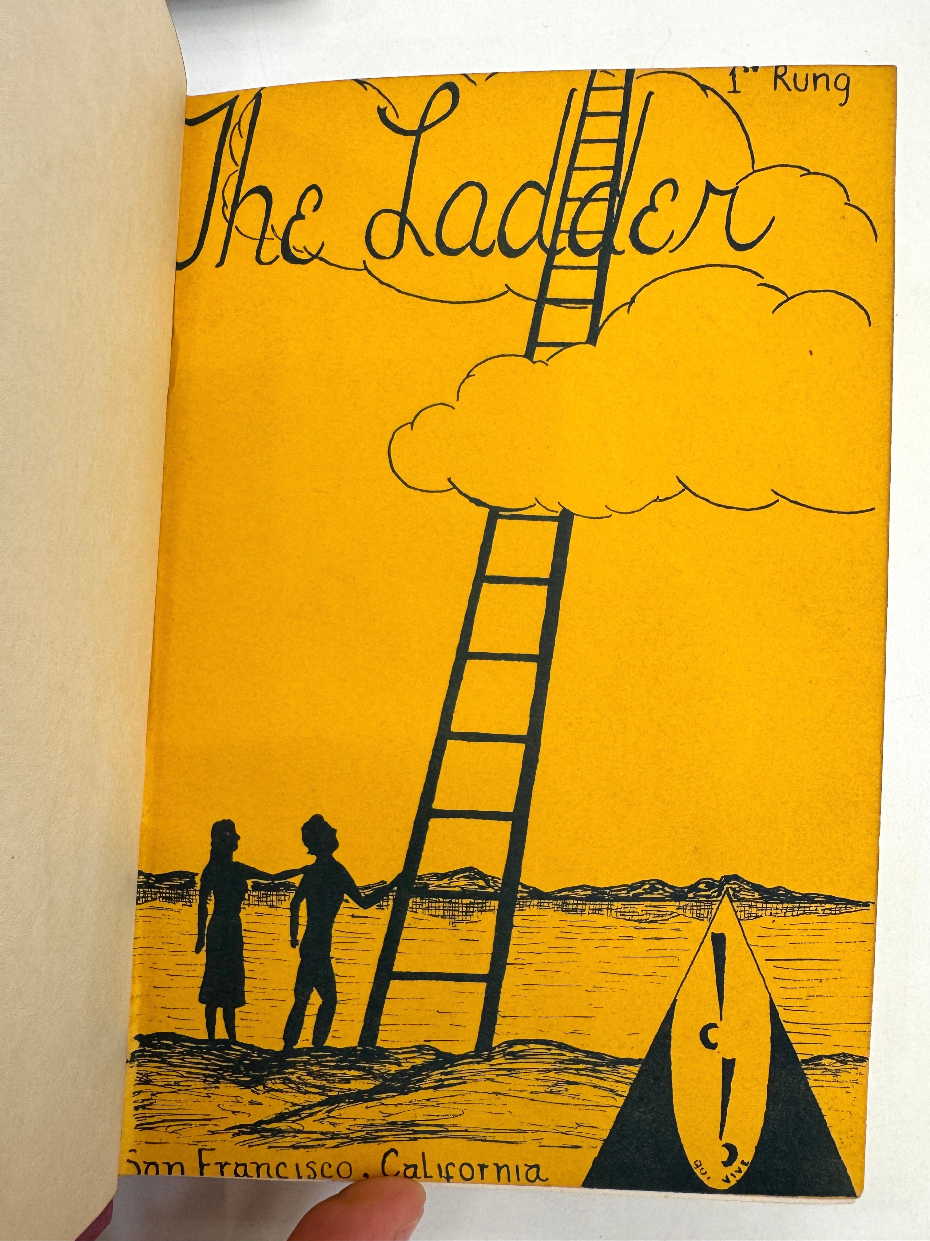
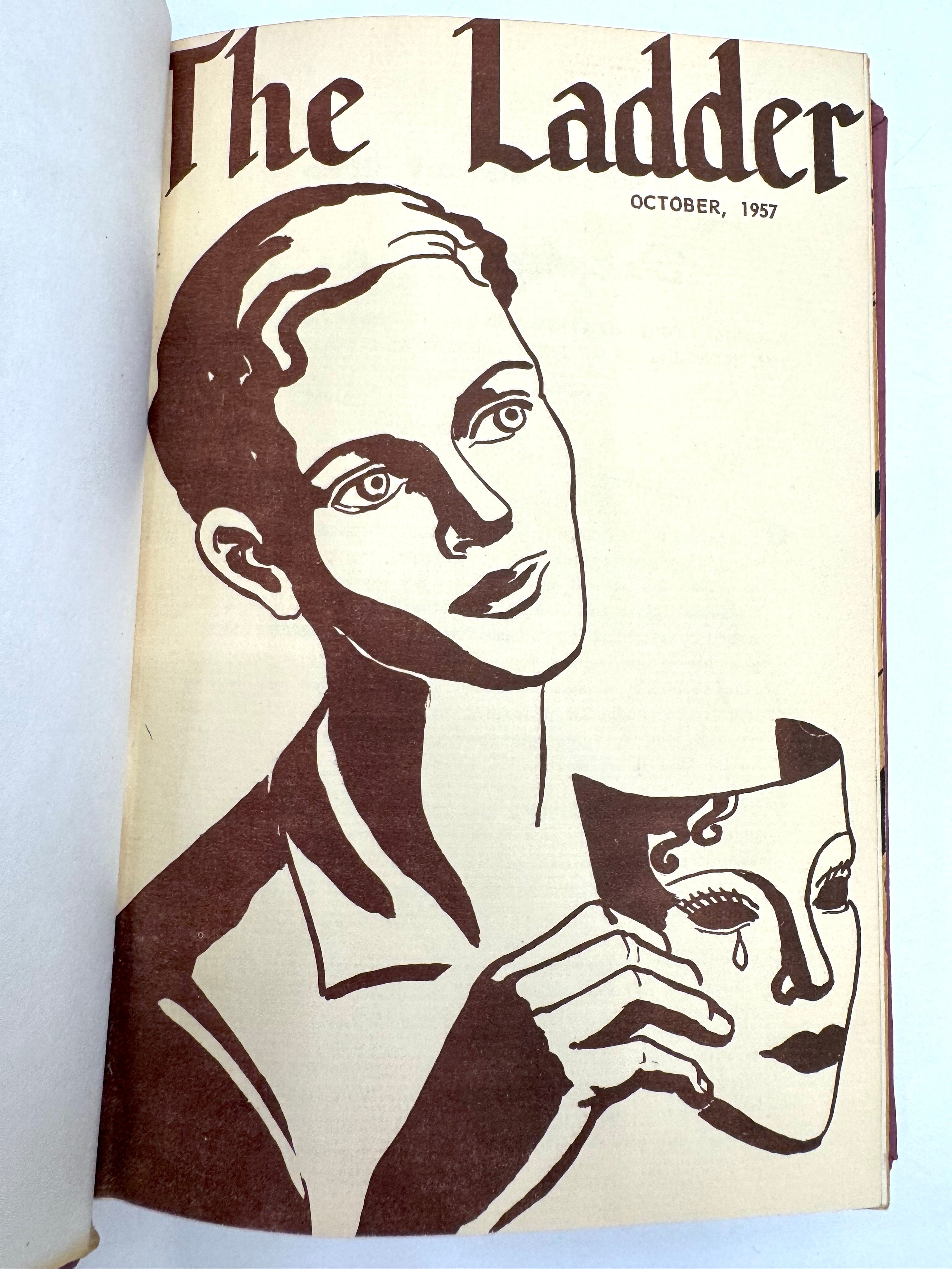
I was in Porto recently to work with Nina Paim, the publisher of Queer Typographies. We were spread out in Nina’s studio on Rua António José da Silva, with manuscript drafts, chapter titles, piles of books, markers, and index cards all over the tables, on the floor, and on the walls. It was such a productive week and we were putting in full days, getting to know each other and shaping this book-to-be! At one point Nina pulled up next to me and I took her through thousands of photos on my computer, sharing images I’d taken of queer publications and ephemera at different archives during the last year. The pics were organized in folders with titles like Come!Unity Press, Kitchen Table, Gay Sunshine, Homeboy, Hippie Dick, Queer Nation, and ACT UP LA. And then we got to The Ladder, the monthly publication of the Daughters of Bilitis (DOB), the first lesbian civil and political rights organization in the US. The first issue of The Ladder was a mimeographed 20-page booklet that appeared in October 1956, and it’s commonly known as the oldest nationally distributed lesbian publication in the US. The first run was 175 copies.
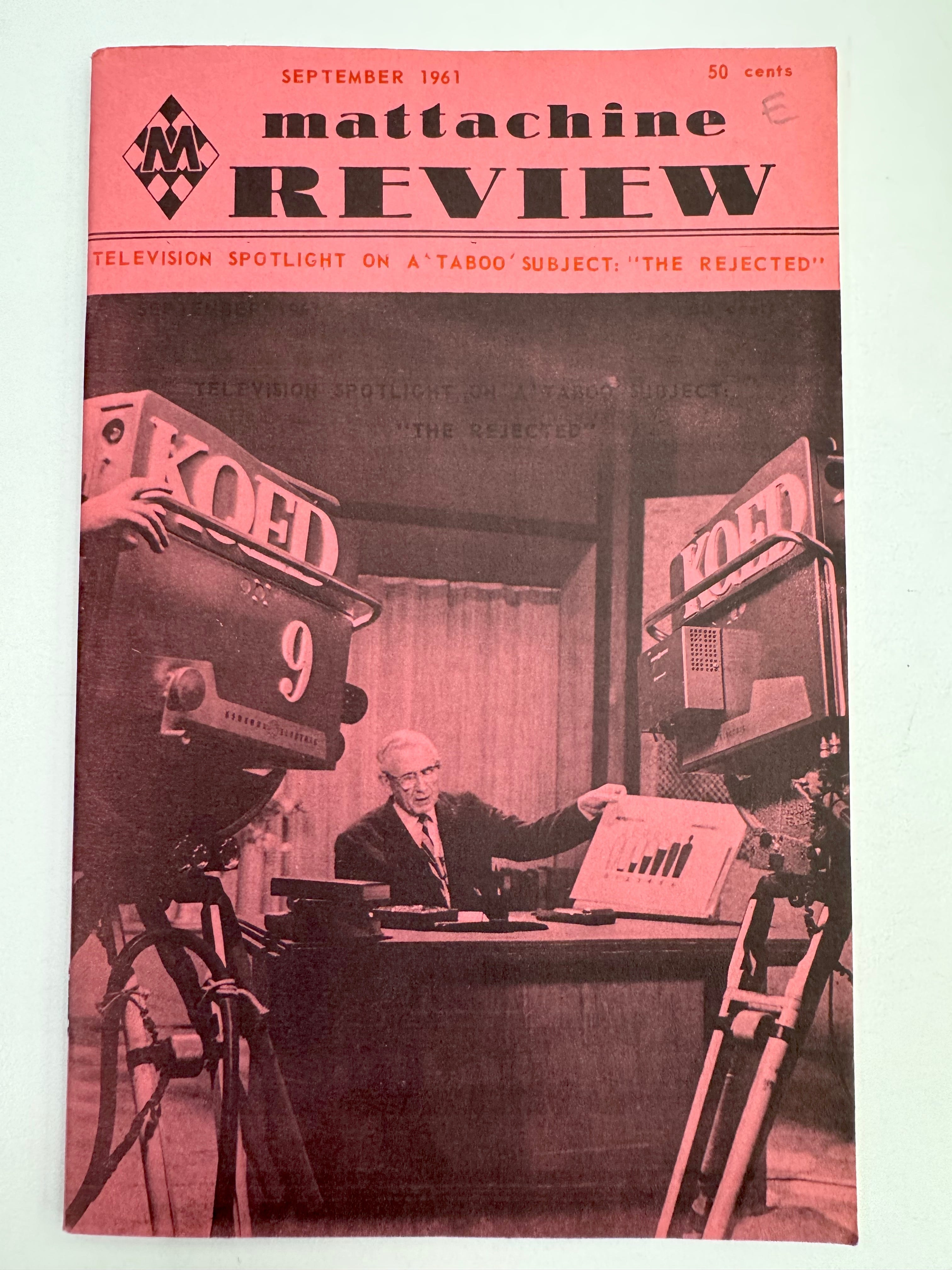
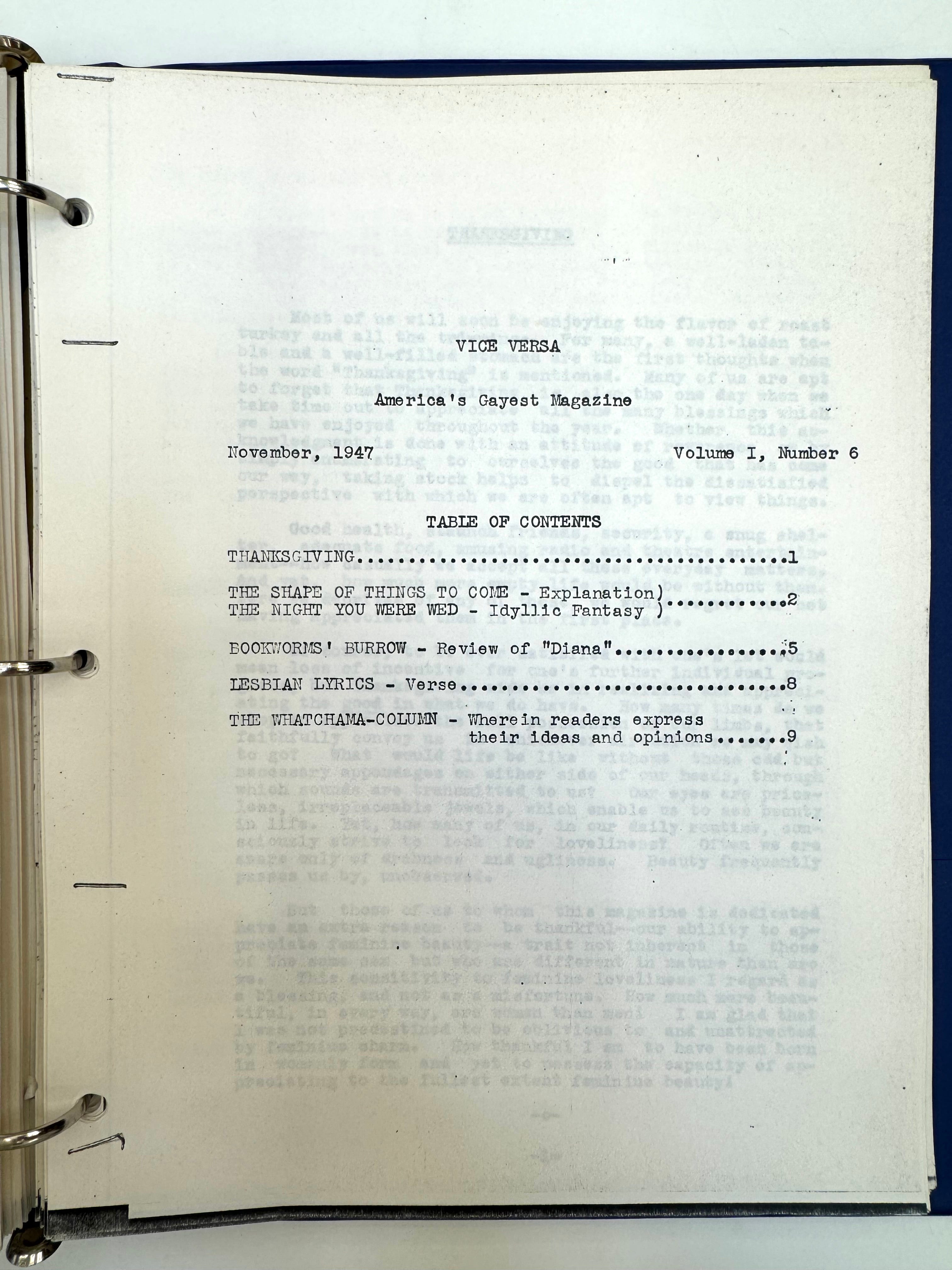
Along with the photos of The Ladder that I’d taken at the ONE Archives in Los Angeles, we looked at other publications that started circulating in the 1940s and 50s, like ONE Magazine and Mattachine Review. These were some of the earliest periodicals of the homophile movement in the US (pre-Stonewall, before it was known as gay liberation or LGBTQIA+ civil rights), including Vice Versa, a lesser-known typed creation by Edythe D. Eyde. Eyde’s pen name was Lisa Ben, a pseudonymous anagram of “lesbian” that she used to publish from June 1947 through February 1948. Vice Versa is so early on the queer publishing timeline that it’s sometimes referred to as the first lesbian periodical in the US, although its circulation was limited; it was distributed locally for free, mostly as a way for Eyde to expand her social circle in Los Angeles (listen to her tell her story in her own words).7 She began by mailing out carbon copies that she typed herself on her office typewriter at RKO Radio Pictures, where she worked as a secretary, and she encouraged the “gay gals” who read it to pass it on to friends when they were finished, rather than discard it. In a regular feature titled “Watchama-Column,” which appeared on the last page of each issue, she imagined and proposed queer futures to her readers. In the September 1947 issue, she wrote:
Perhaps even Vice Versa might be the forerunner of better magazines dedicated to the third sex, which in some future time might take their rightful place on the newsstands beside other publications, to be avail openly and without restriction to those who wish to read them.

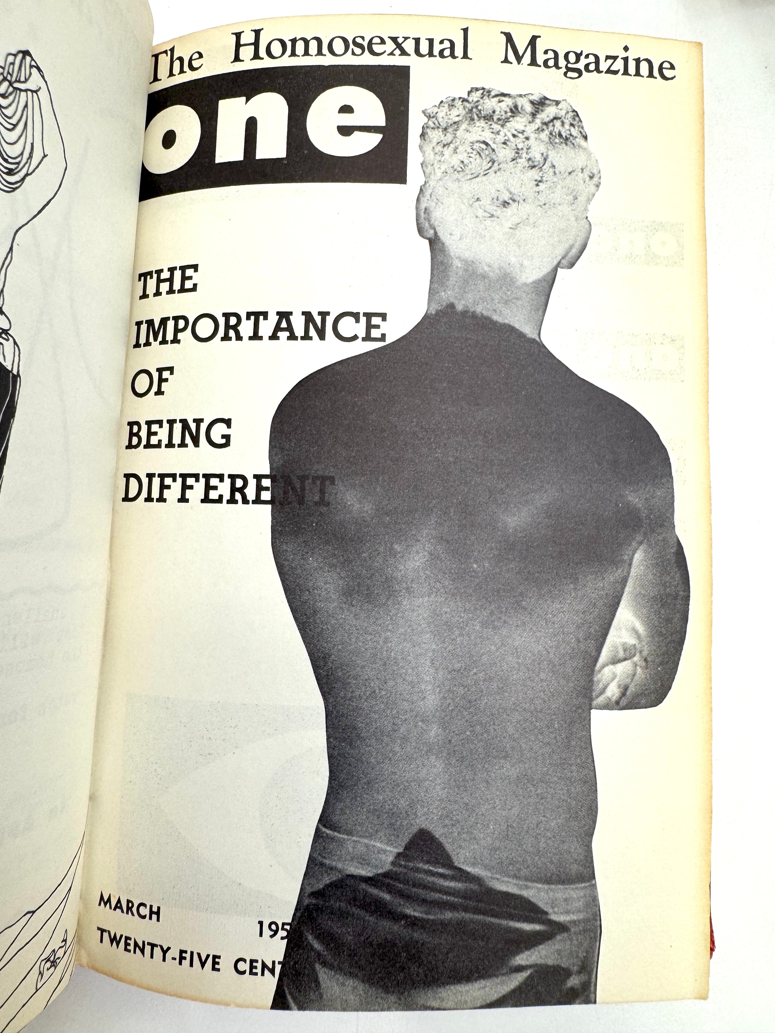
Those restrictions were real. Until 1958, the Comstock Act of 1873 prohibited the circulation of obscene material through the US Mail, so publications like Vice Versa and The Ladder were automatically banned from the mail. To distribute these publications they had to be “illegible,” that is, distributed secretly, by hand, or mailed in plain, unmarked envelopes in order to protect those who were creating, distributing, and reading these publications, who were at great risk personally, professionally, and legally. Eventually, Lisa Ben “stopped distributing copies (of Vice Versa) through the mail early in its run, concerned about the potential dangers of being caught sending a lesbian publication in the mail.”8 Shortly after ONE Magazine began publishing in 1953, it became the target of a harassment campaign by the US Post Office Department (the predecessor of the United States Postal Service) and the Federal Bureau of Investigation (FBI), which declared it lewd, lascivious, and filthy, and therefore un-mailable. One Institute, the publisher of ONE Magazine, challenged the decision and ONE, Inc. v. Olesen was eventually heard by the United States Supreme Court, which reversed a lower court ruling that the publication was obscene, upholding the publisher’s First Amendment protections and therefore allowing it to be mailed. This was a landmark decision and the first Supreme Court ruling to deal with homosexuality; it radically changed the landscape for print material, queer publishing, and the visibility of gay and lesbian life pre-Stonewall.
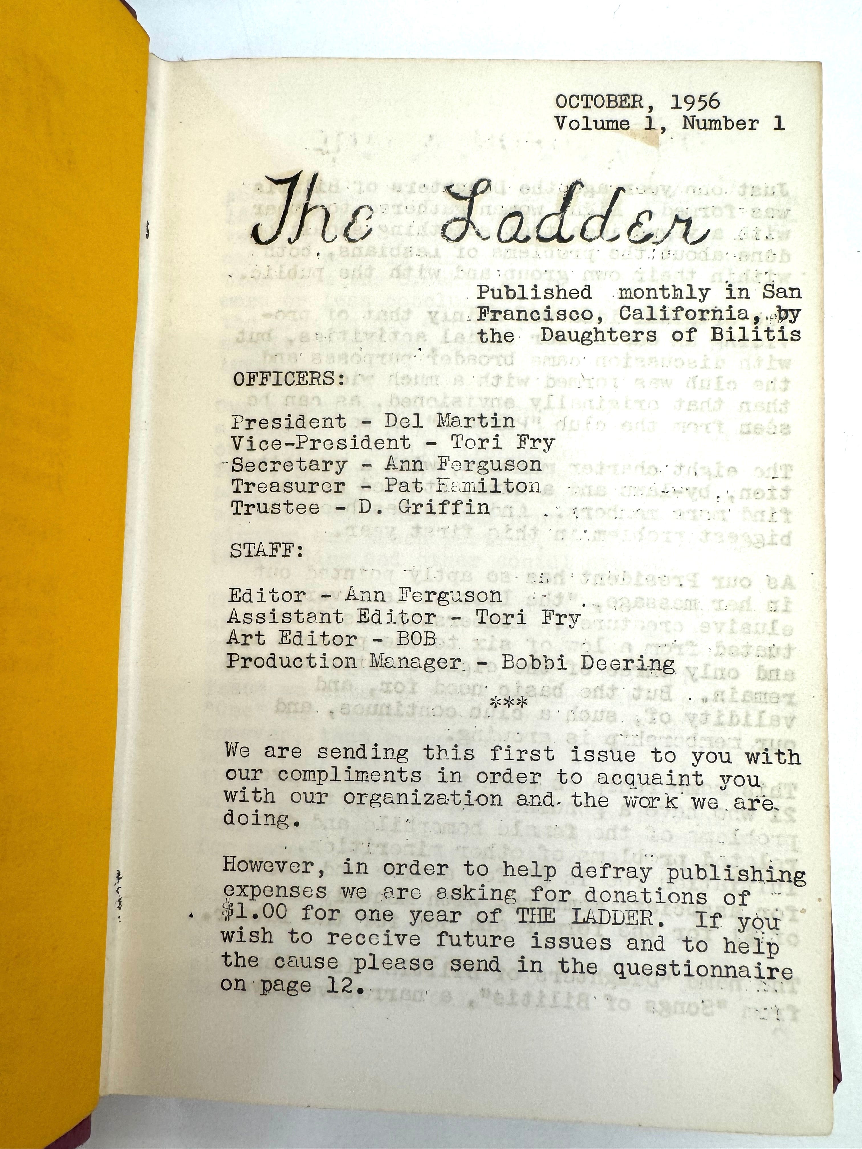
A post on the ONE Archives website states that “in all of the issues of Vice Versa, Lisa Ben herself is never identified by name, pen or otherwise. . . . The need for secrecy was a significant concern for Ben, for the protection of herself and all of the other writers who contributed to the magazine.”9 Even after she stopped publishing Vice Versa, Eyde continued to use the pseudonym, and later published her writing in The Ladder as Lisa Ben. Gay and lesbian editors, writers, and designers operated under the logics of the permeable closet, even after the ONE, Inc. v. Olesen decision. With enormous risk and fear of exposure, readers, writers, and editors of these “openly secret” publications debated the idea of assimilation in their pages, and shared strategies for negotiating visibility in their private and public lives, advocating for more conservative approaches and prioritizing compliance and safety. There was pressure to conform and appear “normal” in relation to heteronormative expectations, and to shape the perception that “we are just like everyone else.” Like Eyde, for safety reasons, many people wrote and edited these publications using initials, pseudonyms, or total anonymity; these were common tactics for protecting one’s identity. In the second issue of The Ladder, the editors addressed the issue of subscribers’ safety directly with a piece titled “Your Name Is Safe!”
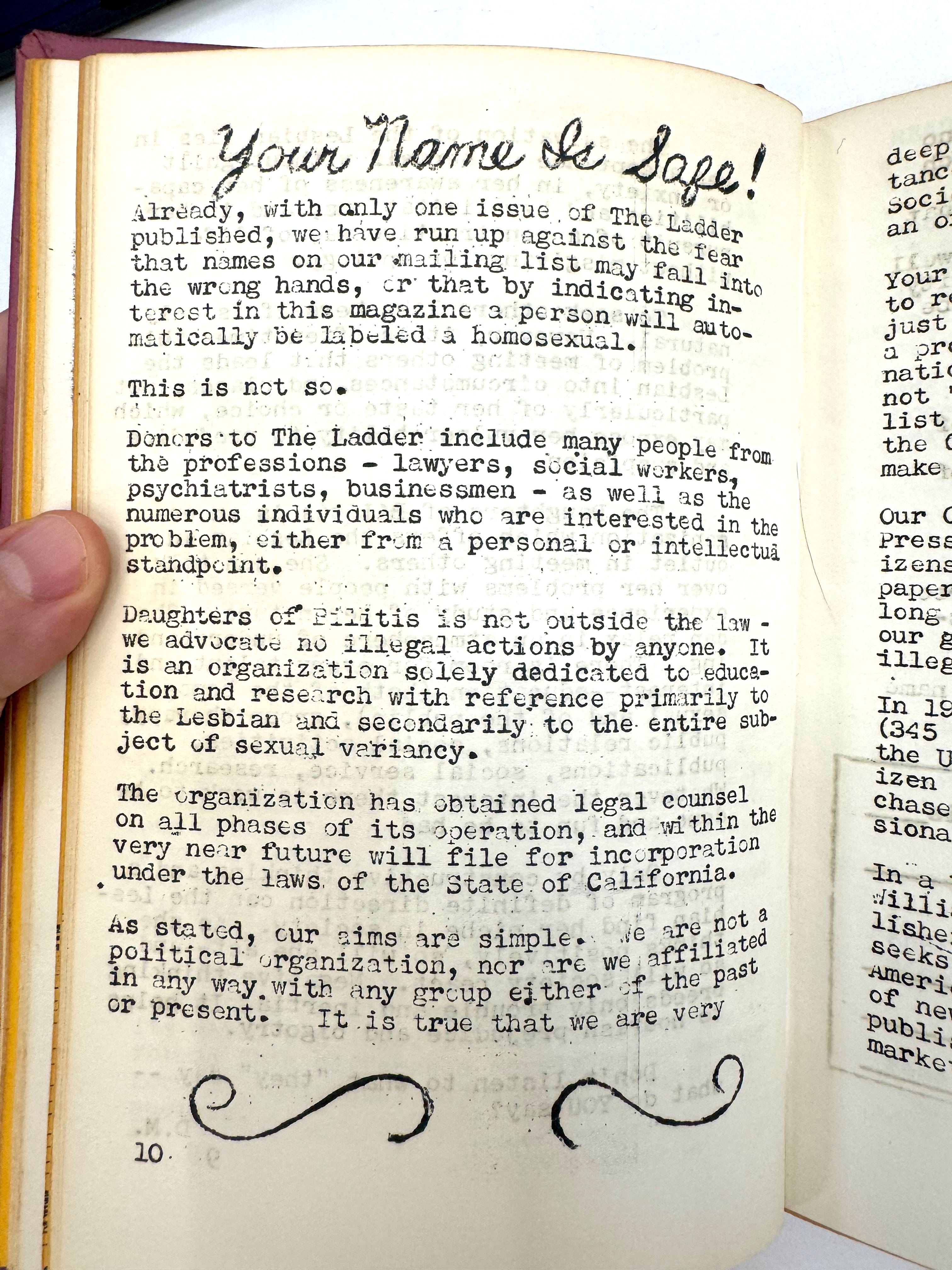
Already, with only one issue of The Ladder published, we have run up against the fear that names on our mailing list may fall into the wrong hands, or that by indicating interest in this magazine a person will automatically be labeled a homosexual.10
Even Phyllis Lyon, one of the founders of The Ladder, edited the first couple of issues under the pseudonym Ann Ferguson. Later, in the fourth issue, Lyon decided to use her real name, and “came out” to readers in a dramatic message.
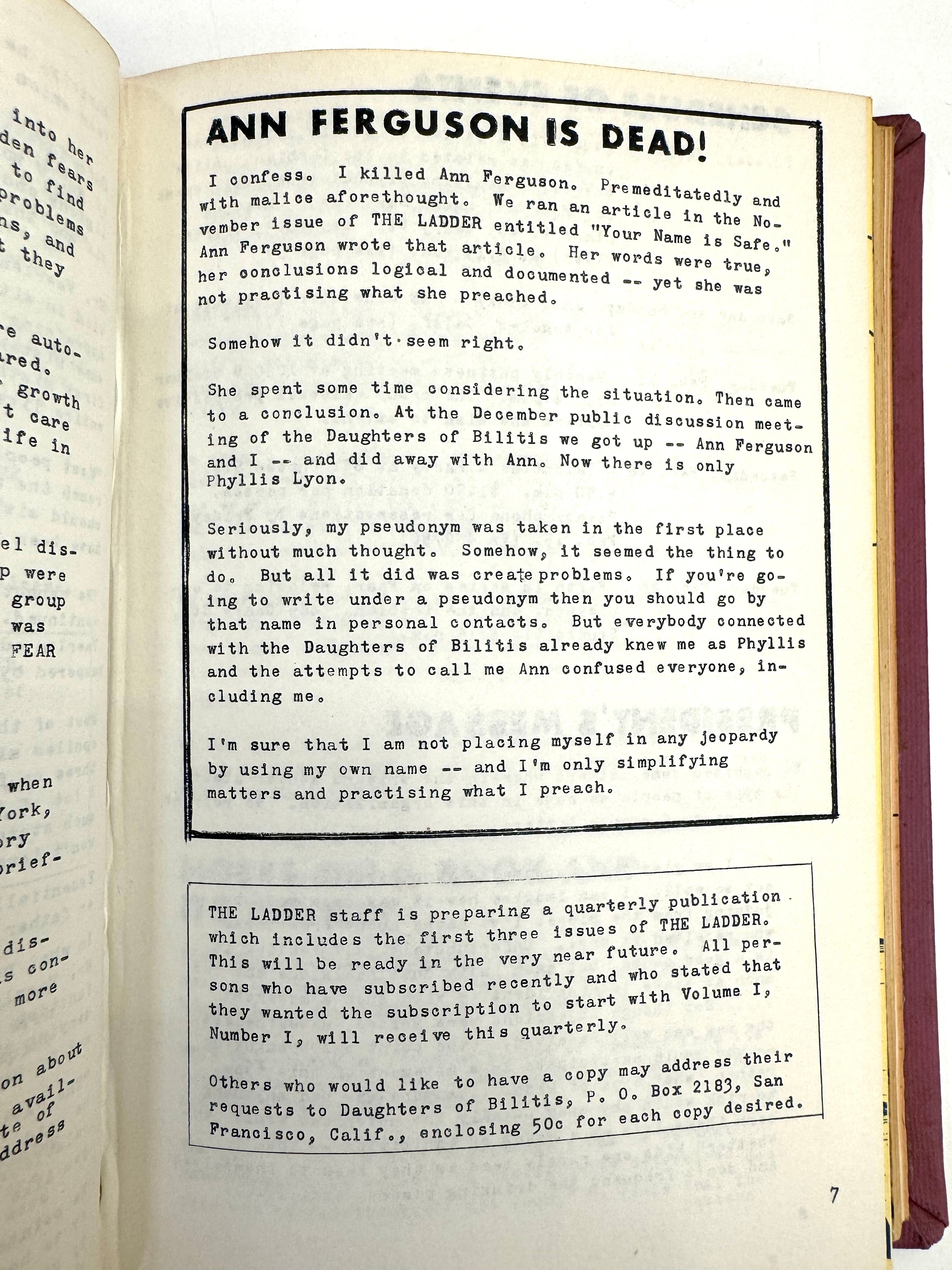
ANN FERGUSON IS DEAD!
I confess. I killed Ann Forguson. Premeditatedly and with malice aforethought. We ran an article in the November issue of THE LADDER entitled “Your Name Is Safe.” Ann Ferguson wrote that article. Her words were true, her conclusions logical and documented—yet she was not practising what she preached.
Somehow it didn’t seem right.
She spent some time considering the situation. Then came to a conclusion. At the December public discussion meeting of the Daughters of Bilitis we got up—Ann Ferguson and I—and did away with Ann. Now there is only Phyllis Lyon.
Seriously, my pseudonym was taken in the first place without much thought. Somehow, it seemed the thing to do. But all it did was create problems. If you’re going to write under a pseudonym then you should go by that name in personal contacts. But everybody connected with the Daughters of Bilitis already knew me as Phyllis and the attempts to call me Ann confused everyone, including me.
I’m sure that I am not placing myself in any jeopardy by using my own name—and I’m only simplifying matters and practising what I preach.11
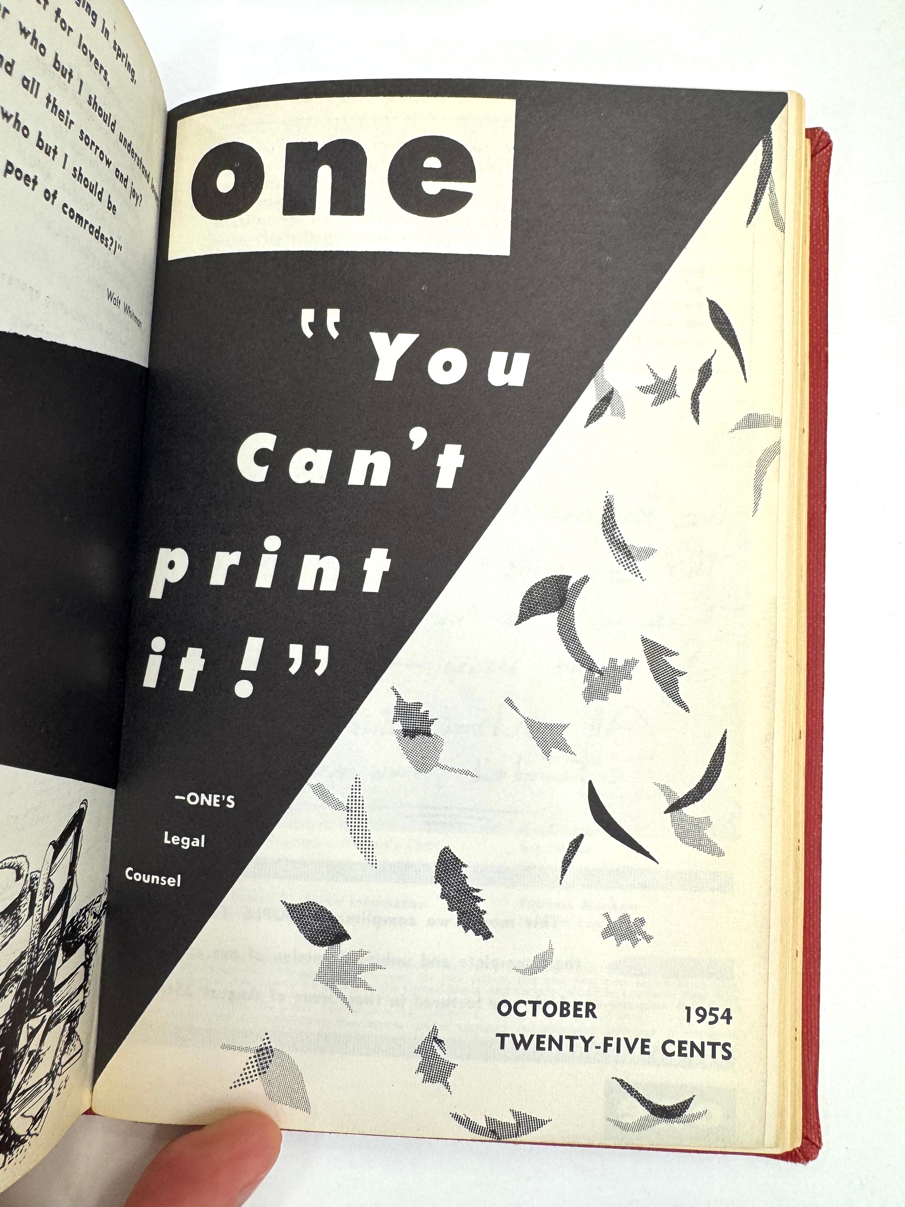
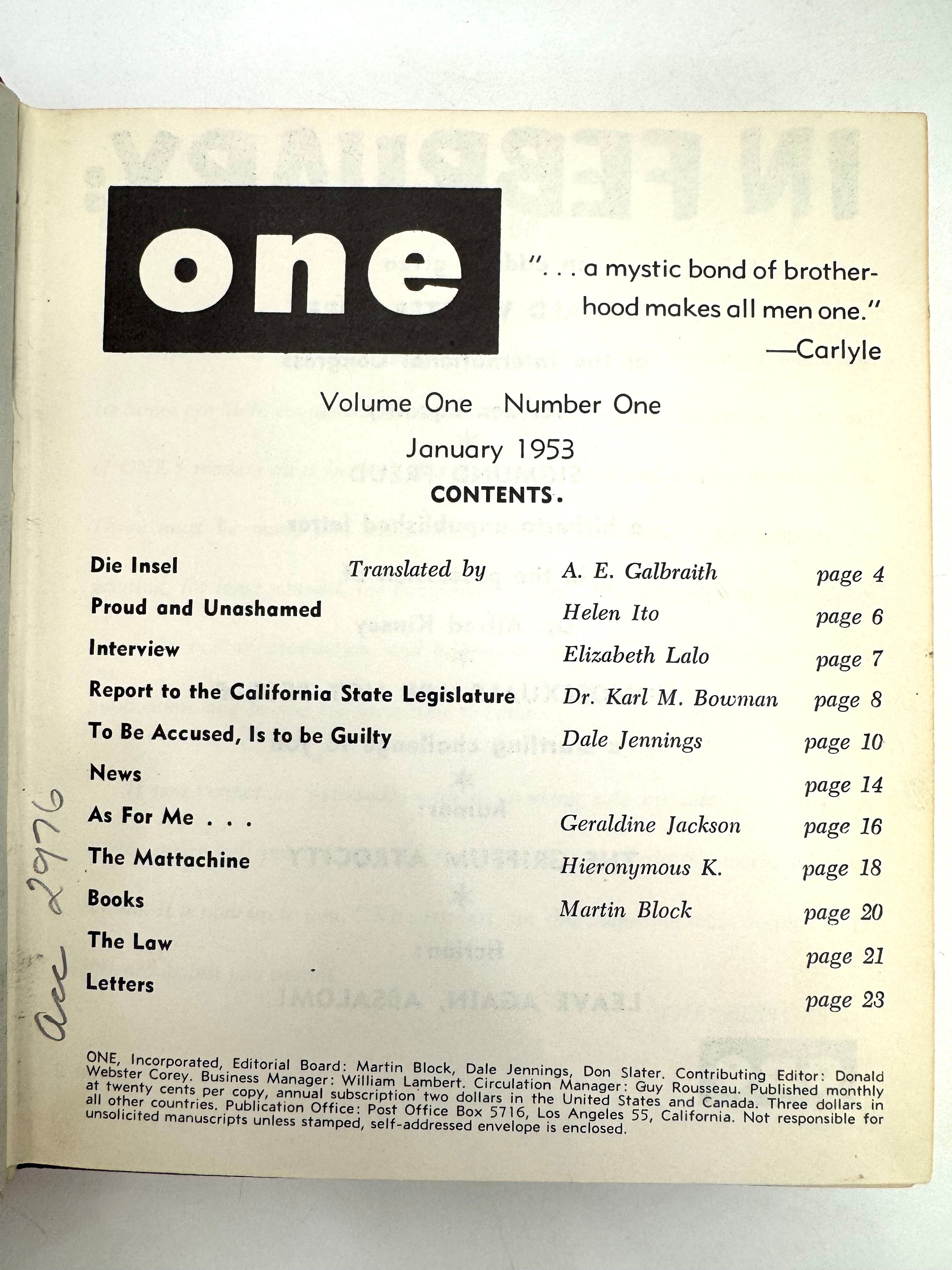
This process of carefully negotiating visibility by manipulating one’s name and appearance was a constant, unforgiving reality, and the logic of the permeable closet extended to the look and feel of these publications as well. Looking at the evolution of the design of both The Ladder and ONE Magazine into the 1960s, the visual techniques common to both could be characterized as compliant—a straightforward, normalized use of graphic design, typography, imagery, and language, especially on the front and back covers, which carried the most potential for exposure as the periodicals circulated. The design language of these magazines was fairly conventional for the time, making use of modern, “universal” typography, especially in ONE Magazine, which launched in January 1953 with a cover headline that read: “TO BE ACCUSED, IS TO BE GUILTY.” ONE Magazine was professionally typeset from the very start, with the lowercase “one” logo and all-uppercase headlines in the first few issues set in respectable Futura, designed by Paul Renner in 1927 and marketed by Bauer in Germany and in the US as “the typeface of today and tomorrow.”
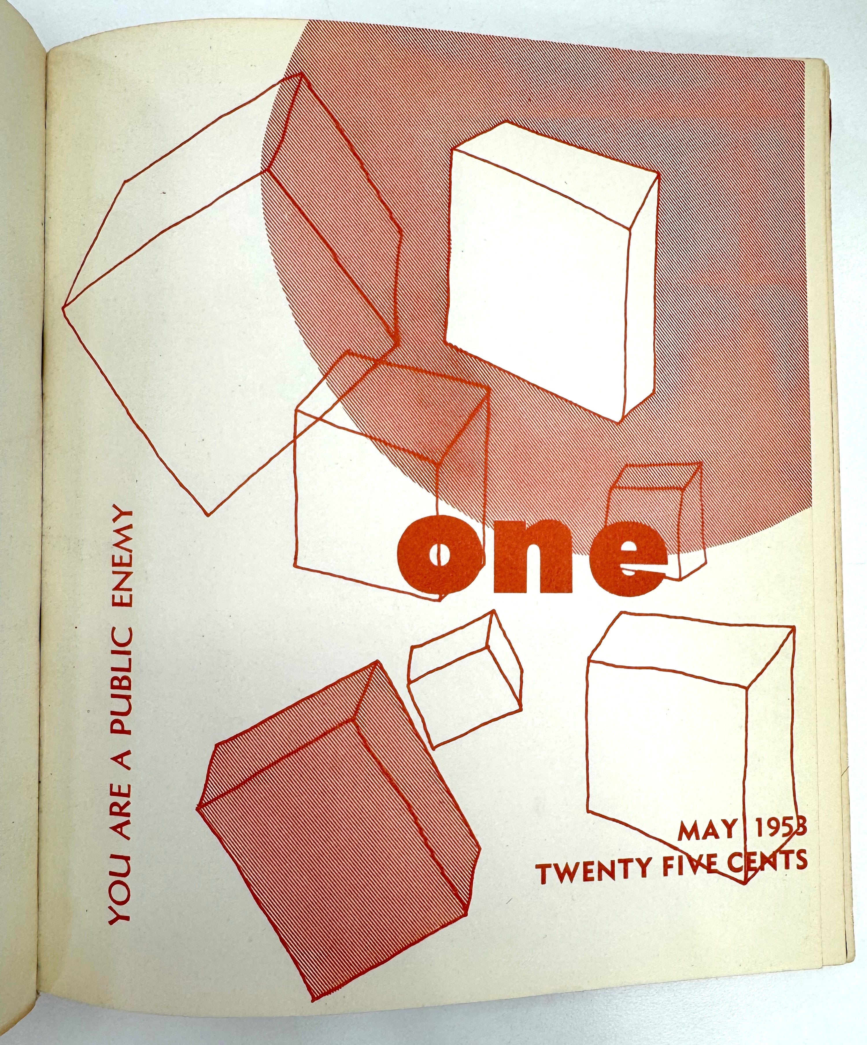
At the same time, this withholding of anything that might attract unwanted attention, or be read as wayward or irregular, controversial, or even just homosexual at all, was countered by carefully encoded signals that were meant to pass through the compliant silence, and permeate the seemingly opaque boundaries of the closet, to reach their intended audience. For every instance of perfectly set Futura, a quirky hand-drawn illustration or hand-lettered message would surprise with unexpected energy and difference.
For those who were “on the lookout,” these clues were like an unspoken agreement, a secret knowledge that skillfully communicated gay and lesbian knowability and belonging within a broader strategy of concealment, like the line “a mystic bond of brotherhood makes all men one” that appeared on the very first page of ONE, Volume 1, Number 1.
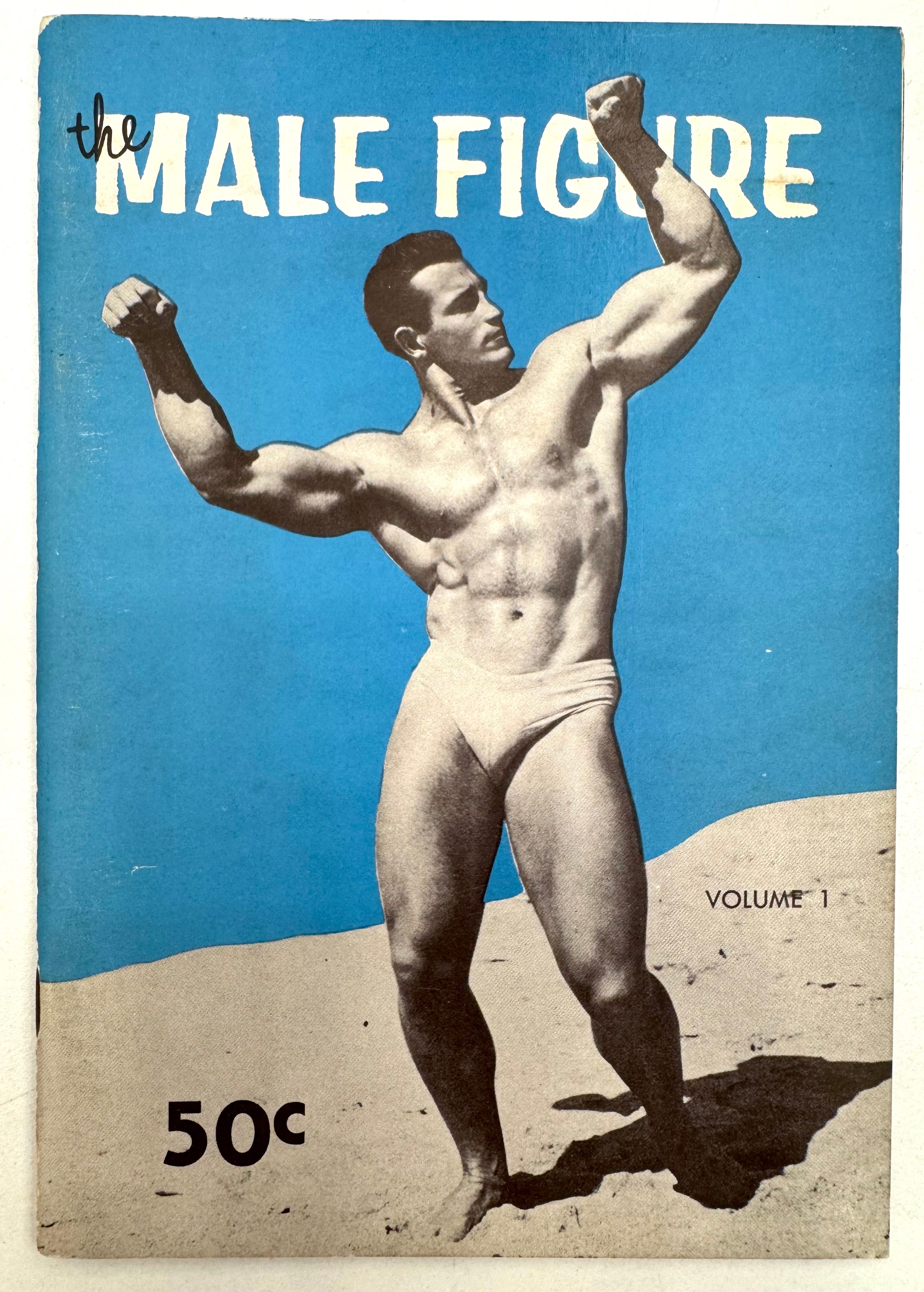
Physique magazines operated under the same kinds of dual-coded, open secret logics, legible as homosexual material for those in the know, but at the same time passing opaquely as art, health, or sports-related material for those who weren’t, or, more importantly, for those who needed to feign ignorance. These signals served as powerful bonds from publisher to reader to reader and back to publisher again—a survival network of knowledge, safety, and trust that formed around the circulation of these publications, which were skillfully designed both to conceal and to reveal. Looking back at them now, they show us how legibility at every level—from community to person to publication to page—was being navigated under the immense pressures of fear, ignorance, entrapment, and hatred, and how gay and lesbian self-consciousness gradually came into existence in isolation, with limited resources and great risk.
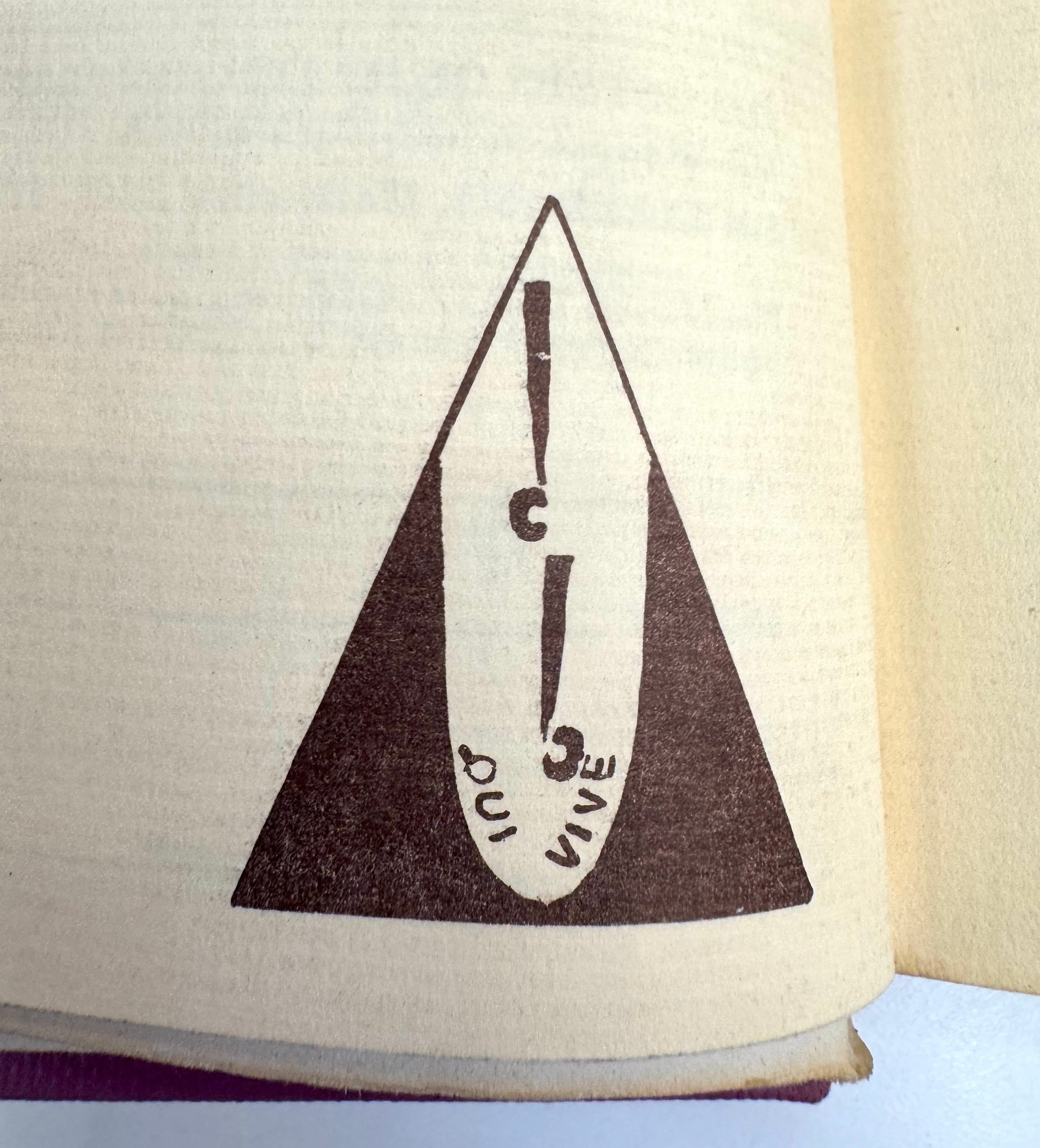
One such signal was an emblem that appeared on the back cover of each issue of The Ladder. It was the logo for the Daughters of Bilitis, a graphic triangle containing a stylized “d b” above the phrase “QUI VIVE,” meaning “to be alert, to be vigilant.” Qui vive was an old French expression originating in the protection of guarded boundaries, used by sentinels to address approaching strangers. The sentinel would call out “Qui vive?”—“[Long] lives who?”—with the correct reply being, “Long live the king!” It was a way to test allegiance and the correct response enabled safe passage through the protected barrier. It’s this message to be “on the lookout” that was used to address the readers of The Ladder in several registers, both as an invitation (“who’s here? who may pass?”) and a warning (“watch out!”). There may have been an embodied or sexual dimension implied as well, when considering the protection of personal physical boundaries and who might be invited closer or warned to stay away.
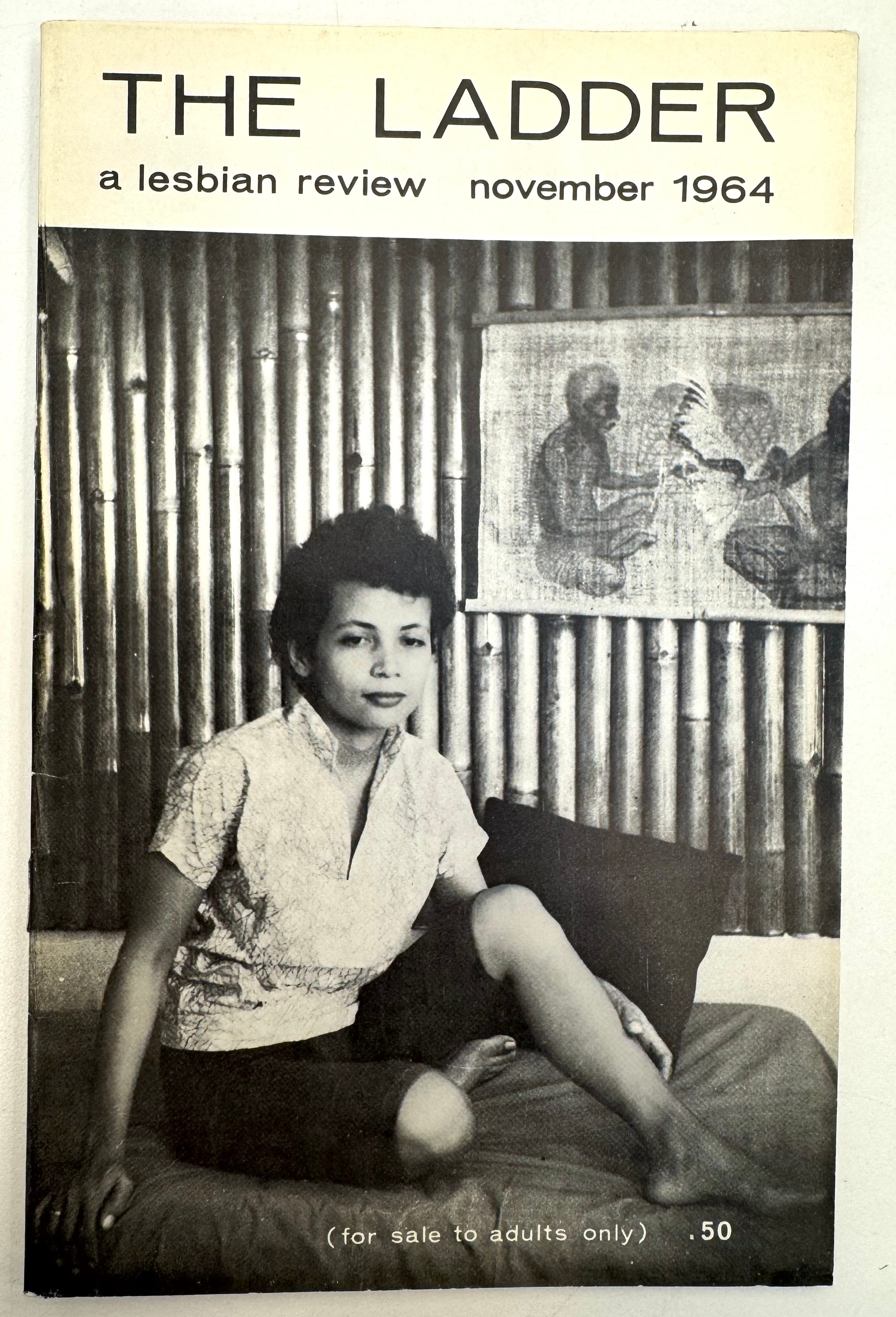
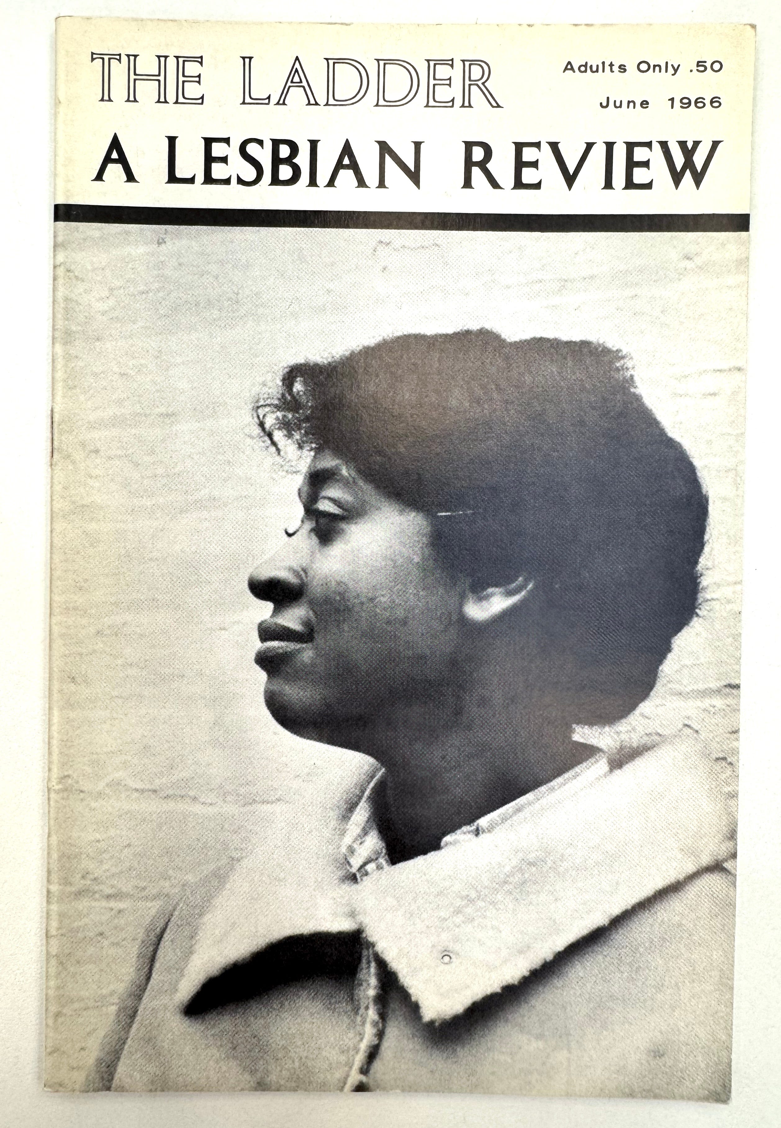
While the general design strategies for The Ladder and ONE Magazine and other publications of the time were reserved in comparison to what was coming in the 1970s, they weren’t dull visually, and they sometimes took great risks. By the end of its first year, ONE Magazine had started displaying the tagline “The Homosexual Magazine” on its cover, although The Ladder wouldn’t add the phrase “A Lesbian Review” to its covers until a change in leadership later on, when the new editor Barbara Gittings introduced a more politically urgent tone. In the 1960s, the publication started to break away from its tradition of abstracting the identities of the women they depicted in illustrations and photographs, and began to feature identifiable names and likenesses. The first was Ger van B., a woman who wrote to The Ladder from Indonesia in June 1964 to describe her isolation (“Isolation in Indonesia”), and who was then photographed for the November cover to accompany her writing in the issue; an appeal to donate lesbian-related books to be sent to Ger was also included. In 1966, The Ladder featured Ernestine Eckstein on its June cover, along with an 8-page interview detailing her work as a Black lesbian activist, known for being the only woman who participated in an early gay rights demonstration at the White House in October 1965. Eckstein was born Ernestine Delois Eppenger, but used the pseudonym Eckstein in her activism, as protection.
In Epistemology of the Closet, Eve Kosofsky Sedgwick wrote that “‘closetedness’ itself is a performance initiated as such by the speech act of a silence—not a particular silence, but a silence that accrues particularity by fits and starts, in relation to the discourse that surrounds and differentially constitutes it.”12 Sedgwick proposed the closet as a fluid structure of variable knowledges, a space where it’s possible to speak in different registers of silence, to be both in and out simultaneously. In these early homophile publications, the ways in which design, imagery, editorial content, authorship, privacy, consent, and safety were negotiated was never a fixed or stable condition, but a constantly re-drawn map along fluctuating axes between transparency and opacity, silence and speaking, knowing and not-knowing. In the “open secret” logic of the permeable closet, concealment was never just pure silence or simple opacity but a flickering performance of changing identities, variable registers, and a switching of codes, languages, and behaviors in order to protect, conceal, reveal, and locate community. These were urgent, wayward skills for maintaining agency and control under the matrix of domination, and they were strikingly apparent in these early gay and lesbian publications.
Sedgwick invoked the French philosopher Michel Foucault in her concept of relational silence as a framework for the closet. I think it’s helpful to go back to study the full thought, where Foucault wrote about silence as a non-binary state, rather than a fixed condition. It gives us a lot to work with as a kind of logic of the closet when considering how voice and legibility might work in queer design:
Silence itself—the things one declines to say, or is forbidden to name, the discretion that is required between different speakers—is less the absolute limit of discourse, the other side from which it is separated by a strict boundary, than an element that functions alongside the things said, with them and in relation to them within over-all strategies. There is no binary division to be made between what one says and what one does not say; we must try to determine the different ways of not saying such things, how those who can and those who cannot speak of them are distributed, which type of discourse is authorized, or which form of discretion is required in either case. There is not one but many silences, and they are an integral part of the strategies that underlie and permeate discourses.13
It’s this forum of “not one but many silences . . . that underlie and permeate discourses” that carries us deeper into the timeline. We’re back in Porto, and while I’m taking Nina through these photographs of The Ladder and ONE Magazine, discussing legibility and the logics of closet, she suddenly mentions Beatrice Warde.
“Didn’t she also write with a pseudonym?”
Warde died in 1969, three months after the Stonewall riots. Her obituary read: “Mrs Beatrice Warde, First Lady of Typography.”14 She was also referred to as “Queen of Type,” “High Priestess of the Classical Typographical Renaissance,” the “Leading Lady of Print,” and “Your Royal Uniqueness.”15 These femme-coded titles accumulated by Warde are worth examining, if not simply to understand her reputation as the most-cited typographic scholar in the western graphic design canon, but also to trace how gender itself was used (by her and others) to shape her reputation.
At the start of her career, Warde presented herself more ambiguously. Early on, in a letter to her mother, she wrote,
I have still to choose my pseudonym under which my Life Work will be done. Reputation made, etc… It won’t be a woman’s name anyway.16
Warde began writing as “Paul Beaujon” in 1926.
Nobody at that time had any idea that a woman could possibly know anything about printing, typography and such like. So the name Paul Beaujon was invented to conceal the personality of the actual writer.17

It was a name change and a play of gender that she performed in order to gain legitimacy in the British printing industry—to publish her scholarly research, and eventually to be hired by Monotype in 1927 as the editor of The Monotype Recorder (first as Beaujon, and then as Warde). Later, she was promoted to publicity manager at Monotype, a position she retained until 1960. Loraine Furter notes the remarkable parallels between Warde’s famous theory of “invisible type” and the cross-dressing disguise she was compelled to take on in order to disappear:
It is the position imposed on women in the whole history of typography. If she asks the designer to be invisible, one can’t help but notice the parallels to her early career, where she could only succeed by hiding her identity. Did Beatrice Ward ever really leave Paul Beaujon behind?18

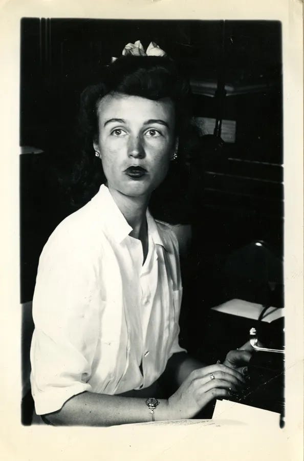
Indeed, it wasn’t just the name. Warde created a persona for Paul Beaujon that included a visual appearance and a history. “Before presenting Beaujon to the printing industry, Warde tried out this identity with an article in an architecture journal, a sufficiently separate environment so that should she be uncomfortable with Beaujon’s presentation, she would be ‘out of sight’ of the printing industry.”19 Remarkably, this first test appearance of Paul Beaujon in Modern Building Construction included a photograph of Warde herself, depicting her as a New Woman in an image that appeared below her pseudonym,
ambiguously gendered or a mixture of feminine and masculine . . . Her gender-bending constituted a profound declaration of this figure’s transgressive nature and inherent modernity.20
Warde never combined the New Woman visual with the Paul Beaujon name again, beyond this initial test, at least not publicly, but the Beaujon character did evolve—into a mature French grandfather with a beard:
No other images of Beaujon have been found and it is likely that Warde perceived her modern image unsuited to the traditional nature of the industry. This decision may have led to the development of Beaujon’s backstory, supporting a masculine presentation. Created to build credibility, Warde developed a background for Beaujon, who was said to be a mature Frenchman, have a ‘long grey beard, four grandchildren, a great interest in antique furniture and a rather vague address in Montparnasse.’21
Warde shaped, tested, and adjusted her persona, likeness, and voice in order to advance through the patriarchal conditions of the British printing industry. Was this a “clarity of transmission” or a survival strategy? Warde’s ideas about legibility are complicated when set against the backdrop of her own actions and the ways in which she aligned her success along heteropatriarchy’s terms. Camille Circlude suggests that “it’s a safe bet that Beatrice Warde would also have dismissed today’s queer, camp, kitsch, and post-binary typographic aesthetics with a wave of the hand.”22
There’s much more to be discovered about Warde’s crafting of Paul Beaujon in Jessica Glaser’s recent research, which concludes that Warde’s expertise in public relations, and the promotion of her writing through her performance of gender and the adoption of multiple identities—rather than what she wrote—is how she established her position and status as the First Lady of Typography in a male-dominated industry.
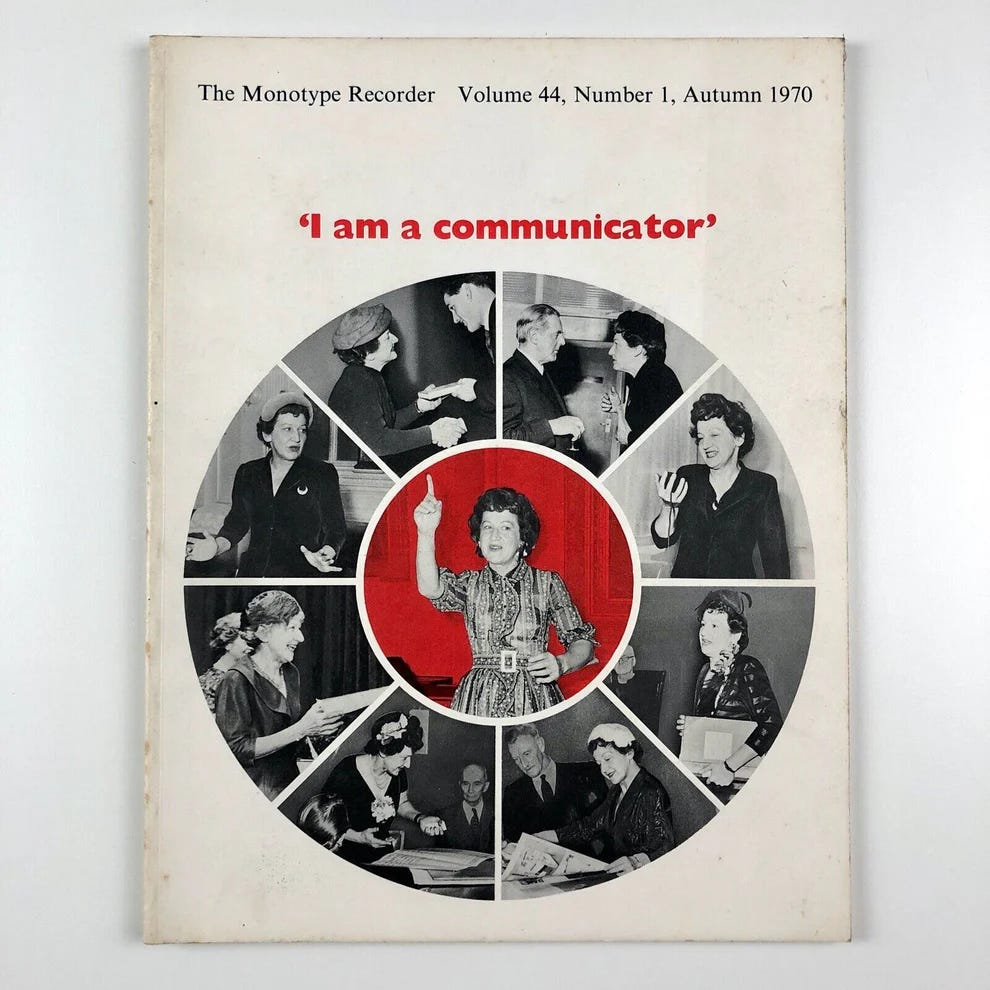
Gender was not her only tactic; Warde also constructed different personas to create her success, whether as an aged French printing historian, as a charismatic American expatriate in London, an artist’s muse and model, or through the multiple characters—consciously clothed and carefully curated— that she assumed for her public engagements. Through her experience in public relations, Warde knew how to construct and convey her multiple identities to her audiences using all available media, including writing, publishing, photography—and other forms of image-making—public speaking, and radio broadcasting, leading her to declare ‘I am a communicator.’23
I really want to consider this revelation about Warde’s legacy in relation to Monotype, her employer of 30 years, and the company’s growing legacy since, as the behemoth of the type industry. Monotype was valued at $825 million at the time of its acquisition by HGGC, a private equity firm, in 2019. Today, the company releases sophisticated marketing materials that shape the global market for thousands of type designers and typographers, with tools and acquisition strategies that attempt to reduce the diversity of the field into a single vision for profit. Their 2025 Monotype Trend Report is fascinating to consider against the trajectory of Warde’s public relations experiments of the 20st century; it displays the evolution of a perverse logics of success that perfectly mirrors the values of neoliberalism today: extraction, exploitation, and expansion, packaged in feel-good benevolence. There’s much more to be said about this, perhaps in a different post.
Eventually, Warde came out and continued to write as “Beatrice Warde” for the rest of her career, carefully building her persona and branding her expertise with the femme-coded distinction that has since defined her. And like Phyllis Lyon’s killing of Ann Ferguson within the pages of The Ladder, Warde later made a public acknowledgement of Beaujon (without totally killing him off). In the introduction to her 1955 book of essays, The Crystal Goblet: Sixteen Essays on Typography, she wrote that there was a “grieving over the disappearance from title-pages of the name of Paul Beaujon,” and that he hadn’t “committed suicide” in order to “free B.W.” to do her work at Monotype, but that he would return years later to continue to his research at the British Museum. She was leaving her options open.
I struggle to consider Warde’s dictum of “printing should be invisible”—or any other idealization or universalization of design—without first acknowledging the variable personas, languages, codes, and modes of communication used by LGBTQIA+, disabled, immigrant, people of color, and others who are systematically criminalized and targeted under domination. For those who are encouraged to go unnoticed or otherwise shaped, neglected, or erased within the surveillant structures of heteropatriarchy, neutrality is never an option. This changes the terms of design for all of us. The techniques necessary for operating—designing, editing, authoring, publishing, promoting, living—under oppression might include refusal, variability, confrontation, fluidity, modulation, simultaneity, and encoding; they enable us to question the given terms of visibility and to re-think safety and survival; to know that invisibility, silence, secrecy, and transparency are never just one-sided limits; and that the closet is never fully sealed. Thinking through the criss-crossing multi-dimensional realities of “transmission of thought” and “spreading the word” in early queer publishing, more often than not, the axes of Warde’s invisibility/opacity and silence/signal models fold up into each other and disintegrate, giving way to a real plurality of legibilities that’s necessary for survival. Within some forms of visibility, a kind of clarity would emerge from ambiguity. Within some registers of silence, a kind of knowing would emerge from not-knowing. Later on, in the fierce explosion of queer and trans publishing that was to come in the 1970s and 80s, these types of hybrid tactics really flourished, and newer, less familiar, and more joyful approaches to design, language, and typography stretched legibility into even more varied dimensions.
Beatrice Warde, “Printing Should Be Invisible,” an address before the British Typographers’ Guild at St. Bride’s Institute, London, 1932; the more widely known version circulated in print later on, titled “The Crystal Goblet, or Printing Should be Invisible,” published in Warde’s collection of essays, The Crystal Goblet: Sixteen Essays on Typography, London: The Sylvan Press, 1955.
Jen Wang, “Now You See It: Helvetica, Modernism and the Status Quo of Design,” 2016.
Warde, “The Crystal Goblet,” 1955, p.13.
Beatrice Warde / Paul Beaujon, “On the Choice of Typefaces,” The Monotype Recorder, Volume 32, New Series No. 1, Spring 1933, p.6.
Édouard Glissant, “For Opacity,” Poetics of Relation, trans. Betsy Wing, Ann Arbor: The University of Michigan Press, 1997, p.191.
Michel Foucault, The History of Sexuality, Volume 1: An Introduction, trans. Robert Hurley, New York: Pantheon, 1978, p.27.
“Edythe Eyde aka Lisa Ben,” Making Gay History podcast, Season 1, Episode 3, date unknown.
“Vice Versa at RKO Studios,” ONE Archives website, November 2018.
“Vice Versa at RKO Studios,” 2018.
The Ladder, Volume 1, Issue 2, November 1956, page 10.
The Ladder, Volume 1, Issue 4, January 1957, page 7.
Eve Kosofsky Sedgwick, Epistemology of the Closet, University of California Press, 1990, p.3.
Foucault, p.27.
The Times, September 1969.
Jessica Glaser, In search of the First Lady of Typography: A reappraisal of Beatrice Warde, thesis dissertation, Birmingham City University, January 2024, p.2.
Shelley Gruendler, The Life and Work of Beatrice Warde, unpublished thesis, University of Reading, Department of Typography & Graphic Communication, 2005, p.73. Warde was writing to her mother Lamberton Becker in 1926. [Cited in Glaser, 2024, p.215.]
Gruendler, 2005, p.73. [Cited in Glaser, 2024, p.215.]
Loraine Furter, “Crystal Clear,” 2020.
Glaser, 2024, p.216.
E. Otto, and V. Rocco, eds., The New Woman International: Representations in Photography and Film from the 1870s through the 1960s (Ann Arbor: University of Michigan Press, 2012), p.7. [Cited in Glaser, 2024, p.218.]
Dreyfus, ‘Beatrice Warde, ‘The First Lady of Typography’, p.74. [Cited in Glaser, 2024, p.218.]
Camille Circlude, La Typographie post-binaire, Éditions B42, 2023, p.113.
Glaser, 2024, p.315.