
The typographic irregular
On the queer use* of type in fascist times

*I’m indebted to Sara Ahmed for their work around the idea of queer use, and to Nina Paim for pointing me towards that work.
Shortcomings
I’m less interested in how *it* actually happened, and all that’s been speculated—who’s to blame, whether it was intentional, if a designer was involved, which software was used. I’m more intrigued by the typographic error and its effects. What is the capacity of the “mistake” to stir things up? I’m trying to stay with the unexpected feelings here, in the face of hegemonic power, because domination is everywhere. A mistake of this magnitude is serious because it alters one of the most visible representations of patriarchal power. If it doesn’t get replaced, this inscription marking the tomb of Pope Francis, leader of the Catholic Church from 2013 until his death in 2025, with its unevenly spaced letterforms engraved in Times New Roman (or something close to it), will live on for eternity.
Irregular spacing (bad kerning, no kerning) is all around us, unnoticeable to most. For others, it’s an atrocity, associated with ignorance of craft or lack of training, although this is changing. As typesetting tools evolve from highly specialized to commonplace and popular, our collective tolerance for “non-professional” typography is increasing. At the same time, students in design school are taught to develop a refined capacity to see what others can’t, beyond the amateur-ish, to identify typographic standards and irregularities, and to design subtle arrangements of letterforms to produce a smooth, uninterrupted read. They learn that when spacing is “perfect,” it’s invisible, allowing content to be read directly and with the greatest impact.
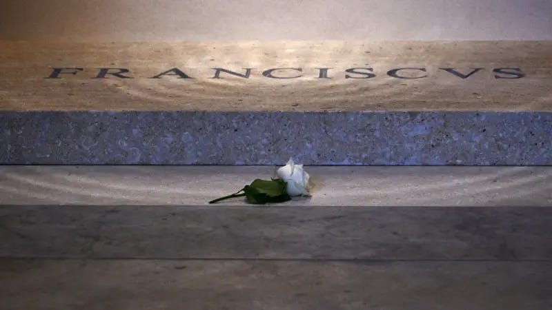
In the “F R A NCISC VS” inscription, the odd spaces around the”R,” “A,” and “V” are distracting and slow down the read. But what makes the typographic error at Santa Maria Maggiore Basilica in Rome so egregious is the finality of it. How could a design mishap like this occur under such extraordinary conditions? When typography is used for extreme displays of institutional power, like an authoritarian government, a fascist uniform, a ruling body, or even the omniscient voice of a holy entity, it supports domination—the communication of a hegemonic agenda. What exactly are the ingredients of typographic power, and why do they fail here?
The typography on the tomb of Pope Francis is so unsettling because the staggered read weakens the emotional experience of patriarchal power in a highly charged context that was designed for reverence. For some (not everyone sees it), the less-perfect spacing reveals the faulty labor behind its construction. Was it intentional? Is this a queer use of type? I don’t think so. But it does accomplish this: it exposes the shortcomings (of an administrative process? of typography? of patriarchy?) and reveals that it’s entirely possible to disrupt the reading of a man’s name with a simple, perhaps accidental act of bad typesetting. Not just any name, but the name of the most powerful authority in the Catholic Church, answering to over one billion followers. When I see it, I question the singularity of the inscription’s voice. Rather than sink into awe or devotion in contemplation of his name, my eye wanders around the oversized gap between the R and the A, and I think of how it came to be—the engraver, the designer (if there was one), the clerk who made the order, the workers who cut and set the stone in place—the administrators of authority that surround and construct such a power. This is labor that is supposed to remain invisible, but instead it’s there on the surface of the stone, pushed into plain view, breaking up the smooth illusion of craft, and dragging the experience of holy perfection down into the profane world of fonts, software, and clerical mistakes.
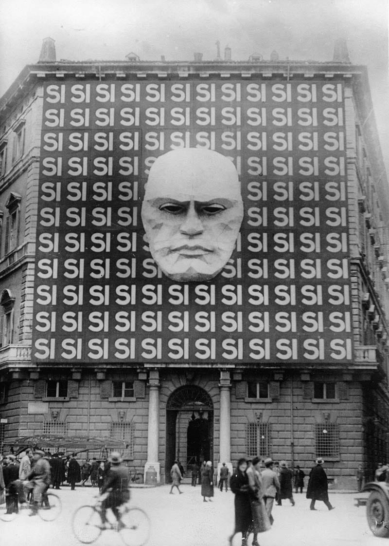
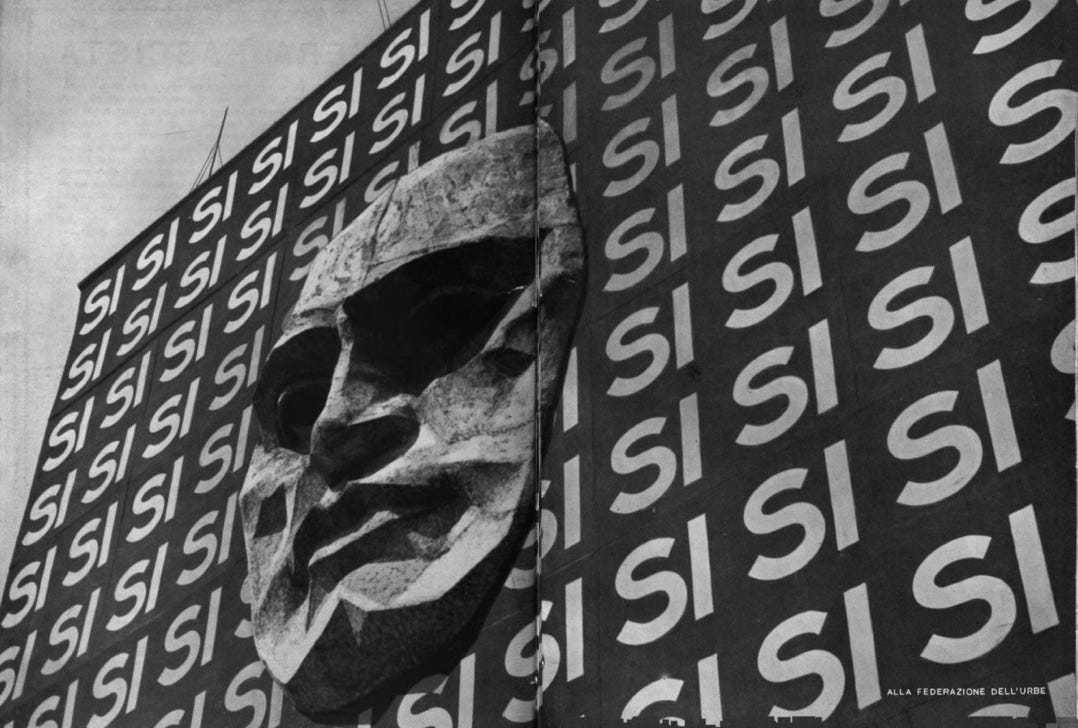
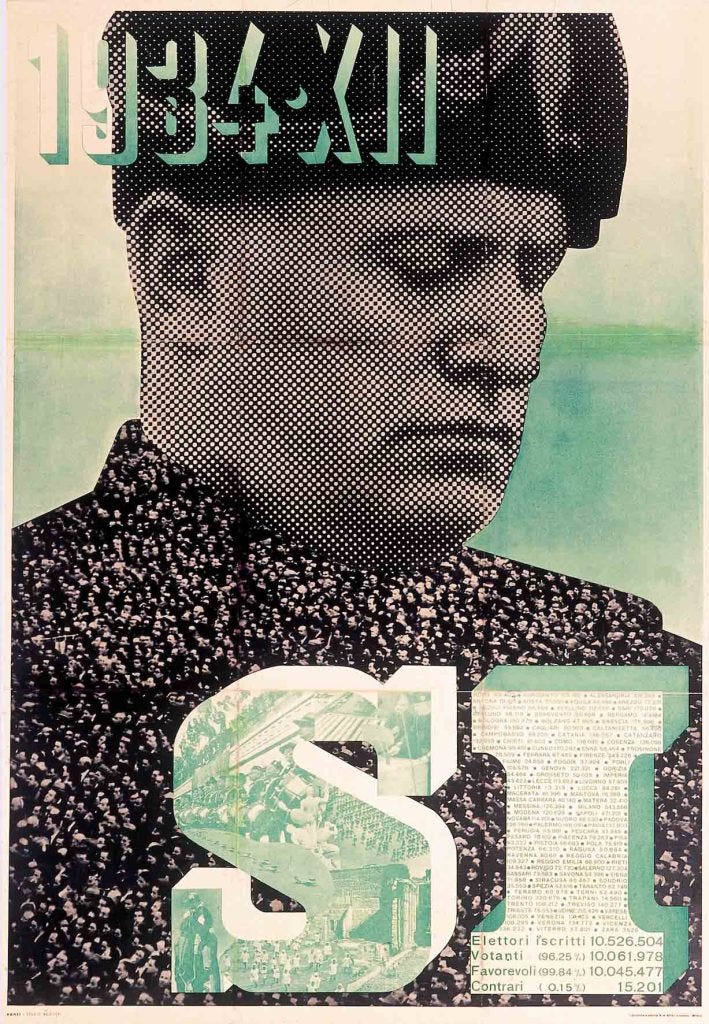
Here’s another notable moment in Rome, for contrast. This is Palazzo Braschi, headquarters for Benito Mussolini and the Italian Fascist Party Federation, 90 years earlier. The photograph depicts the building’s facade covered over with a billboard by Mussolini’s party to promote the vote of “SI” (YES) for the March 1934 national “election.” This was a single party ballot that was put to voters for approval; no other options were allowed. Propaganda for “SI” was imposed, 99.85% of the vote was forcibly achieved under duress, and fascist power was retained. Here, the typography of domination speaks to support a singular source, the voice of ultimate authority looking down threateningly from its palace to the street with a loud, one-word message perfectly set in repeating uppercase letterforms. This is typography designed to evoke fear in the seizure of power. There is no uncertainty here, no room for dissent in this representation of fascist dominance. If an election is an issue of consent—may we remain in control?—the SI propaganda was an enforced “default yes.” Authoritarian regimes erase collective agency with graphic design, architecture, monuments, and propaganda that support a singular, unquestioned voice. The fascist voice speaks in loud, predictable tones to a forced agenda.
The contact zone
My search, my drive towards queer typography brings me to this place, in considering the language and letterforms of violent regimes, because today I am surrounded by representations of power that are at once confusing, frightening, and eerily familiar. In staying close to my own experiences and feelings in the face of extreme authority, as well as those around me in my various communities, I hope to better understand the practice of graphic design and typography within the matrix of domination. I’m compelled to look at it, because this kind of design—the highly legible, controlled, regulation of design that constructs and supports white supremacy, settler colonialism, capitalism, and heteropatriarchy—is all around us now. It’s been here for a very long time—centuries—and it works to undo all of the progress that makes survival and liberation possible. The gradual rise of a more visible and emboldened extreme-right politics in the US is shifting my search deeper into the archive, back to the present, and out towards an uncertain future. If the purpose of empire is to expand, dominate, and reproduce itself at all costs, then what kind of language(s) do we shape in response? What do queer typographies feel like today? “Feel like” because I’m trying to stay close to an emotional route in this work, rather than the formalities of queer or fascist aesthetics, which only go so far. As an aging, queer body moving through an era of frightening surveillance and consolidation of unilateral power, I’m learning best by cultivating intimacy, contact, and connection in my writing, by sharing experiences embodied and felt. This is why so much of my time is spent in queer archives, which “challenge traditional conceptions of history and understand the quest for history as a psychic need rather than a science” (emphasis my own).1
So far, my cruising in and out of these spaces reveals this: that it’s entirely possible to create a contact zone for these psychic needs, a place for radically different approaches to queerness, design, typography, and time to criss-cross and encounter each other in radical difference. In gathering these unexpected figures, moments, works, gestures, and acts into one risky, porous space—the space of an idea, a thesis, an essay, a book—I’m able to share the complexities that cultivate contamination, unlearning, and growth. In establishing contact across time and space, I’m trying to work against the hegemonic urge to canonize only those who support virtuosity, and open up to risky encounters that problematize the normative and move us towards plurality.

Design normativity
Design normativity is enforced by the conservative institutions of capitalist, heteropatriarchal society that wish to maintain a controlled, visual expression of their values. The tools and materials of design normativity are the regulations, design standards, and branding guidelines of institutions, corporations, and governing structures. These policies provide the visual ingredients and communication strategies for defining and maintaining the singular voice of authority, and exclude everything else. In the construction and enforcement of design normativity, the irregular is neglected, erased, or even outlawed.
The need to spread propaganda through one nationalist voice that would read as “authentically German” led to a typographic debate in late 1930s Germany, causing leaders of the Nazi regime to create a false narrative that wrongly defined the widely-used Fraktur typefaces as “Jewish letters.” Fraktur was declared to be un-German, and outlawed. In January 1941, the Nazi regime issued a “typographic decree” prohibiting Fraktur typography, demanding that all newspaper and magazine printers change immediately to “normal typefaces.” Similarly, printers in the US issued their own proclamation boycotting the use of German-made “Nazi type,” and promoted American-made equivalents.

The hateful, anti-semitic values associated with the policies of the Nazi regime were extended into the regulation of design and typography (as well as art, architecture, music, etc); anything outside of “normal” was regarded as wayward and criminal. For the Nazi regime, “normal typefaces” meant Latin-based letters designed in an “Antiqua” style. The fractured style of Fraktur typography (from Latin frāctūra, “a break”), characterized by choppy, self-contained blackletter forms, was considered to be the “opposite” of flowing Antiqua, which evoked the smooth, connected forms of Latin inscription and the calligraphic hand.
(Fraktur) looked old fashioned; it was too ornate, too prominent, too visible: indeed, one of the arguments in favour of its use was that the Gothic script was more open to typographical experiment than the simple, definitive letters of the Latin face, which confines typeface design to tiny details, subtle shifts, small strokes and fine adjustments here and there. The letters can vary in appearance, but not too much: the constraints are high, the room for maneuver small.2
Fraktur was eliminated because the potential for variability, experimentation, and expression was seen as a threat. Irregularity had no place in a tightly controlled regime intent on the expansion of power through cruelty and violence. Later in the Nazi regime, Paul Renner’s Futura was also promoted, with its easy-to-read geometric forms and clear connections to modernity (even though Renner had been arrested by the Nazis in 1933, and later fled to Switzerland). As foreign lands were invaded and occupied, controlled legibility was prioritized; a “regular” and “normal” typographic voice was seen as the most effective strategy for communicating Nazi propaganda to non-German speakers; anything (and anyone) irregular was seen to be deviant and discarded. This was normative, legible typography for colonialism, empire building, and genocide.

Typography for domination
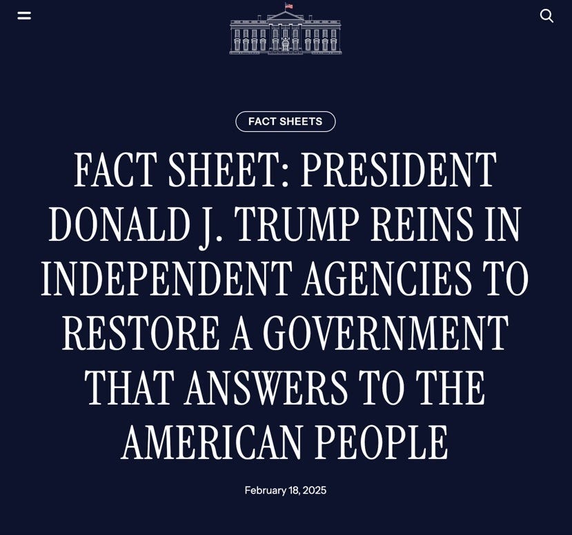
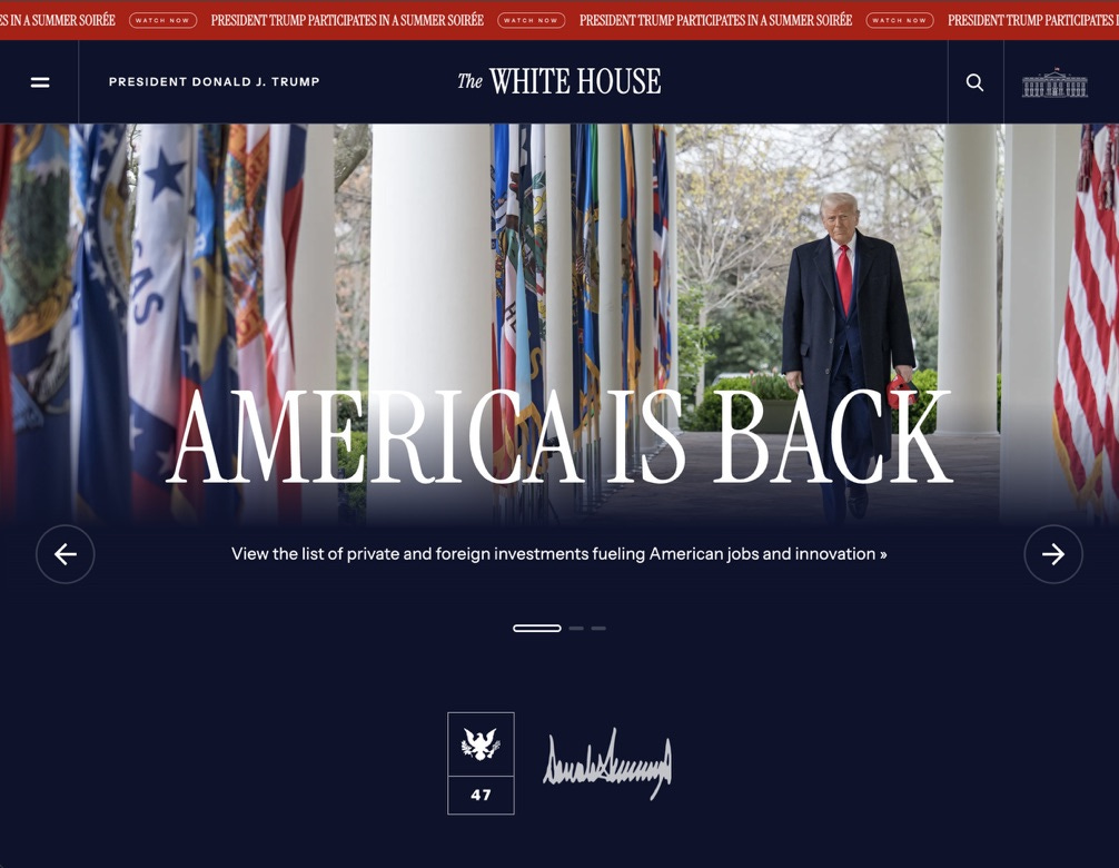
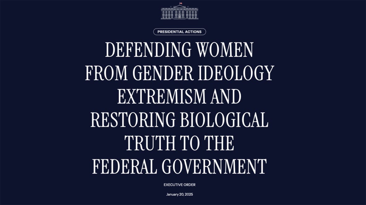
Now, right before me, I see the deployment of similar tactics—strategic design used to create fear and panic in the construction of authoritative rule. The Trump regime uses design in the performance of US statecraft that mimics some of these fascist examples, as well as others, employing a “militarized” command of typography and the use of bold, super legible typefaces that frequently appear in all-caps. The typographic voice of the current regime first appeared when the new administration was elected in January 2025, primarily on the White House website. They took command with a redesigned site that centralizes all of their official communications. This is where announcements are made, Executive Orders are posted, and the latest fake news is promoted through ominous movie-poster-style headlines. In the virtuous execution of typography used by the Trump regime, frightening propaganda is created about the control of entire populations, gender ideology, reproductive rights, healthcare, and immigration, all supported by good, legible typography.
The fonts used on the White House website are Instrument Serif and Instrument Sans, from a family of typefaces designed by independent type designer Rodrigo Fuenzalida for Instrument, the Portland, OR and New York, NY-based design agency. Fuenzalida lives and works in Santiago, Chile. This makes me wonder what an “authentically American” typeface might be, or a purely authoritarian one, or a caring one, or a truly powerful one. And suddenly I’m back at the very questions that prompted this book in the first place—does queer typography exist? and by extension, is there gendered typography? what about ethical typography? can a font be good, or evil? Within these questions lies an even deeper one, about the nature of letterforms: why does the appearance of language matter?
I call masculine all printing that is noticeable for its readability, for its strength and absence of useless ornament. I call feminine all printing noticeable for its delicacy, and for the weakness which always accompanies delicacy, as well as for its profusion of ornamentation.3
This statement by Theodore Low De Vinne would almost be laughable if he hadn’t been such an influential printer and scholar of typography at the start of the 20th century. 134 years later, we know that there’s nothing inherently gendered or radical or good or evil about fonts, but that it’s entirely possible to construct an affective experience through typography. That’s where it gets complicated. Those who write and perform acts of language do so under certain social and political conditions; this is how typography acts, how it does things, how it shapes language. There is always context to those declarations that qualify as toxic, or harmful, or painful, supported by people making decisions that put design to bad use.
I wonder how long all-caps Instrument Serif on a dark background will retain the power to conjure up the trauma of this particular era. Can the design surpass this moment? There’s nothing toxic about the font, but as it’s made to deliver violent language again and again, new associations form. Setting the tall letterforms in all-caps on a dark background gives the Trump headlines an exaggerated stature, as well as the quality of being shouted or barked, like the all-cap threats Trump has made on social media for years. By following the official Trump 47 White House Brand Guidelines, the tightly controlled “hero” voice of the singular commander is constructed. Control is regulated through consistent usage, repetition, and a seamless display of rigid order—the hallmarks of effective branding. Of course, the long-lasting connections between design, branding, and politics are plentiful, and have been explored in depth elsewhere.

Enforced design
Mussolini’s SI, Hitler’s Futura, and Trump’s all-caps Instrument are successful (if we can call them that, within their respective contexts) because they work to support the already-existing infrastructures of necropolitics and domination that determine which populations get to live or die. Design decisions are being made right now by people who support barbaric systems of destruction, decisions involving the militarized dissemination of propaganda, the staging of violent imagery, and the branding of terror regimes. How do we reconcile this as design educators and practitioners?

In the US, the playbook for the Trump 47 presidency, the 920-page Project 2025 Mandate for Leadership: The Conservative Promise report, was designed by in-house graphic designers at the Heritage Foundation. It makes perfectly good use of excellent typefaces: Chronicle and Gotham from Hoefler&Co, part of the Monotype Library of typefaces and foundries. The design of the book is boring and without any distinction at all, but communicates adequately, like one might expect from a conservative think tank. The plain design of the Project 2025 document works to mask the true scope of its horrors; this is itself a kind of craft. I’m not sure there’s much more to learn about hegemonic power by looking at the good typography here, as it’s been used to disseminate hateful ideology, other than this: enforced design works to support domination. There’s a long history of good design and typography—from the banal to spectacular displays—going hand-in-hand with cultures of militarized terror, colonialism, and necropolitics. I’m bringing these particular examples into the contact zone because they cause me to question my own relationship with typography right now, in this troubling era of extraction and devolving democracy. And I’ve come to realize that the full capacity of typography, as a set of material conditions, knowledges, and practices, requires a much wider view than typically articulated by design educators: as a tool for both resistance and oppression, as support for both liberation and terror.
Acts of language
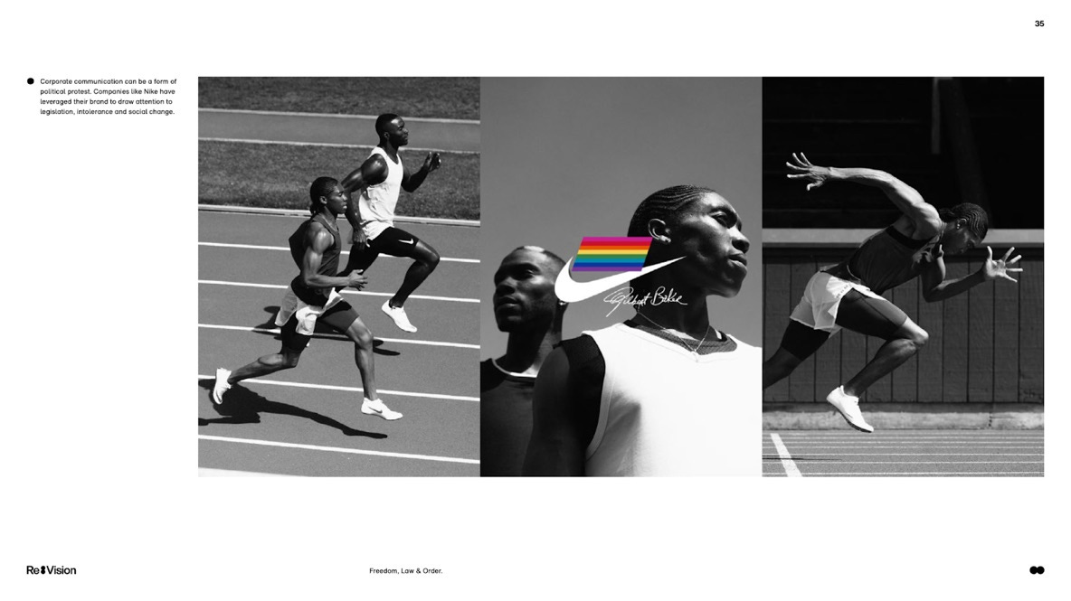
I recall Re:Vision, Future Typography, the Monotype 2025 Trend Report, and how the team who wrote that document positioned the entire field of typography as a benevolent force for advancing progress and good in the world. Chapters addressing artificial intelligence, climate change, “freedom, law & order,” and “conflict & peace” were illustrated with inspiring examples of projects and campaigns that elevate the use of good typography as a hopeful, virtuous endeavor. It even includes GenderFail’s Protest Fonts. I’m sure it’s an effective way to sell software—but what we don’t see in the Monotype Trend Report is the complete range of graphic design’s contradictions, which extends all the way from progressive movements for liberation to the politics of terror and domination that create the conditions for global oppression. Typography has a way of reflecting our current conditions back to us through contradictory acts of language that have the capacity to terrorize, inspire, embolden, inform, and confuse, and all of the other ways that language forms and frames our affective experiences of the world. As painful as it might be, we need to make space for these contradictions, and try to understand them; this is part of what it means to engage with design right now.
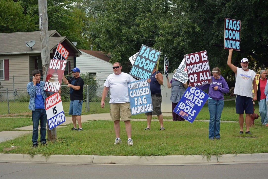
Here are some past, recent, and very current typographic moments that I’m bringing into the contact zone as I try to make sense of how plain acts of language can be used both to support and counter violence, in fraught moments of turbulent upheaval. How do we make sense of design and typography here in the zone?
the embroidered letterforms visible on the back of an ICE agent,
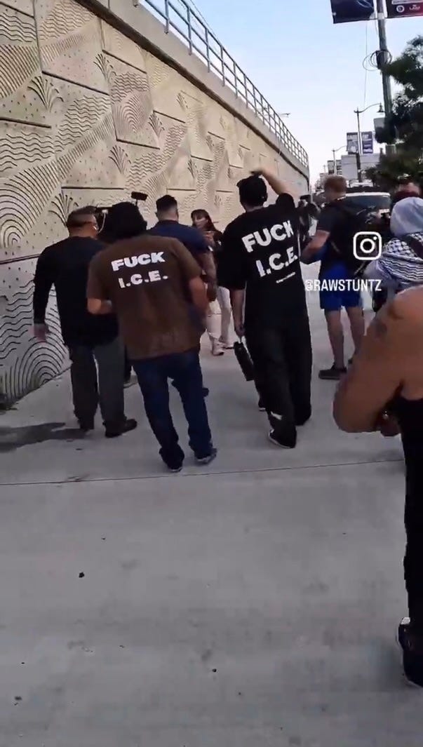
the printed letterforms on signs and shirts spelling out ICE OUT OF LA and FUCK ICE, being used by protestors in Los Angeles in June 2025,
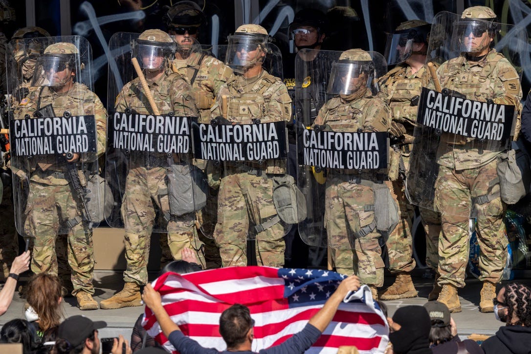
the printed shields used by the California National Guard in June 2025,
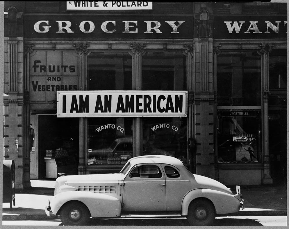
the perfectly painted letterforms spelling out “I AM AN AMERICAN” hung outside a Japanese immigrant-owned store in Oakland, CA that was shut-down the day after the Pearl Harbor attack in 1942,
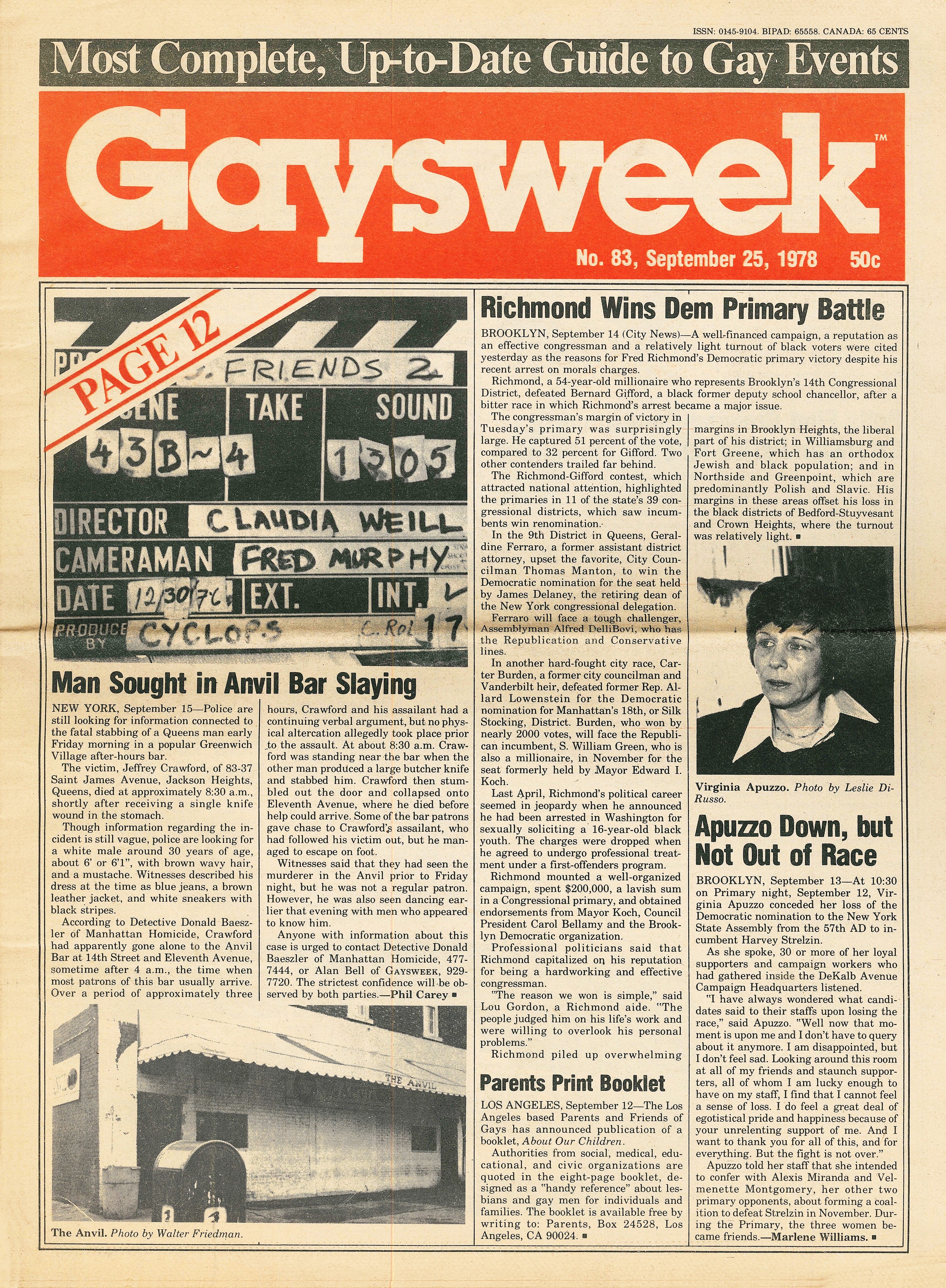
the cover of Gaysweek from September 1978, the first gay weekly publication in NYC and the first Black-owned and edited mainstream gay publication;
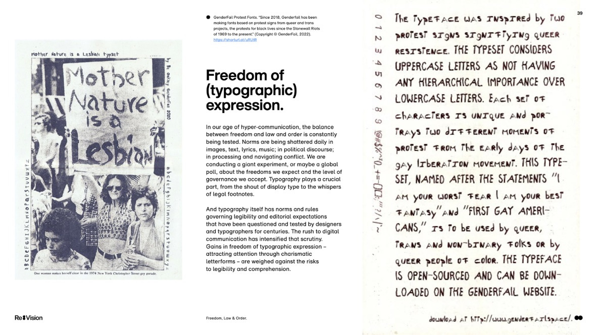
Paul Chan’s “Boulder Font” protest signs that turned the Westboro Baptist Church’s hateful designs inside-out in 2018,
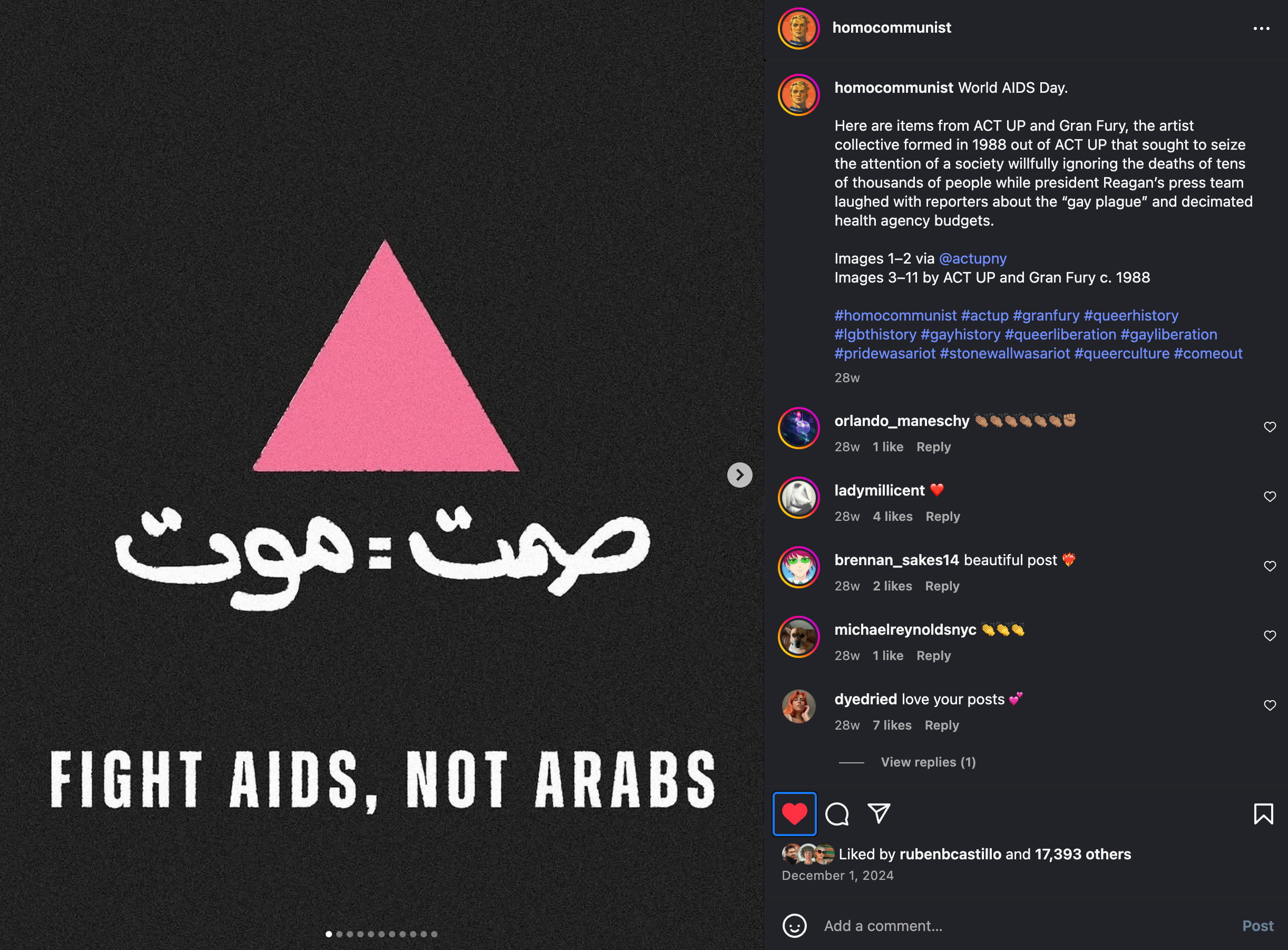
a social media post by @homocommunist on World AIDS Day, 2024,
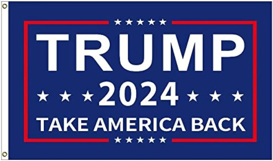
print-on-demand Trump flags typed in Arial Black hanging outside homes all across the US right now
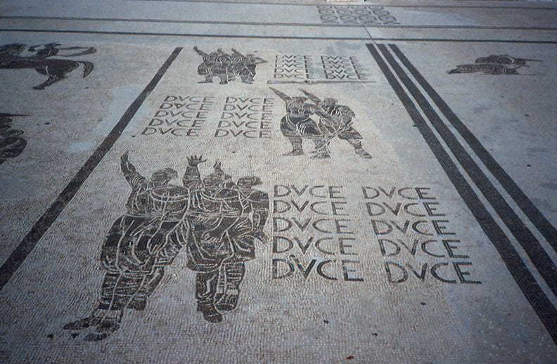
the DVCE (meaning DUCE, (duke), or “The Leader”, referring to Mussolini) pavement mosaic at Foro Italico, the 1930s fascist-era sports stadium in Rome, Italy
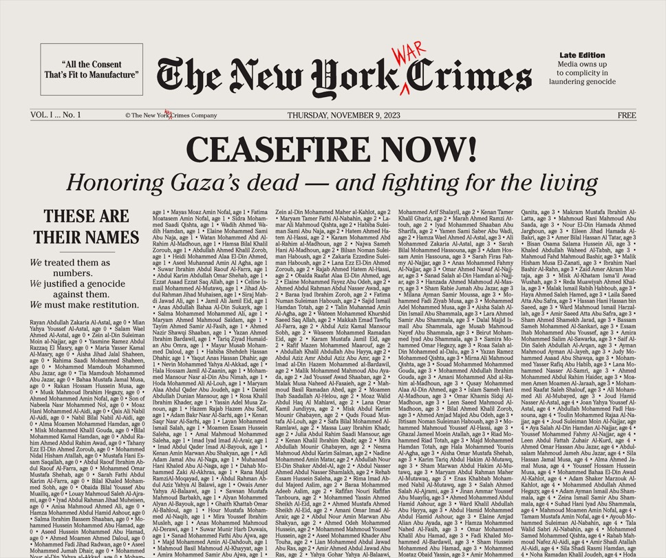
the front cover of the The New York War Crimes, November 9, 2023.
These fonts only matter because they perform certain effects on language in public space. They use legibility to deliver messages that make visible not only the language at hand but who declares it, during highly charged moments of struggle. They use (and reuse) the restrictions and regulated design assets of constraint-based branding as their raw material to make claims for or against violence.

Queer as reused; reuse as queer use.4
A queer use of type is an irregular language act, a way to make language do something unexpected in the face of power. One such tactic is mimicry, seen in some of these examples. Alan Bell re-used the Newsweek logo to claim new forms of space and power through publishing when he founded and published Gaysweek in 1977, the first Black-owned and edited mainstream gay publication and New York City’s first gay weekly (Bell later went on to publish BLK, BLACK LACE, and other groundbreaking queer publications). Similarly, Writers Against the War on Gaza have used the instantly recognizable form of The New York Times to defamiliarize with their own newspaper, The New York War Crimes, since 2023. The “FUCK ICE” messages seen on the backs of protestors in Los Angeles mirror “POLICE ICE” in form; Paul Chan makes perfect copies of the Westboro Baptist Church’s hateful designs for his own. Thinking through Sara Ahmed’s work around “queer use,” we can see these as typographic acts of reuse as queer use that are both weaponized and caring, reusing the tools and materials of power to achieve certain effects. They turn the tools—the brand guidelines, the design constraints, the materials of domination—upside-down and inside-out, by using them for counter purposes. They “load up” the language with a reinforced armor that strikes at how hegemonic power works, by reusing its materials and speaking its language. These fonts matter because they play with perception in the instant read, and slow down the experience for a second look. “But it is not just that use is a restriction of possibility that is material. Restrictions can also become material through use.”5

The typographic error
Nat Pyper wrote a letter to me recently about care, in response to my “Cruising” essay, which I share here in order to continue these thoughts.
I went to a Johanna Hedva talk where they lamented about ‘care’ being used as rhetorical cover by cultural institutions who have no real investment in actual caretaking and whose accessibility considerations are abysmal. Then the new Stereolab album came out, and I was struck by the lyrics in ‘Aerial Troubles,’ the second song on the album:
The juncture invites us to provide care
(Palliative)
Dying modernity
While offering antenatal care for the inception
Of the new yet undefined futureWhich of course resonates so much with your essay. And then in thinking about Hedva, I wondered about the deployment of ‘caretaking’ and who uses it and for what purpose. Surely there are those on the right who will say that their xenophobic Christian nationalism is an effort to take care of a certain possibility or worldview or world, that is, a future. (And to a lesser degree, Vignelli and his ‘six,’ although some of those quotes are very icky and no less xenophobic.) So then that made me wonder about different kinds of caretaking. And which is the kind that I value? Maybe there are different and opposing forms of caretaking: a caretaking that closes down vs. a caretaking that opens up; a caretaking that is destructive/severing vs. a caretaking that is creative/reparative; a caretaking of power vs. a caretaking of people. And of course all of this is wrapped up in this question of consent, of who gets to lay claim to what, or who. Is that kind of caretaking which is destructive and forecloses possibilities actually caretaking or is it, as you name at the end, just domination?
In caring for a world, for a future, in the kind of caretaking that destroys, or opens up, or repairs—it’s somewhere in this full spectrum of an ethics of care that I return to the typographic error. Or rather, not the error itself, but the absence of design perfection—the glitched, deviant, non-normative, and sometimes rageful practices that aren’t used to build empires, aren’t replicated in graphic design canons, nor celebrated at awards ceremonies. Can the refusal to deliver perfect legibility be an act of care, a worldview, an intentional practice, even? Deviant design—hand-made letterforms, odd spacing, crowded pages, encoded messages, mimicry, unpredictability—exposes labor and reveals the messiness of political life and work in the collective. Some kind of evidence of human life is made real there in the disruption of the perfect read, in the slowed-down act of reading variant bodies of design that makes felt the work of shaping language.
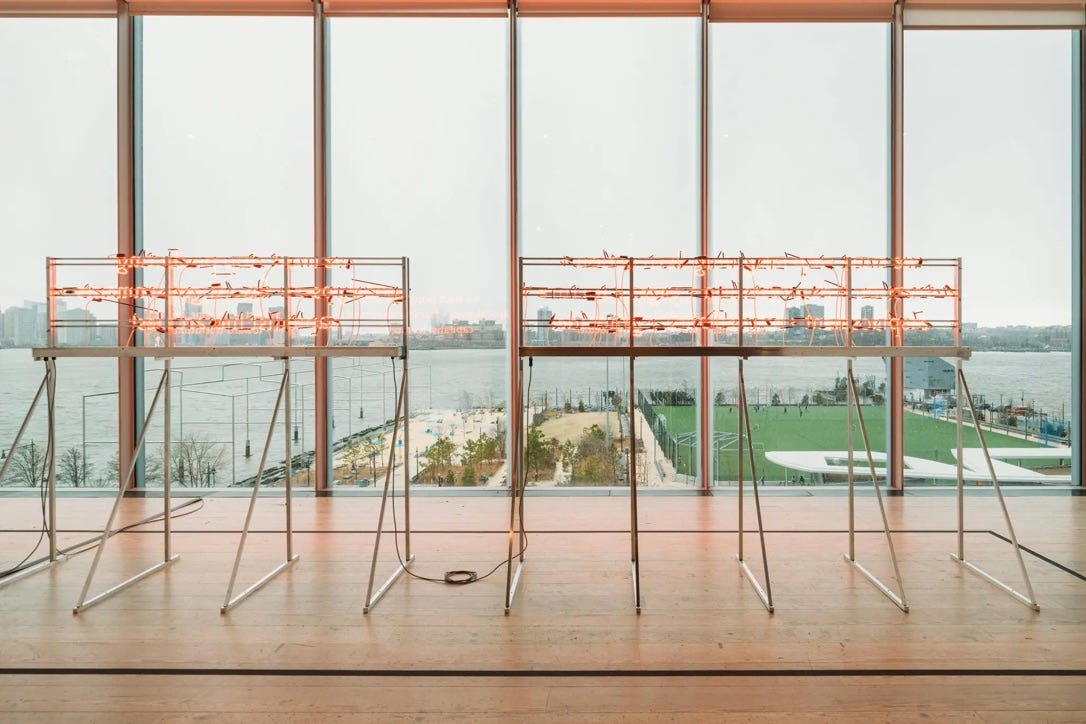
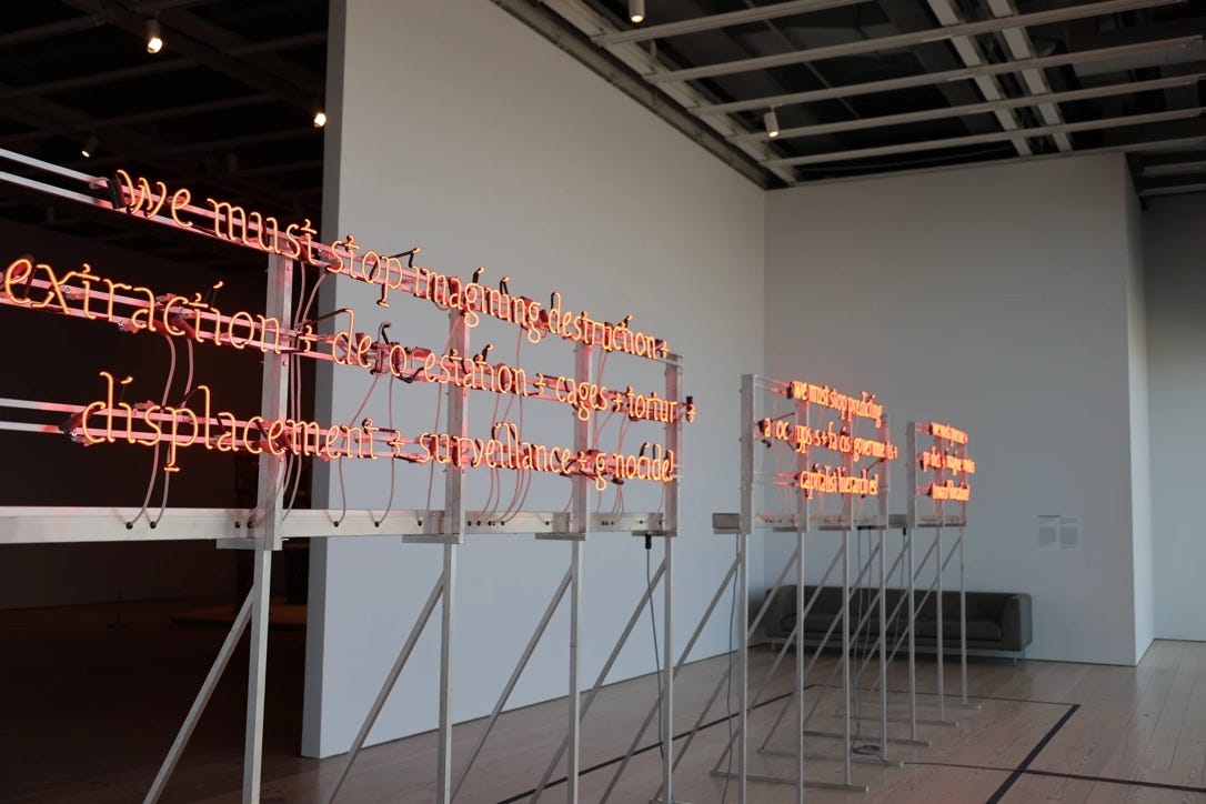
Deviant design can be a strategy for survival. We must stop imagining apocalypse / genocide + we must imagine liberation (2024) is a work by artist Demian DinéYazhi' that depends on a slower read and the power of layered language that gets “loaded up” and deployed through the coded, queer use of language. DinéYazhi's practice focuses on indigenous and LGBTQIA+ people and white supremacist capitalist heteropatriarchial colonization. They created We must stop imagining apocalypse for the 2024 Whitney Biennial, a typographic poem constructed in neon that was installed on three separate metal stands. 13 letters in the poem flicker to slowly reveal a hidden message: “free palestine” The work faced west through the gallery window and was visible from outside the building. I wish I’d been able to see it in person.
The full poem reads as follows:
“we must stop imagining destruction + extraction + deforestation + cages + torture + displacement + surveillance + genocide! we must stop predicting apocalypses + fascist governments + capitalist hierarchies! we must pursue + predict + imagine routes toward liberation!”
DinéYazhi' described the hidden message—
Free Palestine is a call for a permanent ceasefire and an end to occupation, genocide, forced migrations of Palestinian peoples and the right of self-determination for Palestinian peoples. It asks us to consider what healing and building future societies could look like if we were all liberated from disharmonic and divisive political systems, police states, and nation states.6
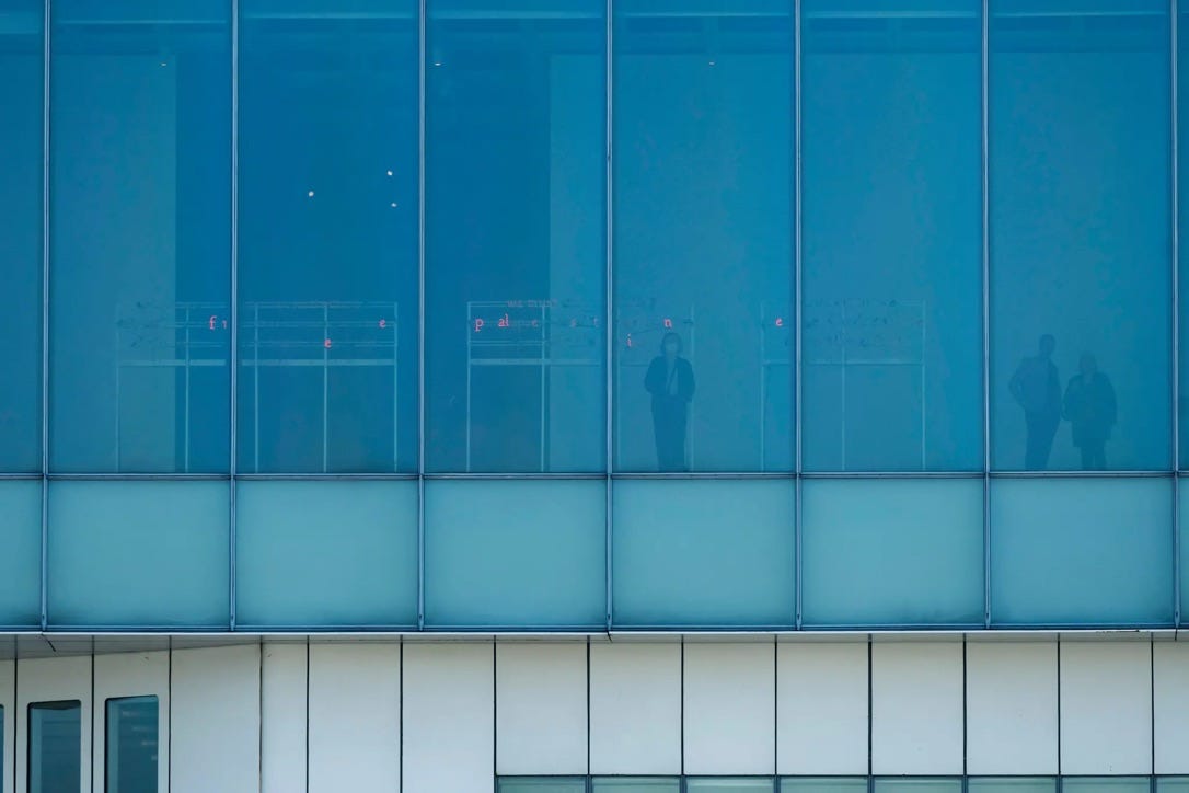
We must stop imagining apocalypse is a hand-made work where typography is key but the font itself is of less importance, where the queer use of language in the form of an irregularity (a hacking in how it acts) deepens its meaning. The queer use of language here depends on patience and perception, an awareness of the irregular, and thinking with Sara Ahmed again, a re-use of one condition in order to direct towards another.7 It’s an encoded act of language that performs non-normatively through time and space: the variable letters signal emancipation. “Queerness is . . . a performative because it is not simply a being but a doing for and toward the future.”8 The flickering of light that spells out the message “free palestine” is delivered by the artist as a kind of generous caretaking, a reprieve from the perfect read, one that opens up possibilities because the variance appears slowly, triggered by the work of the viewer. The flicker reveals something new that emerges as a challenge to its context—the systemic silence and complacency of the institutional art world where the work is situated.
We must stop imagining apocalypse only partially delivers itself for viewers accustomed to an Instagram-quick read in a blockbuster museum space. In what might be seen first as a benign error, a flickering letter, the lingering view gives way to more—to variability, a kind of irregularity that is outlawed. A real sitting with the work directs to an opening, towards a “new yet undefined future,” a future free from genocide and tyranny. This is a strategic approach to shaping language that depends upon the seduction of art-world perfection that we might expect in a setting like this (the exquisite craft of the display, the red-orange glow of the neon, the curation of a world-class collection of art), but it only really gets to work once we sit and open ourselves up to the irregular. In the irregular is the potential for new practices, new knowledges, new contaminations in the contact zone. In the irregular is new language.
Ann Cvetkovich, An Archive of Feelings: Trauma, Sexuality, and Lesbian Public Cultures, Duke University Press, 2003, p.268.
Sadie Plant, “On Bea Schlingelhoff ’s typefaces for Women against Hitler,” 2017.
Theodore L. DeVinne, “Masculine Printing,” The American Bookmaker, November 1892.
Ibid.
Demian DinéYazhi’, “A Whitney Biennial artist’s hidden message, ‘Free Palestine,’ asks viewers to take a long look,” CNN, March 2024.
Ahmed, 2018.
José Esteban Muñoz, “Feeling Utopia,” Introduction to Cruising Utopia: The Then and There of Queer Futurity, 10th Anniversary Edition, New York University Press, 2019: 1.
Just read the passage about the “bad” spacing on the tomb of Pope Francis. Is it a coincidence that similar “bad” or “amateur” design can be found--quite deliberately, I imagine—in early Christian catacombs?
Channeling Armando Petrucci, here.
Such an interesting topic, I loved your selection of examples.
It poked at something I had been thinking about this week, a 'type' of queer type, those found on album covers. It was the re-release of SOPHIE's Product EP, and her distinctive logotype that prompted this. It isn't surprising to me she selected Lÿno, which has four unique styles. Which, as the designers note, "resist normative tendencies and to reject the idea of definitive form".